Terra Mission (EOS/AM-1)
Terra (formerly known as EOS/AM-1) is a joint Earth observing mission within NASA's ESE (Earth Science Enterprise) program between the United States, Japan, and Canada. The US provided the spacecraft, the launch, and three instruments developed by NASA (CERES, MISR, MODIS). Japan provided ASTER and Canada MOPITT. The Terra spacecraft is considered the flagship of NASA's EOS (Earth Observing Satellite) program. In February 1999, the EOS/AM-1 satellite was renamed by NASA to "Terra". 1) 2) 3) 4)
The objective of the mission is to obtain information about the physical and radiative properties of clouds (ASTER, CERES, MISR, MODIS); air-land and air-sea exchanges of energy, carbon, and water (ASTER, MISR, MODIS); measurements of trace gases (MOPITT); and volcanology (ASTER, MISR, MODIS). The science objectives are:
• To provide the first global and seasonal measurements of the Earth system, including such critical functions as biological productivity of the land and oceans, snow and ice, surface temperature, clouds, water vapor, and land cover;
• To improve the ability to detect human impacts on the Earth system and climate, identify the "fingerprint" of human activity on climate, and predict climate change by using the new global observations in climate models;
• To help develop technologies for disaster prediction, characterization, and risk reduction from wildfires, volcanoes, floods, and droughts
• To start long-term monitoring of global climate change and environmental change.
Complemented by aircraft and ground-based measurements, Terra data will enable scientists to distinguish between natural and human-induced changes.

Figure 1: Illustration of the Terra spacecraft (image credit: NASA)
Spacecraft:
Terra consists of a spacecraft bus built by Lockheed Martin Missiles and Space (LMMS) in Valley Forge, PA. The spacecraft is constructed with a truss-like primary structure built of graphite-epoxy tubular members. This lightweight structure provides the strength and stiffness needed to support the spacecraft throughout its various mission phases. The zenith face of the spacecraft is populated with equipment modules (EMs) housing the various spacecraft bus components. The EMs are sized and partitioned to facilitate pre-launch integration and test of the spacecraft.
EPS (Electrical Power Subsystem): A large single-wing solar array (size of 9 m x 5 m = 45 m2), deployed on the sunlit side of the spacecraft, maximizes both its power generation capability and the cold-space FOV (Field of View) available to instrument and equipment module radiators. The average power of the satellite is 2.53 kW provided by a GaAs/Ge solar array (max of 7.5 kW @ 120 V at BOL). The solar array is based on on a prototype lightweight flexible blanket solar array technology developed by TRW (use of single-junction GaAs/Ge photovoltaics). A coilable mast is used for the deployment of the solar array. The Terra spacecraft represents the first orbiting application of a 120 VDC high voltage spacecraft electrical power system implemented by NASA. A PDU (Power Distribution Unit) has been designed to provide 120 DC (±4%) under any load conditions. This regulated voltage, in turn, is achieved via a sequential shunt unit (SSU) and the 2 BCDUs. A NiH2 (nickel hydrogen) battery is used (54 cells series connected) to provide power during eclipse phases of the orbit. 5) 6) 7)

Figure 2: Coilable mast deployer for the Terra solar array (image credit: NASA)
GN&C (Guidance Navigation and Control) subsystem: Terra is a three-axis stabilized design with a single rotating solar array. The GN&C subsystem is made up of sensors, actuators, an ACE (Attitude Control Electronics) unit, and software. A three-channel IRU (Inertial Reference Unit) determines body rates in all control modes. Solid-state star trackers provide fine attitude updates, processed by a Kalman filter to maintain precise 3-axis inertial knowledge. A 3-axis magnetometer senses the Earth's geomagnetic field, primarily for magnetic unloading of reaction wheels, but also as a sensor to determine an attitude failure during a deep space calibration maneuver. 8)
The backup sensors include an ESA (Earth Sensor Assembly) for roll and pitch sensing, and coarse sun sensors for pitch and yaw sensing of the sun line relative to the solar array. A fine sun sensor is used in the event that one star tracker fails or during the backup stellar acquisition mode. In addition to these sensors, a gyro-compassing computation is performed for backup yaw attitude determination.
A reaction wheel assembly provides primary attitude control. During normal mode, a wheel speed controller is available to bias the wheel speeds at a range that avoids zero rpm crossings (stagnation point). Magnetic torquer rods regulate the wheel momentum to < 25% capacity in four-wheel mode and < 50% capacity in the three-wheel mode (backup mode). Thrusters are used for attitude control during all velocity change maneuvers and for backup attitude control and wheel momentum unloading.
GN&C is a fault-tolerant system that includes an FDIR (Fault Detection, Isolation and Recovery) capability unique to each of the different operational control modes. If an attitude fault is detected, FDIR transfers all control functions to the ACE unit configured to use all redundant hardware. Once in safe mode, FDIR is disabled.
Table 1: Overview of GN&C sensors and actuators

Figure 3: Artist' view of the Terra spacecraft in orbit (image credit: NASA)
The design life of the Terra spacecraft is six years. The spacecraft bus is of size of 6.8 m (length) x 3.5 m (diameter) and has a total launch mass of 5,190 kg. The total payload mass is 1155 kg.
RF communications: The primary Terra telemetry data transmissions are via TDRS (Tracking & Data Relay Satellite) system. A steerable HGA (High Gain Antenna) and associated electronics are mounted on a deployed boom extending from the zenith side of the spacecraft. This location maximizes the amount of time available for TDRS communications via this antenna without obstruction by other pads of the spacecraft. Emergency communication is done via the nadir or zenith omni antenna. Command and engineering telemetry data are transmitted in S-band. The science data recorded onboard are transmitted via Ku-band at 150 Mbit/s. The nominal mode of operation is to acquire two 12 minute TDRSS contacts per orbit. During each TDRSS contact, both S-band and Ku-band transmission is being used.
The average data rate of the payload is 18.545 Mbit/s (109 Mbit/s peak); onboard recorders for data collection of one orbit. Mission operations are performed at GSFC. 9)
Broadcast of data: Besides Ku-band and S-band communication, Terra is also capable of downlinking science data via X-band. The X-band communication can be operated in three different modes, Direct Broadcast (DB), Direct Downlink (DDL) and Direct Playback (DP). DB and DDL is used to directly transmit real-time MODIS and ASTER science data respectively to users.
The DAS (Direct Access System) provides a backup option for direct transmission in X-band. DAS supports transmission of data to ground stations of qualified EOS users around the world. These users fall into three categories:
- EOS team participants and interdisciplinary scientists
- International meteorological and environmental agencies
- International partners who require data from their EOS instruments

Figure 4: The Terra spacecraft in the cleanroom of LMMS at Valley Forge (image credit: LMMS)
Launch: The launch of the Terra spacecraft took place on Dec. 18, 1999 from VAFB, CA, on an Atlas-Centaur IIAS rocket.
Orbit: Sun-synchronous circular orbit, altitude = 705 km, inclination = 98.5º, period = 99 minutes (16 orbits per day, 233 orbit repeat cycles). The descending nodal crossing is at 10:30 AM.
Orbit determination is performed by TONS (TDRS Onboard Navigation System) which estimates Terra's position and velocity, drag coefficient, and master oscillator frequency bias. TONS is updated by Doppler measurements at the spacecraft's receivers and provides the attitude control software with a desired pointing ephemeris. Ground-based orbital elements are uplinked daily for backup navigation.
As of March 1, 2001, the Landsat-7, EO-1, SAC-C and Terra satellites are flying the so-called "morning constellation" or "morning train" (a loose formation demonstration of a single virtual platform). There is 1 minute separation between Landsat-7 and EO-1, a 15 minute separation between EO-1 and SAC-C, and a 1 minute separation between SAC-C and Terra. The objective is to compare coincident observations (imagery) from various instruments (synergistic effects). 10)
Figure 5: NASA's Terra mission at 10 years on-orbit (video credit: NASA)
Mission status
• June 11, 2019: Los Glaciares National Park in Patagonia gets its name from the plentiful glaciers flowing from the flanks of the Andes Mountains. Where some of the park's most notable glaciers end, a series of colorful glacial lakes begin. 11)
- Most of these glaciers end in water, where their fronts can lose ice by melting and through calving icebergs. Numerous studies have focused on the glaciers on the west side of the southern icefield that dispense ice and meltwater to the Pacific Ocean. But the icefield is losing plenty of ice on its eastern side too, through glaciers that end in freshwater lakes.
- Lago Argentino and Lago Viedma are the two main freshwater lakes connected to Los Glaciares National Park (Figure 6). These lakes, as well as nearby Lago San Martin, are filled with so much fine sediment from the glaciers—also known as glacial flour—that they appear milky turquoise when viewed from space.
- Notice that Lago Viedma is much grayer than Lago Argentino and Lago San Martin. That's because Lago Viedma receives sediment-rich-water directly from Viedma glacier—the second-largest in Patagonia. The meltwater pouring out near Upsala glacier is equally gray, but the color changes as the water flows through the fjord. Most of the sediment particles settle to the bottom before reaching the main body of Lago Argentina, which appears bluer.
- In recent years, scientists have identified ways in which these freshwater-calving glaciers differ from those that end in seawater. Teasing out those differences is important for understanding the various mechanisms responsible for melting and calving.
- Shin Sugiyama, a researcher at Hokkaido University, showed that the high sediment concentration in the freshwater lakes can affect the water's thermal structure near the ice front. The sediment causes cold, turbid meltwater from the bottom of a submerged glacier to stay at depth. In contrast, cold meltwater from the bottom of a glacier submerged in seawater tends to rise and be replaced with warm water. That means that melting at a glacier's front in a freshwater lake is probably limited compared to that of its western, seawater-terminating counterpart—at least at depth.
- Sugiyama pointed out that even among the freshwater lakes there could be differences in the ice-water interaction. "As suggested by the water colors, conditions are very different at each lake," Sugiyama said. "I am curious how those glaciers ending in different lakes behave differently in the future."

Figure 6: MODIS on NASA's Terra satellite acquired this natural-color image of the South Patagonian Icefield on February 4, 2019. Spanning about 13,000 km2 of Chile and Argentina, the icefield is the southern hemisphere's largest expanse of ice outside of Antarctica. Together with the northern icefield, ice in this region is being lost at some of the highest rates on the planet. Much of the loss happens through more than 60 major outlet glaciers—channels of ice that descend from the icefield (image credit: NASA Earth Observatory, image by Lauren Dauphin, using MODIS data from NASA EOSDIS/LANCE and GIBS/Worldview. Story by Kathryn Hansen)
• June 6, 2019: As summer approaches and hours of sunlight increase in the northern hemisphere, the oceans come alive with blooms of phytoplankton. In early June 2019, a stunning bloom colored the waters off the coast of Norway. 12)

Figure 7: Phytoplankton in the Norwegian Sea are visible in this image, acquired on June 5, 2019, with the MODIS instrument on NASA's Terra satellite. The bloom, shown here off Nordland and Trøndelag counties, likely includes plenty of Emiliania huxleyi—a species of coccolithophore with white scale-like shells made of calcium carbonate. The mixture of calcium carbonate and ocean water appears milky blue-green. Some of the color may come from sediment or from other species of phytoplankton (image credit: NASA Earth Observatory image by Joshua Stevens, using MODIS data from NASA EOSDIS/LANCE and GIBS/Worldview, Story by Kathryn Hansen)

Figure 8: This image, photographed by Stig Bjarte Haugen of the Norwegian Institute of Marine Research, shows what E. huxleyi looks like though a microscope. (Note that the green hue was added for aesthetic reasons.) Each microalga is just a fraction of the diameter of a human hair. But when rapid cell division leads to an explosive bloom, you get a high enough concentration that they become visible from space (image credit: NASA Earth Observatory, photo by Stig Bjarte Haugen/Norwegian Institute of Marine Research)
- Previous natural-color satellite images show signs of the milky blue-green color in this area starting in mid-May. Follow the coastline south, and you can see more colorful phytoplankton visible between areas of cloud cover. Even the waters of some fjords, including Sognefjord (Norway's largest and deepest)—are abloom with E. huxleyi.
- E. huxleyi is harmless to fish and people. The same is not true, however, for the species Chrysochromulina leadbeateri. Although not visible in this image, high concentrations of Chrysochromulina were responsible for suffocating millions of farmed salmon in northern Norway. According to news reports, this type of phytoplankton is commonly found in the waters around Norway, but warm weather contributed to their rapid spread in May.
• June 4, 2019: Situated along the Nile River, the modern city of Luxor stands as a relic of one of the most venerated metropolises of ancient Egypt. Then known as Thebes, the city was the capital of ancient Egypt at two separate times and home to prominent temples, chapels, and towers. Although those structures have weathered over the centuries, the ruins still make Luxor one of the world's greatest open air museums. 13)

Figure 9: This image of Luxor and its surroundings was acquired on 15 November 2018, by the ASTER(Advanced Spaceborne Thermal Emission and Reflection Radiometer) instrument on NASA's Terra satellite. This false-color scene is shown in green, red, and near-infrared light, a combination that helps differentiate components of the landscape. Water is black, vegetation is red, and urban areas are brown to gray (image credit: NASA Earth Observatory, image by Lauren Dauphin, using data from NASA/METI/AIST/Japan Space Systems, and U.S./Japan ASTER Science Team. Story by Kasha Patel)
- The legendary temples of Luxor attract tourists from around the world. The Luxor Temple (now with a fast-food restaurant next door—not a relic of ancient Egypt) lies at the modern city's center. The temple served as "the place of the First Occasion" where the god Amun-Ra (to whom the city of Thebes was dedicated) experienced rebirth during the pharaoh's annual coronation ceremony. Over time, the sandstone temple has eroded from contact with salty groundwater, so it is currently undergoing treatment.
- Another notable landmark is the Karnak Temple Complex, a collection of temples that were developed over more than 1,000 years. At its peak, Karnak was one of the largest religious complexes in the world, covering 80 hectares (200 acres). It is home to one of the most significant and largest religious building ever built—the Temple of Amun-Ra, where the god was believed to have lived on Earth with his wife and son (who also have temples in the complex). A row of human-headed sphinxes—known as the Avenue of Sphinxes—once lined the three-kilometer path from Karnak to the Luxor Temple.
- The Egyptians also created massive underground mausoleums to bury and honor their pharaohs in the area. On the west bank of the Nile River, near the hills, Egyptians built an inconspicuous vault called the "Valley of Kings," where more than 60 tombs have been found. One of the most famous housed the boy King Tutankhamun (commonly known as King Tut). That tomb was found almost entirely preserved—the most intact tomb ever found.
• May 22, 2019: When satellites observe large dust plumes over Japan, the dust typically comes from vast deserts in Central Asia and arrives on westerly winds. However, on May 20, 2019, the Moderate Resolution Imaging Spectroradiometer (MODIS) on the Terra satellite acquired an image of a different type of dust event—a plume streaming from farmland near Shira and Kiyosato in northern Hokkaido. 14)
- The seasonal rhythms of farming likely contributed as well. Landsat satellite imagery suggests that many fields in the area had little green vegetation or may have been tilled recently, both of which would make it easier for gusty winds to pick up dust.
- Scientists who routinely monitor global dust storm activity say it is unusual for Japan to produce such a large dust plume. Though on average there are 20 teragrams (20 x 1012 grams, or 20 million tons) of dust in the air at any one time, most of it comes from large deserts in North Africa, the Middle East, and Central Asia. Only about 5 percent of global emissions come from middle and high-latitude areas.

Figure 10: Unusually dry weather in April and May 2019 likely dried out the land surface and made it easier for strong southerly winds to lift so much dust. In the nearby town of Betsukai, the Japan Meteorological Agency recorded wind gusts as fast as 60 km/hr on May 20, noted Teppei Yasunari, an atmospheric scientist with Hokkaido University's Arctic Research Center. Dust storms typically can occur if winds exceed 40 km/hr (image credit: NASA Earth Observatory, image by Adam Voiland, using MODIS data from NASA EOSDIS/LANCE and GIBS/Worldview. Caption by Adam Voiland)
• May 6, 2019: As soon as the snow melts in springtime, widespread fires typically emerge in far northeastern Russia. On 3 May 2019, the Moderate Resolution Imaging Spectroradiometer (MODIS) on NASA's Terra satellite acquired this false-color image of a large burn scar along the Amur River in Russia's Khabarovsk region. The image was composed using visible and infrared light (bands 7-2-1), which makes it easier to distinguish burned areas. 15)
- The Amur River Valley is a mosaic of farmland, forests, shrubs, and grasslands. It is known for being a productive agricultural region, and most of these fires were probably triggered by farmers burning off old plant debris to prepare their fields for a new crop. Some of the fires may have begun on farmland, but then escaped control and grew larger as they moved into nearby wildlands.

Figure 11: The large burn scar near the center of the image emerged west of the town of Naykhin on April 28, 2019, and then spread rapidly north through swampy grasslands near Lake Bolon. Separate fires that burned within the past few weeks left the scars to the north, west, and south (image credit: NASA Earth Observatory image by Lauren Dauphin, using MODIS data from NASA EOSDIS/LANCE and GIBS/Worldview and using Landsat data from the U.S. Geological Survey. Story by Adam Voiland)

Figure 12: The fire near Naykhin on 30 April 2019 caught the attention of atmospheric scientists for producing what was likely the first pyrocumulus of the year in the Northern Hemisphere. Pyrocumulus clouds—sometimes called "fire clouds"—are tall, cauliflower-shaped, and appear as opaque white patches bubbling up from darker smoke in satellite images. Fires that produce pyrocumulus clouds tend to spread smoke much higher and farther than those that do not (image credit: NASA Earth Observatory image by Lauren Dauphin, using MODIS data from NASA EOSDIS/LANCE and GIBS/Worldview and using Landsat data from the U.S. Geological Survey. Story by Adam Voiland)
- In order for scientists to classify a cloud as pyrocumulus, cloud top temperatures observed by satellites must be -40°C (-40°F) or cooler. According to University of Wisconsin meteorologist Scott Bachmeier, this cloud passed that threshold at 03:10 Universal Time, a few hours after the Operational Land Imager (OLI) on Landsat 8 acquired the natural-color shown image above. At that time, low-lying gray smoke streamed from an actively burning fire front as the beginning stages of the pyrocumulus cloud billowed up over the fire.
• May 02, 2019: With some areas that receive just a few millimeters of rain per year and some that see none at all, the Atacama Desert in northern Chile is one of the driest places in the world. When it does rain, the landscape can transform. 16)
- The desert extends along the western edge of the Andes Mountains, which produce an intense rain shadow effect. The desert also sits next to a cool ocean current that chills the air and limits how much moisture it can hold. And often a zone of persistent high pressure blocks storms from moving into the area.
- Still, water occasionally finds its way to the Atacama, as it did in January and February 2019. Storms, which are usually restricted to the highest parts of the Andes, dropped enough rain in the foothills to cause damaging floods in Arica, Tarapacá, and Antofagasta. The western slopes of the Andes were hit particularly hard, with several ground-based weather stations recording between 100 – 200 millimeters (4 – 8 inches) of rain. Between February 4 – 6, 2019, satellites measured more than 50 millimeters falling in wide bands near Calama and Camiña. According to news reports, several people died, hundreds of homes were destroyed, and thousands of people lost power due to the floods.
- However, the rush of water left its mark on this hyper-arid region in a positive way, too. By March 2019, land surfaces that are typically brown and barren were blanketed with wildflowers and other vegetation. While the wildflowers are not easily visible in natural-color imagery from satellites, several sensors make observations of infrared light that make the greenup more apparent.
- The map depicts the Normalized Difference Vegetation Index (NDVI), a measure of the health and greenness of vegetation based on how much red and near-infrared light it reflects. Healthy vegetation with lots of chlorophyllreflects more near-infrared light and less visible light.
- Wildflower blooms happen occasionally in the southern part of the Atacama Desert in winter. The last big event was in 2017. "This year is different and less studied because it is occurring in austral fall and farther north," said René Garreaud, an Earth scientist at the Universidad de Chile. "It should be interesting to investigate the cause of last summer's storms and see if the rain increases groundwater levels in the Pampa del Tamarugal."
- A recent analysis of satellite NDVI observations collected between 1981 and 2015 identified 13 Atacama greening events, with most beginning in the winter and remaining until the following summer.

Figure 13: The NDVI anomaly map is based on data collected by the Moderate Resolution Imaging Spectroradiometer (MODIS) on NASA's Terra satellite between April 14 – 28, 2019. The map contrasts vegetation health against the long-term average (2000 – 2012) for that period. Greens indicate vegetation that is more widespread or abundant than normal for the time of year. The most greening occurred at elevations between 2500 – 3000 meters in a band that extended for hundreds of kilometers [image credit: NASA Earth Observatory, image by Lauren Dauphin, using MODIS data from NASA EOSDIS/LANCE and GIBS/Worldview. Story by Adam Voiland, with information from René Garreaud (Universidad de Chile)]
• April 22, 2019: Once the second-largest saltwater lake in the Middle East, Lake Urmia attracted birds and bathers to bask in its turquoise waters in northwest Iran. Then beginning in the 1970s, nearly three decades of drought and high water demands on the lake shriveled the basin, shrinking it by 80 percent. 17)
- Recent torrential rains have replenished the water levels of this aquatic gem once known as "the turquoise solitaire of Azerbaijan." At its greatest extent, Lake Urmia once covered a surface area of 5,000 km2 (2,000 square miles).
- The fresh pulse of water came from intense rains during the fall of 2018 and spring 2019. In late March and early April 2019, 26 of Iran's 31 provinces were affected by deadly flooding from the rain and the seasonal melting of snow cover in the mountains.

Figure 14: These images, acquired by Terra MODIS, show Lake Urmia (also Orumiyeh or Orumieh) on 5 February, 2019, and 12 April 12 2019, before and after the recent floods in the region. The rains were reported to be the heaviest Iran has seen in 50 years. After the spring rains, the depth of the lake increasedby 62 cm (24 inches) compared to the spring of 2018 (image credit: NASA Earth Observatory, images by Lauren Dauphin, using MODIS data from NASA EOSDIS/LANCE and GIBS/Worldview. Story by Kasha Patel)
• April 9, 2019: Most people will never see Pine Island Glacier in person. Located near the base of the Antarctic Peninsula—the "thumb" of the continent—the glacier lies more than 2,600 km (1,600 miles) from the tip of South America. That's shorter than a cross-country flight from New York to Los Angeles, but there are no runways on the glacier and no infrastructure. Only a handful of scientists have ever set foot on its ice. 18)
- While this outlet glacier is just one of many around the perimeter of Antarctica, data collected from the ground, air, and space confirm that Pine Island is worth extra attention. It is, along with neighboring Thwaites Glacier, one of the main pathways for ice entering the Amundsen Sea from the West Antarctic Ice Sheet and one the fastest-retreating glaciers in Antarctica. Collectively, the region contains enough vulnerable ice to raise global sea level by 1.2 meters (4 feet).

Figure 15: The animation shows a wide view of Pine Island Glacier (PIG) and the long-term retreat of its ice front. Images were acquired by the MODIS instrument on NASA's Terra satellite from 2000 to 2019. Notice that there are times when the front appears to stay in the same place or even advance, though the overall trend is toward retreat (image credit: NASA Earth Observatory animation by Lauren Dauphin, using MODIS data from NASA EOSDIS/LANCE and GIBS/Worldview)

Figure 16: NASA Earth Observatory map by Lauren Dauphin, using Reference Elevation Model of Antarctica (REMA) data from the Polar Geospatial Center at the University of Minnesota.
- "The process of how a large outlet glacier like Pine Island ‘shrinks' has some interesting twists," said Bob Bindschadler, an emeritus NASA glaciologist who landed on Pine Island Glacier's ice shelf in 2008.
- Decades of investigations have given scientists a better idea of the quirks of PIG's behavior. For example, data collected during science flights in 2009 led researchers to discover a deep-water channel (Figure 17) that could funnel warm water to the glacier's underbelly and melt it from below.

Figure 17: NASA Earth Observatory map by Jesse Allen, based on a model by Michael Studinger of NASA IceBridge and gravity data from Columbia University
- Bindschadler explained that a shrinking outlet glacier is usually doing three things: thinning (mostly at the seaward edge), retreating, and accelerating. The acceleration stretches the glacier, causing the thinning and likely making the ice more prone to crevassing (cracking) "upstream."
- Fractures near the seaward edge cause the ice to calve off as icebergs, a normal part of life for glaciers that extend over water. If icebergs calve off at a rate that matches the glacier's acceleration, the ice front stays in the same place.
- But over the long term at Pine Island, you can see that the ice front has retreated inland, which means the calving rate has increased more than the glacier has accelerated. "This underlies our concern that retreating outlet glaciers can ‘shrink' rapidly," Bindschadler said.
• March 22, 2019: On Dec. 18, 2018, a large "fireball" - the term used for exceptionally bright meteors that are visible over a wide area - exploded about 16 miles (26 km) above the Bering Sea. The explosion unleashed an estimated 173 kilotons of energy, or more than 10 times the energy of the atomic bomb blast over Hiroshima during World War II. 19)
- Two NASA instruments aboard the Terra satellite captured images of the remnants of the large meteor. The image sequence shows views from five of nine cameras on the Multi-angle Imaging SpectroRadiometer (MISR) instrument taken at 23:55 UTC (Coordinated Universal Time), a few minutes after the event. The shadow of the meteor's trail through Earth's atmosphere, cast on the cloud tops and elongated by the low sun angle, is to the northwest. The orange-tinted cloud that the fireball left behind by super-heating the air it passed through can be seen below and to the right the center of Figure 18.

Figure 18: This image sequence shows views from five of nine cameras on the MISR instrument, taken at 23:55 UTC (image credit: NASA/GSFC/LaRC/JPL-Caltech, MISR Team)
- The fireball observed on 18 December 2018 was the most powerful meteor to be observed since 2013; however, given its altitude and the remote area over which it occurred, the object posed no threat to anyone on the ground. Fireball events are actually fairly common and are recorded in the NASA Center for Near Earth Object Studies database.

Figure 19: The MODIS instrument captured this true-color image showing the remnants of a meteor's passage, seen as a dark shadow cast on thick, white clouds on Dec. 18, 2018. MODIS captured the image at 23:50 UTC (image credit: NASA/GSFC)
• March 12, 2019: Tropical Cyclone Idai is poised to move inland over East African countries that were already soaked by flooding rain from the same storm system earlier this month. 20)
- The storm system first developed as a tropical disturbance on March 3 and grew by March 5 into a tropical depression with winds measuring 30 knots. In the process, it dropped heavy rain on Mozambique and Malawi and spawned deadly floods. By March 11, the storm had tracked eastward into the warm channel between the coast of Africa and Madagascar, where it strengthened into an intense tropical cyclone.
- Now on a southwestward track, forecasts call for Idai to reach Mozambique by March 14-15, bringing a second round of wind and heavy rain to the region.
- "Several cyclones in the past have started over Mozambique and then moved over water and intensified into more organized systems, although this type of situation is not common," said Corene Matayas, a researcher at University of Florida who has studied cyclones in this area. It is relatively common, however, to see cyclone tracks in the Mozambique Channel that meander and loop, due to weak steering currents.
- Cyclones that form in the channel tend to be weaker than those that form over the Southwest Indian Ocean, north and east of Madagascar. But Matayas points out that regardless of where a cyclone forms, some have reached their highest intensity within a day before landfall. Tropical Cyclone Eline in February 2000, for example, passed over Madagascar and the Mozambique Channel, and then quickly intensified just before landfall in Mozambique.
- "Keys to intensification are warm ocean waters to sufficient depth, the absence of strong winds in the upper troposphere, and being contained inside of a moist air mass," Matayas said. "These conditions are all present right now."
- Most tropical cyclone activity in the Southwest Indian basin occurs between October and May, with activity peaking in mid-January and again in mid-February to early March. Idai is the seventh intense tropical cyclone of the basin's 2018-2019 season.

Figure 20: MODIS on on NASA's Terra satellite acquired this image of the cyclone on March 12, 2019, as it spun across the Mozambique Channel. Around this time, the potent storm carried maximum sustained winds of about 90 knots (105 miles/165 kilometers per hour)—equivalent to a category 2 storm on the Saffir-Simpson wind scale (image credit: NASA Earth Observatory, image by Lauren Dauphin, using MODIS data from NASA EOSDIS/LANCE and GIBS/Worldview. Story by Kathryn Hansen)
• March 4, 2019: Unseasonably warm temperatures swept across the United Kingdom and much of Europe in February 2019. The month started with snow and freezing temperatures in the United Kingdom, but provisional statistics from the UK Met Office indicate February 2019 was the second warmest February on record for the country. England, Scotland, and Wales all recorded their warmest meteorological winter days and hottest February days since record-keeping began in 1910. 21)
- Kew Gardens in London recorded 21.2° Celsius (70.1° Fahrenheit) on February 26, a new record for the warmest winter day in the United Kingdom. Scotland experienced its warmest winter day with 18.3°C (64.9°F) at Aboyne, Aberdeenshire, on February 21. Wales also broke its existing record, reaching 20.8°C (69.4°C) in Porthmadog, Gywnedd, on February 26.
- The high temperatures were the product of a large area of high pressure that stalled and trapped warm air over Europe. The clear, dry conditions allowed more sunshine to warm the ground. (February 2019 was the second sunniest on record for the United Kingdom as a whole.) The high-pressure system also drew in warm air from the North Atlantic near the Canary Islands.

Figure 21: The maps of Figures 21 and 22 show land surface temperature anomalies for February 11-25, 2019. Reds and oranges depict areas that were hotter than average for the same two-week period from 2000-2012; blues were colder than average. White pixels were normal, and gray pixels did not have enough data, most likely due to excessive cloud cover. This temperature anomaly map is based on data from the Moderate Resolution Imaging Spectroradiometer (MODIS) on NASA's Terra satellite (image credit: NASA Earth Observatory, image by Joshua Stevens, using data from the Level 1 and Atmospheres Active Distribution System (LAADS) and Land Atmosphere Near real-time Capability for EOS (LANCE), story by Kasha Patel)
Legend to Figure 21: The map depicts land surface temperatures (LSTs), not air temperatures. LSTs reflect how hot the surface of the Earth would feel to the touch and can sometimes be significantly hotter or cooler than air temperatures.

Figure 22: While the UK was experiencing record-breaking warmth, increased temperatures spread across central and eastern Europe—so much that spring barley harvesting may start early. Forecasters say the weather over central Europe will be warmer and drier-than-normal through May (image credit: NASA Earth Observatory, image by Joshua Stevens, using data from the Level 1 and Atmospheres Active Distribution System (LAADS) and Land Atmosphere Near real-time Capability for EOS (LANCE), story by Kasha Patel)
• February 28, 2019: The 2015-2016 El Niño event brought weather conditions that triggered regional disease outbreaks throughout the world, according to a new NASA study that is the first to comprehensively assess the public health impacts of the major climate event on a global scale. 22)

Figure 23: Increased sea surface temperatures in the equatorial Pacific Ocean characterizes an El Niño, which is followed by weather changes throughout the world (image credit: NASA Goddard's Scientific Visualization Studio)
- El Niño is an irregularly recurring climate pattern characterized by warmer than usual ocean temperatures in the equatorial Pacific, which creates a ripple effect of anticipated weather changes in far-spread regions of Earth. During the 2015-2016 event, changes in precipitation, land surface temperatures and vegetation created and facilitated conditions for transmission of diseases, resulting in an uptick in reported cases for plague and hantavirus in Colorado and New Mexico, cholera in Tanzania, and dengue fever in Brazil and Southeast Asia, among others.
- "The strength of this El Niño was among the top three of the last 50 years, and so the impact on weather and therefore diseases in these regions was especially pronounced," said lead author Assaf Anyamba, a research scientist at NASA's Goddard Space Flight Center in Greenbelt, Maryland. "By analyzing satellite data and modeling to track those climate anomalies, along with public health records, we were able to quantify that relationship."
- The study utilized a number of climate datasets, among them land surface temperature and vegetation data from the Moderate Resolution Imaging Spectroradiometer aboard NASA's Terra satellite, and NASA and National Oceanic and Atmospheric Administration precipitation datasets. The study was published on 13 February 2019 in the journal Nature Scientific Reports. 23)
- Based on monthly outbreak data from 2002 to 2016 in Colorado and New Mexico, reported cases of plague were at their highest in 2015, while the number of hantavirus cases reached their peak in 2016. The cause of the uptick in both potentially fatal diseases was an El Niño-driven increase in rainfall and milder temperatures over the American Southwest, which spurred vegetative growth, providing more food for rodents that carry hantavirus. A resulting rodent population explosion put them in more frequent contact with humans, who contract the potentially fatal disease mostly through fecal or urine contamination. As their rodent hosts proliferated, so did plague-carrying fleas.
- A continent away, in East Africa's Tanzania, the number of reported cases for cholera in 2015 and 2016 were the second and third highest, respectively, over an 18-year period from 2000 to 2017. Cholera is a potentially deadly bacterial infection of the small intestine that spreads through fecal contamination of food and water. Increased rainfall in East Africa during the El Niño allowed for sewage to contaminate local water sources, such as untreated drinking water. "Cholera doesn't flush out of the system quickly," Anyamba said, "so even though it was amplified in 2015-2016, it actually continued into 2017 and 2018. We're talking about a long-tailed, lasting peak."
- In Brazil and Southeast Asia, during the El Niño dengue fever proliferated. In Brazil the number of reported cases for the potentially deadly mosquito-borne disease in 2015 was the highest from 2000 to 2017. In Southeast Asia, namely Indonesia and Thailand, the number of reported cases, while relatively low for an El Niño year, was still higher than in neutral years. In both regions, the El Niño produced higher than normal land surface temperatures and therefore drier habitats, which drew mosquitoes into populated, urban areas containing the open water needed for laying eggs. As the air warmed, mosquitoes also grew hungrier and reached sexual maturity more quickly, resulting in an increase in mosquito bites.
Figure 24: How the 2015-2016 El Niño triggered outbreaks across the globe (video credit: NASA Goddard's Scientific Visualization Studio)
- The strong relationship between El Niño events and disease outbreaks underscores the importance of existing seasonal forecasts, said Anyamba, who has been involved with such work for the past 20 years through funding from the U.S. Department of Defense. Countries where these outbreaks occur, along with the United Nations' World Health Organization and Food and Agriculture Organization, can utilize these early warning forecasts to take preventive measures to minimize the spread of disease. Based on the forecast, the U.S. Department of Defense does pre-deployment planning, and the U.S. Department of Agriculture (USDA) takes measures to ensure the safety of imported goods.
- "Knowledge of the linkages between El Niño events and these important human and animal diseases generated by this study is critical to disease control and prevention, which will also mitigate globalization," said co-author Kenneth Linthicum, USDA center director at an entomology laboratory in Gainesville, Florida. He noted these data were used in 2016 to avert a Rift Valley fever outbreak in East Africa. "By vaccinating livestock, they likely prevented thousands of human cases and animal deaths."
- "This is a remarkable tool to help people prepare for impending disease events and take steps to prevent them," said co-author William Karesh, executive vice president for New York City-based public health and environmental nonprofit EcoHealth Alliance. "Vaccinations for humans and livestock, pest control programs, removing excess stagnant water — those are some actions that countries can take to minimize the impacts. But for many countries, in particular the agriculture sectors in Africa and Asia, these climate-weather forecasts are a new tool for them, so it may take time and dedicated resources for these kinds of practices to become more utilized."
- According to Anyamba, the major benefit of these seasonal forecasts is time. "A lot of diseases, particularly mosquito-borne epidemics, have a lag time of two to three months following these weather changes," he said. "So seasonal forecasting is actually very good, and the fact that they are updated every month means we can track conditions in different locations and prepare accordingly. It has the power to save lives."
• February 18, 2019: In Spanish, Sierra Nevada means "snowy mountain range." During the past few months, the range has certainly lived up to its name. After a dry spell in December, a succession of storms in January and February 2019 blanketed the range. 24)
- In many areas, snow reports have been coming in feet not inches. Back-to-back storms in February dropped eleven feet (3 meters) of snow on Mammoth Mountain—enough to make it the snowiest ski resort in the United States. More than 37 feet (11 meters) have fallen at the resort since the beginning of winter, and meteorologists are forecasting that yet another storm will bring snow this week.
- Statistics complied by the California Department of Water Resources indicate that the mountain range had a snow water equivalent that was 130 percent of normal as of February 11, 2019. It was just 44 percent of normal on Thanksgiving 2018. Last season, on February 15, 2018, snow cover was at a mere 21 percent of normal.
- Some of the snow has come courtesy of atmospheric rivers, a type of storm system known for transporting narrow, low-level plumes of moisture across long ocean distances and dumping tremendous amounts of precipitation on land.
- The condition of Sierra Nevada snowpack has consequences that go well beyond ski season. Spring and summer melt from the Sierra Nevada plays a crucial role in recharging California's reservoirs. Though conditions could change, California drought watchers are cautiously optimistic that the boost to the snowpack will insulate the state from drought this summer.
- The reservoirs are already in pretty good shape. Cal Water data show that most of the reservoirs are already more than half-full, and several have water levels that are above the historical average for the middle of February.

Figure 25: A succession of storms in January and February dumped huge amounts of snow on the Sierra Nevada. The MODIS instrument on NASA's Terra satellite acquired these natural-color images of the Sierra Nevada on February 11, 2019, and February 15, 2018. In addition to the much more extensive snow cover in 2019, notice the greener landscape on the western slopes of the range (image credit: NASA Earth Observatory, images by Joshua Stevens, using MODIS data from NASA EOSDIS/LANCE and GIBS/Worldview. Story by Adam Voiland)
• February 12, 2019: The world is literally a greener place than it was twenty years ago, and data from NASA satellites has revealed a counterintuitive source for much of this new foliage. A new study shows that China and India—the world's most populous countries—are leading the increase in greening on land. The effect comes mostly from ambitious tree-planting programs in China and intensive agriculture in both countries. 25)
- Ranga Myneni of Boston University and colleagues first detected the greening phenomenon in satellite data from the mid-1990s, but they did not know whether human activity was a chief cause. They then set out to track the total amount of Earth's land area covered by vegetation and how it changed over time.
- The research team found that global green leaf area has increased by 5 percent since the early 2000s, an area equivalent to all of the Amazon rainforests. At least 25 percent of that gain came in China. Overall, one-third of Earth's vegetated lands are greening, while 5 percent are growing browner. The study was published on February 11, 2019, in the journal Nature Sustainability. 26)
- "China and India account for one-third of the greening, but contain only 9 percent of the planet's land area covered in vegetation," said lead author Chi Chen of Boston University. "That is a surprising finding, considering the general notion of land degradation in populous countries from overexploitation."
- This study was made possible thanks to a two-decade-long data record from the Moderate Resolution Imaging Spectroradiometer (MODIS) instruments on NASA's Terra and Aqua satellites. An advantage of MODIS is the intensive coverage they provide in space and time: the sensors have captured up to four shots of nearly every place on Earth, every day, for the past 20 years.
- "This long-term data lets us dig deeper," said Rama Nemani, a research scientist at NASA's Ames Research Center and a co-author of the study. "When the greening of the Earth was first observed, we thought it was due to a warmer, wetter climate and fertilization from the added carbon dioxide in the atmosphere. Now with the MODIS data, we see that humans are also contributing."
- China's outsized contribution to the global greening trend comes in large part from its programs to conserve and expand forests (about 42 percent of the greening contribution). These programs were developed in an effort to reduce the effects of soil erosion, air pollution, and climate change.

Figure 26: Over the last two decades, the Earth has seen an increase in foliage around the planet, measured in average leaf area per year on plants and trees. Data from NASA satellites shows that China and India are leading the increase in greening on land. The effect stems mainly from ambitious tree planting programs in China and intensive agriculture in both countries (image credit: NASA Earth Observatory, image by Joshua Stevens, using data courtesy of Chen et al., (2019). Story by Abby Tabor, NASA Ames Research Center, with Mike Carlowicz, Earth Observatory)
- Another 32 percent of the greening change in China, and 82 percent in India, comes from intensive cultivation of food crops. The land area used to grow crops in China and India has not changed much since the early 2000s. Yet both countries have greatly increased both their annual total green leaf area and their food production in order to feed their large populations. The agricultural greening was achieved through multiple cropping practices, whereby a field is replanted to produce another harvest several times a year. Production of grains, vegetables, fruits and more have increased by 35 to 40 percent since 2000.
- How the greening trend may change in the future depends on numerous factors. For example, increased food production in India is facilitated by groundwater irrigation. If the groundwater is depleted, this trend may change. The researchers also pointed out that the gain in greenness around the world does not necessarily offset the loss of natural vegetation in tropical regions such as Brazil and Indonesia. There are consequences for sustainability and biodiversity in those ecosystems beyond the simple greenness of the landscape.
- Nemani sees a positive message in the new findings. "Once people realize there is a problem, they tend to fix it," he said. "In the 1970s and 80s in India and China, the situation around vegetation loss was not good. In the 1990s, people realized it, and today things have improved. Humans are incredibly resilient. That's what we see in the satellite data."

Figure 27: This map shows the increase or decrease in green vegetation—measured in average leaf area per year—in different regions of the world between 2000 and 2017. Note that the maps of Figures 26 and 27 are not measuring the overall greenness, which explains why the Amazon and eastern North America do not stand out, among other forested areas (image credit: NASA Earth Observatory, image by Joshua Stevens, using data courtesy of Chen et al., (2019). Story by Abby Tabor, NASA Ames Research Center, with Mike Carlowicz, Earth Observatory)

Figure 28: Ambitious tree-planting programs and intensified agriculture have led to more land area covered in vegetation ((image credit: NASA Earth Observatory, image by Joshua Stevens, using data courtesy of Chen et al., (2019). Story by Abby Tabor, NASA Ames Research Center, with Mike Carlowicz, Earth Observatory)
• February 6, 2019: For the ranchers and soybean farmers of northwestern Argentina, January 2019 was a remarkably wet month. 27)
- After several weeks of storms that dropped about five times more rain than usual, floods have inundated millions of hectares of farmland, forced thousands of people to evacuate, and even turned some unsuspecting cattle into swimmers. Some areas received a year's worth of rain in the first two weeks of January, according to the Buenos Aires Times.
- The flooding has caused more than $2 billion in agricultural damage, according to one estimate. That makes it Argentina's second-most-expensive flood on record.

Figure 29: This MODIS image shows the flooding along the Paraná River on 4 February 2019, composed in false color, using a combination of infrared and visible light (MODIS bands 7-2-1). Flood water appears black; vegetation is bright green (image credit: NASA Earth Observatory image by Lauren Dauphin, using MODIS data from NASA EOSDIS/LANCE and GIBS/Worldview. Story by Adam Voiland)
• February 1, 2019: While much of North America is enduring exceptionally cold winter temperatures, Australia is coping with all-time record summer heat. 28)
- An unusual, prolonged period of heatwaves has been sweeping over Australia for most of the summer, including the country's hottest December on record. The intense heat has caused numerous deaths, power outages, and severe fires. The heatwaves started in late November when Queensland saw record-breaking temperatures on the north tropical and central coasts.

Figure 30: This map shows land surface temperature anomalies from January 14-28, 2019. Red colors depict areas that were hotter than average for the same two-week period from 2000-2012; blues were colder than average. White pixels were normal, and gray pixels did not have enough data, most likely due to excessive cloud cover. This temperature anomaly map is based on data from MODIS on NASA's Terra satellite (image credit: NASA Earth Observatory, image by Lauren Dauphin, using data from the Level 1 and Atmospheres Active Distribution System (LAADS) and Land Atmosphere Near real-time Capability for EOS (LANCE). Story by Kasha Patel)
- Note that the map depicts LSTs (Land Surface Temperatures), not air temperatures. LSTs reflect how hot the surface of the Earth would feel to the touch and can sometimes be significantly hotter or cooler than air temperatures. (To learn more about land surface temperatures and air temperatures, read: Where is the Hottest Place on Earth?).
- The summer of 2018-19 has brought seven of the ten hottest days on record for Australia. The most potent heatwave so far occurred from January 11-18, when nationally averaged mean temperatures exceeded 40°C (104°F) for five days in a row. Nationally, January 15th ranked as the second-warmest day ever in Australia, falling 0.02°C short of the all-time record from January 2013. Adelaide recorded the hottest temperature for any Australian state capital in 80 years, reaching 46.4°C (116°F) on January 25.
- A few factors have contributed to the severe summer, starting with a dearth of strong weather fronts that would typically cool the country. In summer, sunlight heats the Australian landmass more quickly than the surrounding ocean. This difference in heating usually draws in moist air over northern Australia, which gradually brings about westerly winds that bring in cooler and rainy conditions with the monsoon.
- But this summer the rains didn't develop. Weather patterns in northern Australia were largely static, providing no significant weather systems to clear out the persistent hot air mass. The city of Darwin usually experiences the beginning of the monsoon in late December, but as of January 22, rainy patterns still had not set in. Western Australia also experienced sparse thunderstorms and no monsoonal activity in December. Northwesterly winds and various weather systems dragged hot air east and south across the Northern Territory, South Australia, western Queensland, New South Wales, and Victoria.
- The increased temperatures are a continuation of a longer warming trend for Australia. Twenty of the warmest years on record have occurred in the past 22 years; the last four have been the hottest on record. Throughout 2018, maximum temperatures for each month were above the country's average.
• January 30, 2019: Desperately cold weather is now gripping the Midwest and Northern Plains of the United States, as well as interior Canada. The culprit is a familiar one: the polar vortex. 29)
- A large area of low pressure and extremely cold air usually swirls over the Arctic, with strong counter-clockwise winds that trap the cold around the Pole. But disturbances in the jet stream and the intrusion of warmer mid-latitude air masses can disturb this polar vortex and make it unstable, sending Arctic air south into middle latitudes.
- That has been the case in late January 2019. Forecasters are predicting that air temperatures in parts of the continental United States will drop to their lowest levels since at least 1994, with the potential to break all-time record lows for January 30 and 31. With clear skies, steady winds, and snow cover on the ground, at least 90 million Americans could experience temperatures at or below zero degrees Fahrenheit (-18° Celsius), according to the U.S. National Weather Service (NWS).
- Figure 31 is not a traditional forecast, but a reanalysis of model input fixed in time—a representation of atmospheric conditions near dawn on January 29, 2019. Measurements of temperature, moisture, wind speeds and directions, and other conditions are compiled from NASA satellites and other sources, and then added to the model to closely simulate observed reality. Note how some portions of the Arctic are close to the freezing point—significantly warmer than usual for the dark of mid-winter—while masses of cooler air plunge toward the interior of North America.

Figure 31: This map shows air temperatures at 2 meters above ground at 09:00 Universal Time (4 a.m. Eastern Standard Time) on January 29, 2019, as represented by the Goddard Earth Observing System Model, Version 5. GEOS-5 is a global atmospheric model that uses mathematical equations run through a supercomputer to represent physical processes (image credit: NASA Earth Observatory, image by Joshua Stevens, using GEOS-5 data from the Global Modeling and Assimilation Office at NASA GSFC, Story by Michael Carlowicz)

Figure 32: You can almost feel that cold in this natural-color image, acquired on January 27, 2019, by MODIS (Moderate Resolution Imaging Spectroradiometer) on NASA's Terra satellite. Cloud streets and lake-effect snow stretch across the scene, as frigid Arctic winds blew over the Great Lakes (image credit: NASA Earth Observatory, image by Joshua Stevens, using MODIS data from NASA EOSDIS/LANCE and GIBS/Worldview. Story by Michael Carlowicz)
- NWS meteorologists predicted that steady northwest winds (10 to 20 miles per hour) were likely to add to the misery, causing dangerous wind chills below -40°F (-40°C) in portions of 12 states. A wind chill of -20°F can cause frostbite in as little as 30 minutes, according to the weather service.
- Meteorologists at The Washington Post pointed out that temperatures on 31 January 2019, in the Midwestern U.S. will be likely colder than those on the North Slope of Alaska.

Figure 33: Animated AIRS image of the polar vortex moving from Central Canada into the U.S. Midwest from January 20 through January 29. The illustration shows temperatures at an altitude of about 300-500 m above the ground. The lowest temperatures are shown in purple and blue and range from -40 degrees Fahrenheit (also -40 degrees Celsius) to -10ºF (-23ºC). As the data series progresses, you can see how the coldest purple areas of the air mass scoop down into the U.S. (image credit: NASA/JPL-Caltech AIRS Project) 30)
• December 23, 2018: Spring and summer are bloom times for plants on land; they are also bloom times for plant-like organisms in the ocean. Fueled by the abundant sunshine of midsummer, phytoplankton were recently spied blooming off the coast of Argentina. 31)
- The plant-like floating organisms of Figure 34 form the center of the ocean food web, becoming food for everything from microscopic animals (zooplankton) to fish to whales. They are key producers of the oxygen that makes the planet livable for humans and other creatures. And they are critical to the global carbon cycle, as they absorb carbon dioxide from the atmosphere and turn it into carbohydrates. When the phytoplankton die (or animals eat and excrete them), some of the remains sink, carrying carbon to the bottom of the ocean.
- The milky green and blue bloom developed along the continental shelf, where warmer, saltier coastal waters and currents from the subtropics meet the colder, fresher waters flowing from the south. Where these currents collide—known to oceanographers as a shelf-break front—turbulent eddies and swirls form, pulling nutrients up from the deep ocean.
- The aquamarine stripes and swirls are coccolithophores, a type of phytoplankton with microscopic calcite shells that can give water a chalky color. The various shades of green are probably a mix of diatoms, dinoflagellates, and other species. Previous ship-based studies of the region have shown that Emiliania huxleyi coccolithophores and Prorocentrum sp. dinoflagellates tend to dominate. Scientists are working to identify types of phytoplankton from satellite images; hyperspectral imagers planned for future satellite missions should make that easier.

Figure 34: The MODIS instrument on NASA's Terra satellite captured a natural-color image (above left) of the bloom on December 17, 2018. The right image shows Terra observations of concentrations of chlorophyll-a, the pigment used by phytoplankton to harness sunlight and turn it into food (image credit: NASA Earth Observatory, image by Joshua Stevens, using MODIS data from NASA EOSDIS/LANCE and GIBS/Worldview, and NASA's OceanColor Web. Story by Mike Carlowicz)
• December 15, 2018: Though the United States and Cuba have operated in largely separate economic spheres for decades, they are only separated by 150 kilometers (90 miles). On December 2, 2018, the Moderate Resolution Imaging Spectroradiometer (MODIS) on NASA's Terra satellite captured this image of the narrow, watery boundaries that separate the United States, Cuba, and the Bahamas. 32)
- From space, the deep water of the Florida Strait appears dark blue in comparison to the shallower, turquoise water covering the Cay Sal Bank and Bahama Banks. Both of these platforms formed as carbonate minerals—produced by certain types of bacteria and sea organisms—were deposited on the ocean floor over millions of years.
- Undeveloped ecosystems (forests and wetlands) cover 53 percent of Cuba, according to an analysis of recent Landsat imagery. About 40 percent of the island's land surface is used for agriculture. Major crops include cassava, tobacco, grapefruit, and sugar. Reservoirs cover about 1 percent of the island's land surface, and cities cover less than 1 percent.
- Despite the patchwork of farmland and pastures, Cuba is known for having relatively large stretches of pristine mangrove forests and undisturbed coral reefs, beaches, and sea grass marshes.
- "Cuba is an ecological rarity in Latin America and the Caribbean region," said University of Vermont remote sensing scientist Gillian Galford in a 2018 report. "Its complex political and economic history shows limited disturbances, extinctions, pollution, and resource depletion."

Figure 35: MODIS image of Cuba acquired on 2 December 2018. Civilization's footprint on this Caribbean island has been relatively light (image credit: NASA Earth Observatory image by Joshua Stevens, using MODIS data from NASA EOSDIS/LANCE and GIBS/Worldview. Story by Adam Voiland)
• November 28, 2018: The 2018 fire season in California has been record-breaking. The Mendocino Complex in July was California's largest fire by burned area on record, destroying nearly half a million acres. The Camp Fire in November was the deadliest and most destructive in state history, completely wiping out the town of Paradise. 33)

Figure 36: This image shows the charred land—known as a burn scar—from the Camp Fire, which has destroyed more than 18,000 structures and caused at least 85 deaths. The fire, which has burned more than 153,000 acres, is now fully contained, according to the California Department of Forestry and Fire Protection. This image was acquired by MODIS on NASA's Terra satellite on 25 November 2018 (image credit: NASA Earth Observatory, image by Lauren Dauphin, using MODIS data from NASA EOSDIS/LANCE and GIBS/Worldview. Story by Kasha Patel)

Figure 37: A wide view of Northern California, where burn scars from nine major 2018 fires are visible from space. The image was acquired by Terra MODIS on November 25, 2018 (image credit: NASA Earth Observatory, image by Lauren Dauphin, using MODIS data from NASA EOSDIS/LANCE and GIBS/Worldview. Story by Kasha Patel)
- "Every year, we keep hearing fires labeled as ‘the biggest', ‘worst', and ‘deadliest'," said Amber Soja, a wildfire scientist at NASA's Langley Research Center. "We keep hearing that this is the ‘new normal.' Hopefully it's not true for long, but right now it is."
- California's fire activity in 2018 is part of a longer trend of larger and more frequent fires in the western United States. Of the total area burned in the West since 1950, 61 percent of it has occurred in the past two decades, according to Keith Weber, GIS Director at Idaho State University and principal investigator of the NASA project RECOVER. "The 2018 fire year is going to fit right in to what's been going on the last decade or two. In fact, it might be a taller spike in the overall trend."
- High temperatures, low relative humidity, high wind speed, and scarce precipitation have increased dryness and made live and dead vegetation in western forests easier to burn. "Those fire conditions all fall under weather and climate," said Soja. "The weather will change as Earth warms, and we're seeing that happen."
- Soja also noted that California had a really wet winter in 2017, which helped build up grass and brush in rural and forested areas. The vegetation was an abundant fuel source as California headed into the 2018 dry season, which was exceptionally dry and lasted into late October.
- As fires are becoming more numerous and frequent, NASA's Disasters Program has been working with disaster managers to respond to the blazes. For California's Camp Fire and Woolsey Fire, NASA scientists and satellite analysts have been producing maps and damage assessments of the burned areas, including identifying areas that will be more susceptible to landslides in the upcoming winter.
• November 13, 2018: California continues to be plagued by wildfires — including the Woolsey Fire near Los Angeles and the Camp Fire in Northern California, now one of the deadliest in the state's history. NASA satellites are observing these fires — and the damage they're leaving behind — from space. 34)
- The Advanced Rapid Imaging and Analysis (ARIA) team at NASA's Jet Propulsion Laboratory in Pasadena, California, produced new damage maps using synthetic aperture radar images from the Copernicus Sentinel-1 satellites. The map of Figure 38 shows areas likely damaged by the Woolsey Fire as of Sunday, Nov. 11. It covers an area of about 50 miles by 25 miles (80 km by 40 km) — framed by the red polygon. The color variation from yellow to red indicates increasing ground surface change, or damage.

Figure 38: The ARIA (Advanced Rapid Imaging and Analysis) team at NASA/JPL in Pasadena, California, created these DPMs (Damage Proxy Maps) depicting areas in California likely damaged by the Woolsey and Camp Fires (image credit: NASA/JPL)

Figure 39: This map shows damage from the Camp Fire in Northern California as of Saturday, Nov. 10. It depicts an area of about 55 miles by 48 miles (88 km by 77 km) and includes the city of Paradise, one of the most devastated areas. Like the previous map, red areas show the most severe surface change, or damage. The ARIA team compared the data for both images to the Google Crisismap for preliminary validation (image credit: NASA/JPL)
• On November 8, 2018, the Camp Fire erupted 90 miles (140 km) north of Sacramento, CA. As of 10 a.m. PST on Nov. 9, the fire had consumed 70,000 acres of land and was 5 percent contained, or surrounded by a barrier. 35)
- Strong winds pushed the fire to the south and southwest overnight, tripling its size and spreading smoke over the Sacramento Valley. The Moderate Resolution Imaging Spectrometer (MODIS) on NASA's Terra satellite captured the natural-color image (annotate above, unannotated at right) on Nov. 9. The High-Resolution Rapid Refresh Smoke model, using data from National Oceanic and Atmospheric Administration (NOAA) and NASA satellites, shows the smoke should continue to spread west. The image also shows two more fires in southern California, the Hill and Woolsey Fires.
- More than 2,000 personnel have been sent to fight the Camp Fire, which is predicted to be fully contained by Nov. 30. Firefighters are having difficulty containing it due to strong winds, which fan the flames and carry burning vegetation downwind. The area also has heavy and dry fuel loads, or flammable material.
- State and local officials have closed several major highways, including portions of Highway 191. They also ordered evacuations in several towns, including Concow and Paradise, where the fatal fire burned through the town.

Figure 40: Annotated image of the Camp Fire in Northern California and the Hill and Woolsey fires in southern California, taken Nov. 9, 2018, by the MODIS instrument on NASA's Terra satellite (image credit: NASA Earth Observatory)
• On 6 October 2018, NASA's Terra satellite completed 100,000 orbits around Earth. Terra joins a handful of satellites to mark this orbital milestone, including the ISS (International Space Station), ERBS (Earth's Radiation Budget Satellite), Landsat-5 and Landsat-7. Terra, which launched Dec. 18, 1999, is projected to continue operation into the 2020s. 36)
- The five scientific instruments aboard Terra provide long-term value for advancing scientific understanding of our planet — one of the longest running satellite climate data records — and yield immediate benefits in such areas as public health. For example, recently scientists analyzed 15 years of pollution data in California, collected by the MISR (Multi-angle Imaging Spectroradiometer) instrument, and discovered that the state's clean air programs have been successful in reducing particle pollution. More urgently, data from the ASTER (Advanced Spaceborne Thermal Emission and Reflection) radiometer and MISR provided crucial information about the air quality and land change conditions around Hawaii's erupting Kilauea volcano, informing critical public health and safety decisions.
- But just as a plane can't fly without a crew, the Terra satellite never could have provided these vital benefits to society for this long without decades of dedicated work by engineers and scientists.
- Completing more than 2.5 billion miles of flight around Earth over almost 19 years, by a satellite designed to operate for five years, does not happen unless a satellite is designed, constructed and operated with great care.
- "Multiple, different aspects in the team make it work," said Eric Moyer, deputy project manager – technical at NASA's Goddard Space Flight Center in Greenbelt, Maryland. "The Terra team includes flight operations, subsystem engineers, subject matter experts, the instrument teams and the science teams for each of the instruments. Overall it all has to be coordinated, so one activity doesn't negatively impact another instrument," said Moyer, who worked on Terra during construction and continues to be involved with its operations today.
- Dimitrios Mantziaras, Terra mission director at Goddard, summed up what it takes: "A well-built spacecraft, talented people running it and making great science products, with lots of people using the data, that's what has kept Terra running all these years."
- Designing a Pioneer: Terra was unique from the beginning. It was one of the first satellites to study Earth system science, and the first to look at land, water and the atmosphere at the same time. Unlike many previous, smaller satellites, Terra didn't have a previously launched satellite platform to build upon. It had to be designed from scratch.
- "Unlike the Landsat mission series, which continues to improve upon its original design, nothing like Terra had ever been built," said Dick Quinn, Terra's spacecraft manufacturing representative from Lockheed Martin, who still works part-time with the team responsible for Terra's continued flight.
- Terra was meant to be the first in a series of satellites, known as AM-1, 2 and 3, each with a design life of about five years. Instead, the mission team ended up designing a satellite that lasted longer than the combined design life of three generations of Terra satellites.
- Constructing and Operating a Solid Satellite: The built-in redundancies and flexibility of the satellite were put to the test in 2009, when a micrometeoroid struck a power cell, degrading the thermal control for the battery.
- "We had to change the way we manage the battery to keep it operating efficiently and keep it at the right temperature," said Jason Hendrickson, Terra flight systems manager at Goddard, who joined the team in 2013. To do this, the team used the charge and discharge cycle of the battery itself to generate the heat necessary to keep the battery operating. They have been finetuning this cycle ever since.
- Terra engineers and scientists continually plan for worst-case scenarios, anticipating problems that may never develop. "We are always thinking, if this were to fail, how are we going to respond?" Hendrickson said. "You can't just go to the garage and swap out parts."
- Not only does the team plan for many possible scenarios, but it also looks back at the response and figures out how it can be improved. However, most of the time, they don't have to wait for a system failure to practice contingency plans. For example, in 2017 the team executed the second lunar deep space calibration maneuver in Terra's lifetime. The satellite turned to look at deep space, instead of at Earth. "We had to take into account what would happen if the computer were to fail when we were pointed at deep space," Hendrickson said.
- The calibration maneuver was executed successfully and the team never had to conduct their contingency plan. The science gained from calibrating Terra's data against deep space allowed the scientists to improve the data collected by the ASTER instrument. ASTER, a collaborative instrument with Japan and the United States, is one of five instruments on Terra. It monitors volcanic eruptions, among many other objectives and provides high resolution imagery of locations all over the world.
- In addition to ASTER, the instruments on Terra make many contributions and benefit people worldwide:
a) The Moderate Imaging Spectroradiometer (MODIS) collects data on land cover, land and sea surface temperatures, aerosol particle properties and cloud cover changes. For example, MODIS data is used to protect people's lives and property through operations like MODIS rapid response, which monitors wildfires daily.
b) MISR continues to provide data useful for health researchers studying the effects of particulate matter on populations all over the world, as well as fundamental studies of how aerosol particles and clouds affect weather and climate and investigations of terrestrial ecology.
c) Measurements of Pollution in the Troposphere (MOPITT), a collaboration with the Canadian Space Agency, is used to study carbon monoxide in the atmosphere, an indicator of pollution concentrations, also a contributor to global health issues.
d) Clouds and Earth's Radiant Energy System (CERES) provides data on Earth's energy budget, helping monitor the outgoing reflected solar and emitted infrared radiation of the planet.
- The science teams for each instrument work with the operations and technical teams to ensure that the scientific data provided is accurate and useful to the researchers who access it.
- The data is free and is valued by people all over the world. Not only can it be accessed daily, there are over 240 direct broadcast sites, where data can be downloaded in near real-time, all over the world. Moyer said that one of the most rewarding parts of working with Terra is that "the science data is truly valued by people we don't even know. People all over the world."

Figure 41: Terra's test team stands in front of the satellite during its construction and testing phase (image credit: NASA, Dick Quinn)
• September 13, 2018: NASA's Multi-angle Imaging SpectroRadiometer (MISR) passed over Hurricane Florence as it approached the eastern coast of the United States on Thursday, September 13, 2018. At the time the image was acquired, Florence was a large Category 2 storm and coastal areas were already being hit with tropical-storm-force winds. 37)

Figure 42: These data were captured during Terra orbit 99670. The MISR instrument, flying onboard NASA's Terra satellite, carries nine cameras that observe Earth at different angles. It takes about seven minutes for all the cameras to observe the same location. This stereo anaglyph shows a 3D view of Florence. You will need red-blue 3D glasses, with the red lens placed over the left eye, to view the effect. The anaglyph shows the high clouds associated with strong thunderstorms in the eyewall of hurricane and individual strong thunderstorms in the outer rain bands. These smaller storms can sometimes spawn tornadoes (image credit: NASA/JPL).
• August 24, 2018: Instruments on NASA's Terra and Aqua satellites were watching as Hurricane Lane — a category 2 storm as of Friday, Aug. 24 — made its way toward Hawaii. 38)
- NASA's MISR (Multi-angle Imaging SpectroRadiometer) captured images of Lane on just before noon local time on 24 August. MISR, flying onboard NASA's Terra satellite, carries nine cameras that observe Earth at different angles. It takes approximately seven minutes for all the cameras to observe the same location, and the motion of the clouds during that time is used to compute the wind speed at the cloudtops.
- The image shows the storm as viewed by the central, downward-looking camera. Also included is a stereo anaglyph, which combines two of the MISR angles to show a three-dimensional view of Lane (Figure 43). The image has been rotated in such a way that north is at the bottom. You will need red-blue glasses to view the anaglyph (with the red lens placed over your left eye).

Figure 43: Stereo anaglyph using MISR data. The image shows a 3D view of Hurricane Lane on August 24. Red-blue 3D glasses required (image credit: NASA/GSFC/LaRC/JPL-Caltech, MISR Team)
- NASA's AIRS (Atmospheric Infrared Sounder) captured Hurricane Lane when the Aqua satellite passed overhead on 22 and 23 August (Figure 44). The infrared imagery represents the temperatures of cloud tops and the ocean surface. Purple shows very cold clouds high in the atmosphere above the center of the hurricane, while blue and green show the warmer temperatures of lower clouds surrounding the storm center. The orange and red areas, away from the storm, have almost no clouds, and the ocean shines through. In the 22 August image, a prominent eye is also visible. No eye is visible on the Aug. 23 image, either because it was too small for AIRS to detect or it was covered by high, cold clouds.

Figure 44: This image shows Hurricane Lane as observed by the AIRS instrument on NASA's Aqua satellite on Thursday, 23 August (image credit: NASA/JPL-Caltech)
• August 15, 2018: When lightning storms passed over the Canadian province of British Columbia in July and August 2018, they ignited several hundred fires in forests that were already primed to burn. Abnormally hot, dry weather had stressed vegetation and parched the soil. And infestations of mountain pine beetles had left many forests with large numbers of dead trees. 39)
- Plumes of wildfire smoke can have a significant impact on people and the environment. Small particles in smoke pose a health risk because they can easily enter the lungs and bloodstream. And dark particles in smoke can land on snow and ice and accelerate melting by absorbing heat and reducing the reflectivity of the surface.

Figure 45: MODIS on Terra captured this image of British Columbia's smoky landscape on August 13, 2018. Some of the thickest smoke lingered in the valleys, but plumes had also spread well beyond the province into Washington state and deep into the U.S. Midwest (image credit: NASA Earth Observatory, image by Lauren Dauphin using MODIS data from LANCE/EOSDIS Rapid Response, story by Adam Voiland)

Figure 46: OLI (Operational Land Imager) on Landsat-8 captured this natural-color image of smoke lingering in valleys near the snow-capped peaks of the Coast Mountains on August 7, 2018 (image credit: NASA Earth Observatory image by Lauren Dauphin using Landsat data from the U.S. Geological Survey, story by Adam Voiland)
• August 11, 2018: Every austral winter in the central Andes, fresh snowfall covers and fills the gaps between mountaintops that have more permanent snow and ice. The continuous strip of winter white is visible in this image, acquired on July 30, 2018, with the MODIS (Moderate Resolution Imaging Spectroradiometer) on NASA's Terra satellite. 40)
- Not all parts of the mountain range—one of the longest in the world—see equal amounts of the seasonal white stuff. The Andes span about 7,200 kilometers (4,500 miles) along the western side of South America, passing through multiple climate regions from dry to wet. This image shows a part of the Andes in central Chile and Argentina that bridges the two climate zones.
- Research into snowfall patterns has found that the largest areas of snow cover have occurred in this central zone. Areas to the north tend to be limited by a drier climate, while areas to the south are limited by the range's lower elevations. In this image you can see the Aconcagua, the highest mountain in the Southern Hemisphere, rising 6,962 meters (22,841 feet) above sea level.
- In this part of the range, the west side tends to receive more precipitation during austral winter, from June through August, when moist air from the Pacific Ocean is carried inland by westerly winds. But winter storms that pass through—including one in early August—can deliver enough snow to fully blanket glaciers on both sides.
- The snowpack that accumulates in the mountains is the primary source of water for communities at lower altitudes. Streams deliver the melt water to populated areas of central-western Argentina and central Chile, where it is particularly important for cities' water supply, power generation, and agriculture. According to Gonzalo Barcaza of the General Water Directorate in Santiago, Chile, this winter has been drier than usual and follows nearly a decade of drought.

Figure 47: MODIS image acquired on 30July 2018 showing the snow coverage in the Andes region (image credit: NASA Earth Observatory, image by Lauren Dauphin, using MODIS data from LANCE/EOSDIS Rapid Response, story by Kathryn Hansen)
• August 2018: The nearly 20 years of MODIS imagery is the longest continuous daily global satellite observation record of Earth ever compiled. As of June 2018, all daily global MODIS imagery dating back to the operational start of MODIS data collection in 2000 is available through NASA's (GIBS Global Imagery Browse Services). GIBS was established by NASA's Earth Observing System Data and Information System (EOSDIS) in 2011 and provides quick access to over 700 satellite imagery products covering every part of the world. 41)
- The Worldview tool from NASA's Earth Observing System Data and Information System (EOSDIS) provides the capability to interactively browse over 600 global, full-resolution satellite imagery layers and then download the underlying data. Many of the imagery layers are updated within three hours of observation, essentially showing the entire Earth as it looks "right now". This supports time-critical application areas such as wildfire management, air quality measurements, and flood monitoring. View current natural hazards and events using the Events tab which reveals a list of natural events, including wildfires, tropical storms, and volcanic eruptions. Animate the imagery over time. Arctic and Antarctic views of several products are also available for a "full globe" perspective. Browsing on tablet and smartphone devices is generally supported for mobile access to the imagery.
- Worldview uses NASA's GIBS (Global Imagery Browse Services) to rapidly retrieve its imagery for an interactive browsing experience. While Worldview uses OpenLayers as its mapping library, GIBS imagery can also be accessed from Google Earth, NASA WorldWind, and several other clients. We encourage interested developers to build their own clients or integrate NASA imagery into their existing ones using these services.
• July 31, 2018: The Carr Fire, which has been burning near Redding, California since July 23, spanned 110,154 acres (44,578 hectares) as of July 31 and was 27 percent contained. The Ferguson Fire, near Yosemite National Park, spanned 57,846 acres (23,409 hectares) as of July 31 and was 33 percent contained (Figure 48). 42)
- These data were acquired during Terra orbit 98973 and 99002. The smoke plume height calculation was performed using the MISR INteractive eXplorer (MINX) software tool, which is publicly available at https://github.com/nasa/MINX. The MISR Plume Height Project maintains a database of global smoke plume heights, accessible at https://www-misr.jpl.nasa.gov/getData/accessData/MisrMinxPlumes2/.

Figure 48: The MISR (Multi-angle Imaging SpectroRadiometer) instrument on NASA's Terra satellite took these images of the Carr Fire (left) and the Ferguson Fire (right) on July 27 and July 29, respectively (image credit: NASA)

Figure 49: Left: This image shows the Carr Fire near Redding California on July 27 as observed by NASA's MISR instrument. The angular information from MISR's images is used to calculate the height of the smoke plume. The results are superimposed on the image on the right (image credit: NASA)

Figure 50: The left image shows the Ferguson Fire near Yosemite National Park on July 29 as observed by NASA's MISR instrument. The angular information from MISR's images is used to calculate the height of the smoke plume. The results are superimposed on the image on the right (image credit: NASA)
• July 26, 2018: Hawaii's Kilauea volcano continues to create new land as flows from fissure 8, one of the most active to break ground since the eruption began in early May, reach the ocean. The ASTER (Advanced Spaceborne Thermal Emission and Reflection) radiometer instrument on NASA's Terra satellite detected the lava flow of fissure 8 — which extends from Leilani Estates to the Pacific Ocean — on July 25. 43)
- With its 14 spectral bands from the visible to the thermal infrared wavelength region and its high spatial resolution of about 15 to 90 m, ASTER images Earth to map and monitor the changing surface of our planet. ASTER is one of five Earth-observing instruments launched Dec. 18, 1999, on Terra. The instrument was built by Japan's METI (Ministry of Economy, Trade and Industry). A joint U.S./Japan science team is responsible for validation and calibration of the instrument and data products.
- The broad spectral coverage and high spectral resolution of ASTER provides scientists in numerous disciplines with critical information for surface mapping and monitoring of dynamic conditions and temporal change. Example applications are monitoring glacial advances and retreats; monitoring potentially active volcanoes; identifying crop stress; determining cloud morphology and physical properties; wetlands evaluation; thermal pollution monitoring; coral reef degradation; surface temperature mapping of soils and geology; and measuring surface heat balance.

Figure 51: In this image, vegetation is displayed in red, clouds are white and the hot lava flows, detected by ASTER's thermal infrared channels, are overlaid in yellow. The image covers an area of 15.3 x 18.6 kilometers (image credit: NASA/METI/AIST/Japan Space Systems, and U.S./Japan ASTER Science Team)
• July 21, 2018: Scorching, dry conditions are spurring historic wildfire outbreaks across Sweden this summer. On July 19, 2018, more than 40 fires dotted the country, causing firefighters to scramble and hundreds of people to evacuate their homes. The Swedish government called for international assistance—the second time this summer—and received firefighting airplanes and helicopters from Italy and Norway. 44)
- The intense fires are unusual for this time of the year, as Sweden's summers are normally mild. In May 2018, several cities experienced their hottest May days in 150 years of recordkeeping. Temperatures cooled off in June, but returned to record highs in July, when Sweden's national weather agency issued a warning for extremely high temperatures. At the same time, Sweden has experienced very low rainfall this summer.

Figure 52: This natural-color image was acquired by MODIS on NASA's Terra satellite on July 17, 2018. The largest fire was near Ljusdal, although Kårböle, Jämtland, and several towns have been evacuated due to fires. No fatalities have been reported so far. The Copernicus Atmosphere Monitoring Service forecast model shows an increase in fine particulate pollution above the fire-stricken areas this week (image credit: NASA Earth Observatory image by Lauren Dauphin and Joshua Stevens, using MODIS data from LANCE/EOSDIS Rapid Response and the Level 1 and Atmospheres Active Distribution System (LAADS). Story by Kasha Patel)

Figure 53: This temperature anomaly map is based on data from MODIS on NASA's Terra satellite. It shows land surface temperatures from July 1-15, 2018, compared to the 2000–2015 average for the same two-week period. Red colors depict areas that were hotter than average; blues were colder than average. White pixels were normal, and gray pixels did not have enough data, most likely due to excessive cloud cover. Note that it depicts land surface temperatures, not air temperatures. Land surface temperatures reflect how hot the surface of the Earth would feel to the touch in a particular location. They can sometimes be significantly hotter or cooler than air temperatures (image credit: NASA Earth Observatory image by Lauren Dauphin and Joshua Stevens, using MODIS data from LANCE/EOSDIS Rapid Response and the Level 1 and Atmospheres Active Distribution System (LAADS). Story by Kasha Patel)
- The hot, dry conditions helped create the severe fire risk for the Sweden. As of July 20, Sweden has over 10,000 hectares of burned land, which is nearly 24 times higher than the amount of burned land averaged over 2008-2017, according to the Copernicus Emergency Management Service.
- High temperatures and wildfires are also hitting neighboring countries and as far north as the Arctic circle. All-time high temperatures were hit in 14 locations in Norway, including Troms county where temperatures hit 33°C, as the southern part of the country was peppered with fires in 100 localities last week. Northern Finland saw temperatures of 33°C on July 18, while wildfires also spread near the border of Finland and Russia (Figure 54).

Figure 54: This natural-color image shows fires near the Russia-Finland border. The image was captured by MODIS on NASA's Aqua satellite on July 20, 2018 (image credit: NASA Earth Observatory image by Lauren Dauphin and Joshua Stevens, using MODIS data from LANCE/EOSDIS Rapid Response and the Level 1 and Atmospheres Active Distribution System (LAADS). Story by Kasha Patel)
• July 7, 2018: Northeast of Africa's Kalahari Desert and southeast of the Okavango Delta lies one of the largest salt pans in the world. It was once the site of one of the largest inland seas on Earth. 45)
- For much of the year, the salt pans glimmer in white, parched by the sun and the salt and allowing little more than algae to grow. But during the rainy season (roughly November to March), the area can be transformed into a crucial wetland. Water can flow in from the Boteti and Nata rivers, filling ephemeral ponds, watering holes, and shallow lakes and creating short-lived but abundant grasslands. The event draws migrating wildebeest and zebras, as well as the predators that hunt them. The waters fill with ducks, geese, pelicans, and flamingos—one of just two breeding spots in southern Africa for the long-legged birds.
- The pans are the salty remains of ancient Lake Makgadikgadi. Scientists estimate that the inland sea once spanned anywhere from 80,000 to 275,000 km2. The Okavango, Zambezi, and Cuando rivers likely emptied into this lake until tectonic shifts changed the elevation of the landscape and a changing climate dried up the rains.

Figure 55: On June 10, 2018, the MODIS instrument on NASA's Terra satellite acquired this natural-color image of the Makgadikgadi Salt Pans. The collection of salt flats covers roughly 30,000 km2 amidst desert and dry savanna in Botswana. Located in Makgadikgadi National Park and Nxai Pan National Park, the salt pans are rivaled in extent only by the Salar de Uyuni in Bolivia (image credit: NASA Earth Observatory, image by Joshua Stevens, using MODIS data from LANCE/EOSDIS Rapid Response, story by Mike Carlowicz)
• June 5, 2018: Powerful Earth-observing instruments aboard NASA's Terra and Aqua satellites, launched in 1999 and 2002, respectively, have observed nearly two decades of planetary change. Now, for the first time, all that imagery—from the first operational image to imagery acquired today—is available for exploration in Worldview. 46)47)
Table 2: Interactively explore your world your way with nearly 20 years of MODIS global imagery and the EOSDIS Worldview data visualization application
• On May 28, 2018, a series of potent dust storms swept across Iran, Turkmenistan, Afghanistan, and Pakistan. Accuweather reported winds approaching hurricane-force of 110 km/hr—near the city of Zabol in eastern Iran. Visibility dropped to zero at several points during the storms that lasted up to 12 hours in some places. News media claimed that as many as 100 people were injured across the region. 48)
- Meteorologists noted that the late-May dust storms were "caused by a strong upper level storm system that tracked north of the region, bringing thunderstorms to Turkmenistan and northern Afghanistan, but just producing powerful winds in eastern Iran." SST (Sea Surface Temperatures) in the Arabian Sea have been about 1.5 to 2º C above normal in May, which could be contributing to the development of potent winds and storm fronts blowing across the Middle East and India this spring.
- Iran is mostly arid or semiarid, with deserts making up at least 25 million hectares (250,000 km2) of the country's area. That already dry landscape has been parched by drought over the past year. Iranian environmental officials recently reported that 18 wetlands have completely dried up in recent months, and another 24 are in critical condition. Lake Urmia has been affected by warmer weather and drier than normal conditions over the past few decades. Such conditions have increased the amount of sand and dust available to be picked up by strong winds.
- Several governments and international groups have been looking for solutions to ease the region's water and dust problems, which are partly due to drought and global warming, but also attributed by some scientists to uneven water management practices (irrigation, storage, treatment, and groundwater pumping). In the meantime, the Iranian government recently reported that it would be spreading petroleum-based mulch across 46,000 hectares of the desert this year in order to cut down on dust pollution.

Figure 56: MODIS on NASA's Terra satellite acquired this image of the dust storms on May 28, 2018. Such storms, sometimes known as haboobs, are dramatic events associated with weather fronts, and they often appear as walls of sand and dust marching across the landscape. Like thunderstorms, haboobs tend to abrupt and short-lived (image credit: NASA Earth Observatory, image by Joshua Stevens, using MODIS data from LANCE/EOSDIS Rapid Response, story by Mike Carlowicz)
• On May 3, 2018, a new eruption began at a fissure of the Kilauea volcano on the Island of Hawaii. Kilauea is the most active volcano in the world, having erupted almost continuously since 1983. Advancing lava and dangerous sulfur dioxide gas have forced thousands of residents in the neighborhood of Leilani Estates to evacuate. A number of homes have been destroyed, and no one can say how soon the eruption will abate and evacuees can return home. 49)

Figure 57: On May 6, 2018, at approximately 11 a.m. local time, the MISR (Multi-angle Imaging SpectroRadiometer) instrument on the Terra satellite captured this view of the island as it passed overhead. Much of the island was shrouded by clouds, including the fissure on its eastern point. However, an eruption plume is visible streaming southwest over the ocean. The MISR instrument is unique in that it has nine cameras that view Earth at different angles: one pointing downward, four at various angles in the forward direction, and four in the backward direction. This image shows the view from one of MISR's forward-pointing cameras (60º), which shows the plume more distinctly than the near-vertical views (image credit: NASA)
- The information from the images acquired at different view angles is used to calculate the height of the plume, results of which are superimposed on the right-hand image. The top of the plume near the fissure is at about 2,000 m altitude, and the height of the plume decreases as it travels south and west. These relatively low altitudes mean that the ash and sulfur dioxide remained near the ground, which can cause health issues for people on the island downwind of the eruption. The "Ocean View" air quality monitor operated by the Clean Air Branch of the State of Hawaii Department of Health recorded a concentration of 18 µg/m3 of airborne particles less than 2.5 µm in diameter at 11 a.m. local time. This amount corresponds to an air quality rating of "moderate" and supports the MISR results indicating that ash was most likely present at ground level on this side of the island.
- These data were acquired during Terra orbit 97780. The smoke plume height calculation was performed using the MISR MINX (INteractive eXplorer) software tool, which is publicly available at https://github.com/nasa/MINX. The MISR Plume Height Project maintains a database of global smoke plume heights, accessible at https://www-misr.jpl.nasa.gov/getData/accessData/MisrMinxPlumes2/.
• May 07, 2018: Loktak Lake is not only the largest freshwater lake in northeast India, it is also home to unique floating islands called "phumdis." These circular landmasses are made of vegetation, soil, and organic matter (at different stages of decomposition) that has been thickened into a solid form. The islands have a spongy surface that feels like a trampoline. Like an iceberg, most of the mass of phumdis lies below the water surface. During the dry season, when water levels drop, the living roots of the islands can reach the lakebed and absorb nutrients. 50)
- Speckled across this Loktak Lake, the several thousand phumdis and its surrounding waters are vital for irrigation, drinking water, food supplies, thus the lake has been referred as the "lifeline of Manipur" state. Thousands of fishermen make their livelihood in the waters, catching about 1,500 tons of fish every year. Children and illiterate adults also attend a school located on one of the floating islands.
- The phumdis support around 200 species of aquatic plants and 400 species of animals, including the rare Indian python. The largest island is home to the Keibul Lamjao, the world's only floating national park. It serves as a habitat for the endangered brow-antlered sangai, or "dancing deer," whose hooves have adapted to the island's spongy ground. The park, covering 40 km2, was specifically created to preserve the deer, which were once thought to be extinct. The habitat is composed of floating meadows and a raised strip of hard ground that separates the park into northern and southern zones.
- The construction of the Ithai Dam in the 1980s — built to provide power for India's northeast states — has threatened the life of the islands. The dam south of Loktak Lake has caused water levels to remain high year-round, preventing the phumdis from sinking and reaching the lakebed for nutrients. As a result, the phumdis are slowly thinning and breaking apart.

Figure 58: The satellite images of Loktak Lake (Figures 58 and 59) were acquired on March 19, 2018, by ASTER (Advanced Spaceborne Thermal Emission and Reflection Radiometer) on the Terra satellite (image credit: NASA Earth Observatory, images by Joshua Stevens, using data from NASA/GSFC/METI/ERSDAC/JAROS, and U.S./Japan ASTER Science Team, story by Kasha Patel)

Figure 59: Overview image of Loktak Lake in India (image creedit: NASA Earth Observatory)
• April 28, 2018: Following a late-spring snowstorm in the Upper Midwest, rapidly melting snow filled rivers and streams and sent suspended sediment swirling in shallow parts of the Great Lakes. 51)
- Sediment loads tend to be especially heavy in the western end of Lake Erie. Of all the Great Lakes, Erie usually has the most sediment loading because of extensive farmland and cities near its shores. Since it is also the shallowest of the lakes, winds and currents can easily stir up sediments (quartz sand and silt, as well as calcium carbonate from limestone) on the lake bottom. And farmland, particularly fields that lack winter cover crops, tends to give up large amounts of sediment to rivers and streams.
- The situation is similar around Saginaw Bay, part of Lake Huron. More than half of the land surrounding the bay is used for agriculture, so spring runoff generally carries very large amounts of sediment.
- Landsat-8 and Sentinel-2 recently captured higher-resolution images of sediment in Saginaw Bay as well.

Figure 60: MODIS on NASA's Terra satellite captured this image on April 20, 2018. After the storm, bloated rivers and streams dumped sediment-rich water into the lakes. Brisk spring winds combined with lake currents to send tendrils of mud and other debris swirling into deeper, bluer waters (image credit: NASA Earth Observatory, image by Adam Voiland, using MODIS data from LANCE/EOSDIS Rapid Response, story by Adam Voiland)
• April 17, 2018: Crops have withered and ranchers are culling herds after an unusually dry growing season in a country that is among the world's top producers of soybeans and corn. Argentina's soy production is projected to decline 31 percent and corn by 20 percent in 2017–2018 compared to the prior growing season, according to the U.S. Foreign Agricultural Service. 52)
- The economic consequences of the drought have been significant. Since December 2017, corn prices in the U.S. have risen 14 percent, and soybean prices are up 8 percent. Losses in Argentina are expected to surpass $3.4 billion, making the drought the most expensive natural disaster in 2018 so far.
- MODIS is just one of several satellite instruments useful for monitoring drought (Figure 61). The soil moisture maps (Figure 62) were produced with data collected on April 3, 2017, (left) and April 6, 2018, (right) by NASA's SMAP (Soil Moisture Active Passive) satellite. SMAP carries a radiometer that measures soil moisture in the top 5 cm of the ground. Dark green and blue areas are progressively wetter.
- Despite the projected declines in Argentina's soy crop, an unusually big crop in Brazil should help keep the global supply of soy at very high levels.

Figure 61: The MODIS instrument on NASA's Terra satellite captured these natural-color images of the flat, fertile Pampas region of central Argentina. The Pampas appeared lush and green in April 2017 (left) in contrast to the browner landscapes (right) visible one year later (image credit: NASA Earth Observatory, images by Joshua Stevens, using MODIS data from LANCE/EOSDIS Rapid Response. Story by Adam Voiland)

Figure 62: Soil moisture map comparison of Argentina acquired with SMAP on April 3, 2017 (left) and on April 6, 2018 (right), image credit: NASA Earth Observatory, images by Joshua Stevens, using soil moisture data courtesy of JPL and the SMAP Science Team
• March 29, 2018: Days of heavy rains drenched several watersheds in central and northern Queensland in early March 2018. Following the deluge, NASA satellites collected images of the pulse of water as it flowed south through braided rivers in Australia's Channel Country, a desert region known for becoming lush with greenery after floods. 53)
- The MODIS instrument on NASA's Terra and Aqua satellites captured this sequence of six images between March 11 and March 26, 2018. It shows the progress of water (light blue) on the Hamilton, Diamantina, and Thomson Rivers. The images use a combination of infrared and visible light to increase the contrast between water and land.

Figure 63: MODIS on Terra and Aqua acquired this sequence of images between 11-26 March 2018 (image credit: NASA Earth Observatory, images by Joshua Stevens, using MODIS data from LANCE/EOSDIS Rapid Response. Story by Adam Voiland)
- These three rivers drain from far to the north into basins near the border with South Australia, where water spreads out in large, shallow lakes. The rivers flow south toward the lowest point in Australia—Lake Eyre—partly because coastal mountain ranges block routes to the sea. As of March 27, 2018, flood water on the Diamantina had flowed as far south as Betoota and had begun to trickle into Birdsville, a remote town on the edge of the Simpson Desert.
- Northern Queensland is still being hammered by heavy rain. As the remnants of a tropical cyclone passed over the region on March 27, some areas received up to 400 mm of rain, according to Australia's Bureau of Meteorology.
• March 10, 2018: In late February 2018, a series of rainstorms pounded the central United States, causing damaging flooding along the Ohio River and parts of the Mississippi. Weeks after the storms, the effects were still being felt as far away as Louisiana. That pulse of flood water traveled down the Mississippi River and, by early March, reached the Gulf of Mexico. 54)
- On March 8, the U.S. Army Corps of Engineers opened the Bonnet Carré Spillway, which diverts excess water from the Mississippi River and relieves pressure on levees downriver in New Orleans. It marks the 12th time that the spillway has been opened since the structure was completed in the early 1930s. "This was a big event, but on the scale of big events, it's a small one," said Alex Kolker, an associate professor with the Louisiana Universities Marine Consortium.
- Still, the flood was substantial enough to color coastal waters brown with suspended sediments. On March 4, 2018, MODIS on NASA's Terra satellite acquired this image of the sediment plume spilling into the Gulf of Mexico.
- According to Nan Walker, director of Earth Scan Laboratory at Louisiana State University, sediment plumes are visible almost every spring. "The biggest floods of the Mississippi River occur on average in March or April," she said, "depending upon the weather over the drainage basin."
- When sediment-laden floodwaters reach the mouth of the Mississippi, they can contribute to land building. That's important because the wetlands in the lower part of the Mississippi River delta, particularly around a sub-delta known as Bird's Foot, are some of the most rapidly sinking wetlands in the country.
- "In order to keep pace with subsidence, you need floods like this one to bring sediment to the mouth of the Mississippi," Kolker said. "Many restoration plans revolve around diverting the flow of the Mississippi River in order to recreate systems like Bird's Foot higher up in the river system. But you need a lot of data to make these decisions when dealing with such a large, complicated hydrological issue."
- Satellite data helps scientists understand the movement of sediment and freshwater into the Gulf. According to Kolker, MODIS is good at telling scientists how a plume gets redirected by winds and currents. It also improves the understanding of plume dynamics—that is, where fresh water, nutrients, and sediments end up.
- When this image was acquired, winds were blowing out of the southeast, pushing the plume of sediment and freshwater to the northwest almost to Grand Isle. "This is the time of year when shrimp are spawning in that bay," Kolker said. "Events like this one can impact their life cycle."

Figure 64: On March 4, 2018, MODIS on NASA's Terra satellite acquired this image of the sediment plume spilling into the Gulf of Mexico (image credit: NASA Earth Observatory, image by Joshua Stevens, using MODIS data from LANCE/EOSDIS Rapid Response, story by Kathryn Hansen with image interpretation by Nan Walker and Alex Kolker)
• February 26, 2018: As sea ice at far northern latitudes approached its annual maximum extent, MODIS on NASA's Terra satellite captured this natural-color image of sea ice and clouds off of Canada's Newfoundland and Labrador province. Though sea ice has been significantly below normal extent and thickness across much of the Arctic, the ice in the Labrador Sea has been relatively close to normal. 55)
- In this image, acquired by MODIS on February 18, 2018, the coastline, the sea ice edge, and offshore clouds all present a clear edge to distinguish one from the next. Ice hugs the coast, where it receives the full chilling effect of offshore winds, and the water is shallower and fresher than in the open sea. The swirl patterns on the eastern edges reveal areas where ice is new and has not yet consolidated into a solid sheet, so it is more susceptible to stirring by winds and by ocean eddies.
- The cloud streets to the right indicate strong and cold winds were blowing from west to east from the interior of Labrador. The gap between the ice and the cloud streets occurs because the cold winds need some "fetch" (a distance of open water) to pick up moisture for cloud formation.
- The Labrador Sea is a marginal sea that separates Arctic Canada and Greenland while connecting the North Atlantic Ocean to the Arctic Ocean by way of Baffin Bay and Davis Strait. The area is critical to the formation of cold, deep water masses that help drive circulation in a phenomenon known as "the great ocean conveyor belt."
- The western half of the Labrador Sea is typically covered with ice from December through late spring, though the extent varies considerably with local weather patterns from year to year. As of mid-February 2018, sea ice extent in this region appeared to be near or just above the long-term average, according to maps from NSIDC (National Snow and Ice Data Center). However, conditions in the rest of the Arctic have been grim this winter. In fact, Arctic sea ice reached a record low for the month of January, and conditions have not improved much in February. NSIDC reported Arctic sea ice extent to be 9.4 percent below the 1981–2010 average.

Figure 65: This MODIS image was acquired on 18 Feb. 2018 showing the coastline of Newfoundland and Labrador, the sea ice edge, and offshore clouds all present a clear edge to distinguish one from the next (image credit: NASA Earth Observatory, image by Jeff Schmaltz, LANCE/EOSDIS Rapid Response. Story by Mike Carlowicz, with image interpretation from Walt Meier, NSIDC, and Claire Parkinson, NASA/GSFC)
• February 21,2018: Indonesia's Mount Sinabung has been sporadically active since 2010, following four centuries of quiet. On February 19, 2018, the stratovolcano on the island of Sumatra erupted violently, spewing ash at least 5 to 7 km into the air over Indonesia. At 11:10 a.m. local time (04:10 Universal Time) on February 19, MODIS on NASA's Terra satellite captured a natural-color image of the eruption, just a few hours after it began. 56)
- According to reporting from the Associated Press, the erupting lava dome obliterated a chunk of the peak as it erupted. Plumes of hot gas and ash rode down the volcano's summit and spread out in a 5 km diameter, while ash falls were recorded as far away as the town of Lhokseumawe, some 260 km to the north.
- Villages were coated in ash, and airline pilots were given the highest alert for the region. Government officials handed out face masks to the citizens of the island and advised them to stay indoors due to the potentially dangerous air quality. As volcanologist and blogger Erik Klemetti put it: "breathing volcanic ash is a significant health hazard—the ash is really small shards of glass, so it can abrade your lungs and form a ‘cement.'"

Figure 66: MODIS image on Terra, acquired on 19 Feb. 2018, showing the massive smoke-and-ash column of Mount Sinabung on the island of Sumatra (image credit: NASA Earth Observatory, images by Joshua Stevens, using MODIS data from LANCE/EOSDIS Rapid Response, Story by Mike Carlowicz)
- The volcanic plume also contained sulfur dioxide (SO2), which can irritate the human nose and throat when breathed in. The gas reacts with water vapor in the atmosphere to produce acid rain, and it also can react with other gases to form aerosol particles that cause haze and, in extreme events, climate cooling. The map of Figure 67 shows concentrations of SO2 as detected at 1:20 p.m. local time (06:20 Universal Time) on February 19 by the Ozone Mapper Profiler Suite (OMPS) on the Suomi-NPP satellite. Maximum gas concentrations reached 140 Dobson Units.

Figure 67: OMPS (Ozone Mapper Profiler Suite) on Suomi NPP observed the SO2 cloud of the Sinabung eruption, acquired on 19 Feb. 2018 (image credit: NASA Earth Observatory, images by Joshua Stevens, using OMPS data from the Goddard Earth Sciences Data and Information Services Center (GES DISC), Story by Mike Carlowicz)
- Other sensors on NASA satellites have also been monitoring Sinabung. According to data from CALIPSO, some debris and gas from the eruption appear to have risen 15 to 18 kilometers in the atmosphere.
• February 9, 2018: NASA's Terra satellite acquired this image of a dust storm from the Sahara blowing over the Mediterranean Sea toward southern Europe (Figure 68). 57)
- According to news reports, the dust was carried by winds known as the scirocco. (In North Africa, these same desert winds are known as "chrom" (hot) or "arifi" (thirsty). The warm, dry air mass begins over the Sahara, picks up moisture over the Mediterranean, and moves north toward areas of lower pressure along the coasts of Europe.
- The dust can be seen making its way toward Italy, and then continues to countries to the north (beyond this image). According to local news reports, the winds brought above average temperatures to Italy, while the sand increased the chance of rain. The fine sand particles can act as a "seed" on which water droplets can form fog or fall as rain. In Italy's coastal areas, cars were covered with a layer of dust.

Figure 68: The MODIS instrument on Terra captured on 7 Feb. this image of a Sahara Storm carrying great amounts of sand north over the Mediterranean Sea (image credit: NASA Earth Observatory, images by Jeff Schmaltz, using MODIS data from LANCE/EOSDIS Rapid Response ,caption by Kathryn Hansen)
• January 28, 2018: Winter is a dusty season off the coast of North Africa. As temperatures drop and high pressure builds on the continent, strong winds known as the harmattan blow east across the Sahara. They pick up sand and dust from the desert and loft it over the ocean. In late January, MODIS on NASA's Terra satellite caught a glimpse of Saharan dust bathing the Cape Verde islands, which lie about 650 kilometers off the coast of Senegal. The images were acquired on January 22 and 23. 58)
- Note the wind shadows, wakes, and vortices—areas with less dust density—on the leeward side of the islands. Winds blowing from the northeast and east run into the high volcanic peaks of the islands, which block some of the dust and alter the air flow. Note, too, how much denser the dust plume grows on the second day.
- Hundreds of millions of tons of dust blow out of Africa every year, crossing the Atlantic all the way to the Caribbean and the Gulf of Mexico. This dust fertilizes the ocean with nutrients that can promote plankton growth, but it can also carry fungus and disease-causing microorganisms that damage coral reefs.

Figure 69: MODIS image of Saharan dust, acquired on 22 Jan. 2018, bathing the Cape Verde islands - resulting in wakes and vortices on the leeward side of the islands (image credit: NASA Earth Observatory, images by Joshua Stevens and Jeff Schmaltz, using MODIS data from LANCE/EOSDIS Rapid Response. Story by Mike Carlowicz and Holli Riebeek)

Figure 70: MODIS image of Saharan dust, acquired on 23 Jan. 2018, bathing the Cape Verde islands - Note, how much denser the dust plume grows on the second day (image credit: NASA Earth Observatory, images by Joshua Stevens and Jeff Schmaltz, using MODIS data from LANCE/EOSDIS Rapid Response. Story by Mike Carlowicz and Holli Riebeek)
• January 24, 2018: Heavy rains and swiftly warming temperatures followed a prolonged cold spell in the Northeastern U.S., leading to a long ice jam that clogged the Connecticut River. MODIS on NASA's Terra satellite collected natural-color (left) and false-color (right) images of the ice on January 18, 2018 (Figure 71). In the false-color image, ice appears light blue, and open water appears black. A second large jam is visible south of Haddam, Connecticut. 59)

Figure 71: MODIS images of the Connecticut region acquired on 18 January 2018 (image credit: NASA Earth Observatory image by Joshua Stevens, using MODIS data from LANCE/EOSDIS Rapid Response, caption by Adam Voiland)
- On the same day, the MSI (Multi Spectral Imager) on the European Space Agency's Sentinel-2 satellite acquired the data for a natural-color image (Figure 72) of the ice jam. Iced-over parts of the river are white; open water is green.
- The ice jam extended several miles upstream from Haddam. Much of it was made up of brash ice—a sturdy type that forms when thinner ice layers are pushed on top of each other and then frozen together by cold weather. Often brash ice on rivers includes tree limbs and other debris that make it difficult for ice cutters to break it.
- Three U.S. Coast Guard cutters capable of breaking ice are working in the area. Cheers went up from the shores of the river as the boats arrived and began to break up the jam on January 23, the Coast Guard tweeted.
- Ice jams can block the natural flow of rivers and cause water levels to rise behind them. On January 23, the river level was 2 m at Middle Haddam—high enough to cause minor flooding. National Weather Service forecasters expect the river to crest at 2.6 m on January 24.

Figure 72: MSI natural-color image on Sentinel-2 of the Connecticut River ice jam captured on 18 Jan. 2018 (image credit: NASA Earth Observatory using modified Copernicus Sentinel data (2018) processed by the European Space Agency, caption by Adam Voiland)
 Terra Mission (continued) Terra Mission (continued)
• January 14, 2018: Sitting along the northwest rim of the Pacific Ring of Fire, Kamchatka is one of the most volcanically active parcels of land in the world. At least 300 volcanoes dot the peninsula, and at least 29 of them are active. 60)
- Two of those volcanoes were busily puffing away in early January 2018. MODIS (Moderate Resolution Imaging Spectroradiometer) on NASA's Terra satellite caught a glimpse of plumes rising from Shiveluch and Klyuchevskaya on January 9 (Figure 73). The plume from Shiveluch stretched for at least 100 km. Note the long shadows, which are caused by high peaks and thick clouds and the low, oblique angle of the Sun in the winter sky.

Figure 73: The MODIS instrument on Terra observed the plumes rising from the Shiveluch and Klyuchevskaya volcanos on January 9 (image credit: NASA Earth Observatory, image by Joshua Stevens and Jeff Schmaltz, using MODIS data from LANCE/EOSDIS Rapid Response. Story by Michael Carlowicz)
- On January 10, OLI (Operational Land Imager) on Landsat-8 got clear, closeup views of the area around the Klyuchevskaya volocano (Figures 74 and 75).

Figure 74: Detail OLI image of the Klyuchevskaya volcano, acquired on 10 January, 2018 (image credit: NASA Earth Observatory, image by Joshua Stevens and Jeff Schmaltz, using Landsat data from the USGS, Story by Michael Carlowicz)
- Shiveluch is one of the largest and most active volcanoes on the Kamchatka Peninsula, with at least 60 eruptions in the past 10,000 years. The current eruption has been ongoing since 1999. On January 10, 2018, the Kamchatka Volcanic Eruption Response Team reported that volcanic explosions had lofted ash 10 to 11 km into the atmosphere. The aviation threat level was briefly raised to code red, but was lowered to orange by the end of the day. Volcanic emissions can pose a hazard to airplane engines, which can stall or fail when choked with smoke and ash.
- By comparison, Klyuchevskaya was relatively docile on January 10, emitting a small plume of gas, steam, and ash. The volcano is the tallest and most active on the peninsula, and the latest eruption has been ongoing since August 2015. More than 100 eruptions have occurred at Klyuchevskaya in the past 3,000 years, with 12 eruptions since 2000.

Figure 75: Overview image of OLI of the Klyuchevskaya volcano, acquired on 10 January, 2018 (image credit: NASA Earth Observatory, image by Joshua Stevens and Jeff Schmaltz, using Landsat data from the USGS, Story by Michael Carlowicz)
• January 9, 2018: After a powerful nor'easter dumped snow across a thousand miles of the U.S. East Coast, yet another blast of bitterly cold air spilled into the region and drove already low temperatures even lower. 61)
- Statisticians and meteorologists had plenty to tally as city after city broke daily low temperature records, but perhaps the most dramatic sign of the extreme cold emerged offshore. Many rivers, bays, and estuaries along the coast froze over, including some that only rarely have ice.
- MODIS (Moderate Resolution Imaging Spectroradiometer) on Terra captured this trio of images on January 7, 2018. Figure 76 shows ice in Delaware Bay—between New Jersey, Pennsylvania, and Delaware—and the northern part of the Chesapeake Bay between Maryland and Delaware. Figure 77 shows ice in the Albemarle Sound in North Carolina, and Figure 78 shows Rhode Island and southeastern Massachusetts.
- The U.S. Coast Guard warned mariners of icy conditions and started operations to break up ice in some areas. Basins and waterways that are shallow and less salty, such as coastal rivers and estuaries, tend to freeze before deeper, saltier water (while fresh water freezes at 32°F (0°C), seawater freezes at 28 °F.)
- On January 7, 2018, several cities experienced record low temperatures, according to the National Weather Service. Temperatures dropped to -20 degrees Fahrenheit (-29 Celsius) in Burlington, Vermont; -11°F (-24 ºC) in Portland, Maine; -2°F (-19ºC)in Boston, Massachusetts; -9°F (-22ºC) in Hartford, Connecticut; 2°F (-19ºC) in Wilmington, Delaware; 1°F (-17ºC) in Baltimore, Maryland; and 4°F (-15ºC) in Raleigh, North Carolina.

Figure 76: MODIS image of Delaware Bay—between New Jersey, Pennsylvania, and Delaware acquired on 7 Jan. 2018 (image credit: NASA image by Jeff Schmaltz, LANCE/EOSDIS Rapid Response. Image cropping and caption by Adam Voiland)

Figure 77: MODIS image of the Albemarle Sound in North Carolina acquired on 7 Jan. 2018 (image credit: NASA image by Jeff Schmaltz, LANCE/EOSDIS Rapid Response. Image cropping and caption by Adam Voiland)

Figure 78: MODIS image of Rhode Island and southeastern Massachusetts, with ice in Buzzards Bay and Nantucket Sound, acquired on 7 Jan. 2018 (image credit: NASA image by Jeff Schmaltz, LANCE/EOSDIS Rapid Response. Image cropping and caption by Adam Voiland)
• January 4, 2018: It is frigid in much of Canada and the Midwestern and Eastern United States. Daily low-temperature records have dropped like snowflakes. New Year's polar plunges have been canceled due to the cold, and many people in the Southeast are in a battle to keep their pipes from freezing. 62)
- In the Western U.S., Alaska, Europe, and Asia—not so much. December and January have been abnormally warm for most of the world. People in California have been worrying about wildfires in what should be the wet season, and Alaskans are ice skating in T-shirts.

Figure 79: MODIS land surface temperature map of North America, acquired in the period 26 Dec. 2017 to 2 Jan. 2018 (image credit: NASA Earth Observatory maps by Jesse Allen, based on MODIS land surface temperature data provided by the Land Processes Distributed Active Archive Center. Story by Adam Voiland)
- This temperature anomaly map is based on data from MODIS on NASA's Terra satellite. It shows land surface temperatures (LSTs) from December 26, 2017 to January 2, 2018, compared to the 2001–2010 average for the same eight-day period. Red colors depict areas that were hotter than average; blues were colder than average. White pixels were normal, and gray pixels did not have enough data, most likely due to excessive cloud cover. Note that it depicts land surface temperatures, not air temperatures. Land surface temperatures reflect how hot the surface of the Earth would feel to the touch in a particular location. They can sometimes be significantly hotter or cooler than air temperatures. (To learn more about LSTs and air temperatures, read: Where is the Hottest Place on Earth?)
- The map of North America underscores one of the realities of weather—when a cold snap hits one region, warmth often bakes another one. A giant meander (or Rossby wave) in the jet stream is the common thread that connects the warm weather west of the Rockies with the chill east of them. As the crest of a Rossby wave—a ridge—pushed unusually far toward Alaska in December, it dragged warm tropical air with it. In response, the other side of the wave—a trough—slid deep into the eastern United States, bringing pulses of dense, cold Arctic air south with it. The Rocky Mountains have boxed in much of the coldest, densest air, serving as a barrier between the cold and warm air masses.
- Even as the Eastern U.S. freezes, comparatively balmy conditions are dominating many other parts of the world. Europe, much of Asia, and the Middle East have been abnormally warm. In the southern hemisphere, Antarctica, eastern Australia, southern Africa, and the Horn of Africa have been warmer than usual, while the Amazon in South America, the Sahara in Africa, and western Australia were cool.

Figure 80: MODIS land surface temperature map of the world, acquired in the period 26 Dec. 2017 to 2 Jan. 2018 (image credit: NASA Earth Observatory maps by Jesse Allen, based on MODIS land surface temperature data provided by the Land Processes Distributed Active Archive Center. Story by Adam Voiland)
• December 21, 2017: It is rare for large wildfires to burn in California in December, which is usually a wet month for the state. In most years, a few hundreds acres might burn. The 2006 Shekell fire in Ventura charred 13,600 acres, making it the largest December fire in the state between 2000 and 2016. — In 2017, the Thomas fire shattered the record for December and may soon eclipse the worst blaze in any month. After burning for 16 days, the massive fire had scorched 272,000 acres (110,000 hectares or 425 square miles) and was just 60 percent contained. That made it the second largest fire on record in California, trailing only the Cedar fire, which burned 273,246 acres in 2003. 63)
- OLI (Operational Land Imager) on Landsat-8 captured an image of the Thomas fire scar on December 18, 2017. The natural-color Landsat-8 image was draped over an ASTER-derived Global Digital Elevation Model, which shows the topography of the area. The fire raged first near Ventura, then burned the hills around communities of Ojai and Oak View. Firefighters put up a fierce fight and managed to prevent flames from descending into the valley towns. Flames then pushed west toward Summerland, Montecito, and Santa Barbara. As of December 20, the fire was still spreading along the northern edge of the burn scar.
- Authorities reported that more than 1,200 structures—most of them in Ventura County—have been destroyed. Several factors came together to make the blaze difficult to control. An usually wet winter and spring in early 2017 caused vegetation to flourish. Then the dry season turned out to be excessively dry, and rains also have been scarce in the typically wetter months of November and December. All of that vegetation dried out and was primed to burn. Once the fire started, warm temperatures and unusually fierce Santa Ana winds caused the fire to spread rapidly.
- After nearly two weeks of red flag conditions, a break in the weather has allowed firefighters to beat back the flames in the past few days. But fire officials still do not expect the Thomas fire to be completely contained until January 2018.
- After nearly two weeks of red flag conditions, a break in the weather has allowed firefighters to beat back the flames in the past few days. But fire officials still do not expect the Thomas fire to be completely contained until January 2018.

Figure 81: OLI on Landsat-8 captured an image of the Thomas fire scar on December 18, 2017. The natural-color Landsat-8 image was draped over an ASTER-derived Global Digital Elevation Model which shows the topography of the area (image credit: NASA Earth Observatory image by Joshua Stevens, using Landsat data from the USGS and ASTER GDEM data from NASA/GSFC/METI/ERSDAC/JAROS, and U.S./Japan ASTER Science Team, story by Adam Voiland)
• December 19, 2017: Peat is a soil-like mixture of partly decayed plant material that builds up in wetlands, swamps, and partly submerged landscapes. When it gets dried out or burned, it can be a significant source of greenhouse gases such as carbon dioxide and methane. 64)
- As the world continues to warm and human activities deplete and degrade wetlands and peatlands in many parts of the world, scientists and policymakers would like to have a better understanding of the volume of the world's peat deposits. However, past estimates have varied significantly.
- Earlier this year, researchers from the Sustainable Wetlands Adaptation and Mitigation Program offered new maps of peat extent and depth in the tropics. The scientists based their findings on a mixture of satellite, climate, and topographic data collected in 2011 that, when merged in a computer model, made it possible to generate better maps of the extent and depth of peatlands. The high resolution of the model meant they could identify peat-forming areas that were often omitted in previous mapping efforts—peat found under dense forest canopies, peat formed in areas that are only wet for part of the year, and other small deposits.
- Using their new approach, the researchers concluded that South America accounts for 46 percent of the global total of tropical peat and holds more than Asia (previously considered to be the largest source). Brazil, not Indonesia, led the world in tropical peatland area, with the Amazon Basin being the largest contributor of tropical peat. They also found new hot spots in Africa, with ten times more peat than was reported in previous estimates.
- The maps of Figures 82 and 83 show peatland depth in South America. Areas with the deepest peat are shown with dark orange. Thinner deposits are shown with lighter shades of orange and yellow. Most of the new stores of peat were found to be in relatively shallow deposits in the Amazon basin, particularly along the Rio Negro and Rio Branco.
- "The Rio Negro headwaters suffer from El Niño droughts, and large fires are known to affect the region. Some of these fires are likely affecting peat deposits, which would result in much larger greenhouse gas emission than previously thought for the region," said Rosa Maria Roman-Cuesta, a Center for International Forestry Research (CIFOR) scientist involved in the project.
- Areas mapped as having peat had to meet three conditions. They had to have enough water, according to rainfall and evapotranspiration data. A satellite sensor—the Moderate Resolution Imaging Spectroradiometer (MODIS)—had to observe wet surfaces for a prolonged period. And the terrain, based on information from the Shuttle Radar Topographic Mission, had to be able to retain water.

Figure 82: Overview map showing the peatland deposits in South America, acquired in 2011 with MODIS on Terra and Aqua and with SRTM (Shuttle Radar Topography Mission), acquired in 2000 (image credit: NASA Earth Observatory, image by Jesse Allen using data from Gumbricht, T., et al. (2017), story by Adam Voiland) 65)

Figure 83: Detail map of the Amazon basin, particularly along the Rio Negro and Rio Branco (image credit: NASA Earth Observatory, image by Jesse Allen using data from Gumbricht, T., et al. (2017), story by Adam Voiland)
• December 7, 2017: Thick smoke was streaming from several fires in southern California when the MODIS (Moderate Resolution Imaging Spectroradiometer) on NASA's Terra satellite acquired a natural-color image in the afternoon on December 5, 2017. 66)
- The largest of the blazes—the fast-moving Thomas fire in Ventura County—had charred more than 65,000 acres (24,000 hectares or 94 square miles), according to Cal Fire. Smaller smoke plumes from the Creek and Rye fires are also visible.

Figure 84: MODIS image of the Ventura County fire acquired on 5 Dec. 2017 (image credit: NASA Earth Observatory, images by Joshua Stevens, using MODIS data from LANCE/EOSDIS Rapid Response, story by Adam Voiland)
- On the same day, the MSI (Multi Spectral Imager) on the Sentinel-2 satellite of ESA captured the data for a false-color image (Figure 85) of the burn scar. Active fires appear orange; the burn scar is brown. Unburned vegetation is green; developed areas are gray. The Sentinel-2 image is based on observations of visible, shortwave infrared, and near infrared light.
- The fires mainly affected a forested, hilly area north of Ventura, but flames have encroached into the northern edge of the city. On December 6, 2017, Cal Fire estimated that at least 12,000 structures were threatened by fire.

Figure 85: MSI image of the Ventura County fire acquired on 5 Dec. 2017 (image credit: ESA, the image contains modified Copernicus Sentinel data (2017) processed by the European Space Agency)
- Powerful Santa Ana winds fanned the flames. Forecasters with the Los Angeles office of the National Weather Service warned that the region is in the midst of its strongest and longest Santa Ana wind event of the year. They issued red flag warnings for Los Angles and Ventura counties through December 8, noting that isolated wind gusts of 130 km/hr are possible.
- A prolonged spell of dry weather also primed the area for major fires. This week's winds follow nine of the driest consecutive months in Southern California history, NASA/JPL ( Jet Propulsion Laboratory) climatologist Bill Patzert told the Los Angeles Times. "Pile that onto the long drought of the past decade and a half, [and] we are in apocalyptic conditions," he said.
• December 5, 2017: Frigid air blowing from Eastern Russia created dramatic cloud formations over the Sea of Okhotsk in late November, 2017. The MODIS instrument aboard NASA's Terra satellite acquired a true-color image of the stunning scene on November 25 (Figure 86). 67)
- Snow covers the land of Eastern Russia in the west of this image, with a large bank of cloud overlying the land in the northwest. Long parallel rows of cumulus clouds blow off the snow-covered area and over the blue waters of the Sea of Okhotsk. These rows of cloud, known as "cloud streets" form as cold, dry air from the land blows across relatively warmer, much moister ocean water and create cylinders of spinning air. Where the air is rising, small clouds form. Where the air is descending, the skies are clear. The cloud streets align along the direction of the wind movement.

Figure 86: MODIS on Terra captured this true-color image of a stunning cloud formation scene over the Sea of Okhotsk on 25 November, 2017 (image credit: Jeff Schmaltz, MODIS Land Rapid Response Team, NASA/GSFC)
• November 28, 2017: The coastal waters along China's Jiangsu province are brown all year round due to the large volume of suspended sediment that flows out from the Yangtze, Yellow, and other rivers. 68)
- But every winter, an even larger tongue of sediment emerges over the Great Yangtze Bank and extends hundreds of kilometers into the East China Sea. These winter plumes are prominent features in satellite imagery for a few months, before fading away in the spring. MODIS (Moderate Resolution Imaging Spectroradiometer) on NASA's Terra satellite captured this natural-color image of a plume over the Great Yangtze Bank on November 9, 2017 (Figure 87).
- Remote sensing scientists find the feature perplexing and have advanced several theories about the causes. Some have argued that the plume is a product of currents moving sediment-laden river water eastward from the coast. Others have argued that it is caused by tides lifting up sediment that was deposited on the bottom of the Great Yangtze Bank hundreds of years ago.
- A new study in the Journal of Geophysical Research Oceans makes the case for the latter option. After gathering data on waves, sediments, and currents as observed in January 2016 (when the sediment plume was visible in satellite imagery), researchers developed a model that simulated conditions in this part of the ocean. They ran a series of computational experiments that showed that the energy of tides is strong enough to stir up bottom sediment from the Yangtze Bank.
- The tides do this all year round, the scientists think, but their modeling shows that the sediment can only rise up to the surface in the winter, when temperatures and salinities at the sea surface and bottom are roughly the same. In the summer, an influx of fresh water from the Yangtze, combined with heating of the surface layers of the sea, prevents vertical mixing and keeps the resuspended sediment in the depths.

Figure 87: MODIS natural-color image of a plume over the Great Yangtze Bank on November 9, 2017 [image credit: NASA Earth Observatory image by Jesse Allen, using data from the Level 1 and Atmospheres Active Distribution System (LAADS). Story by Adam Voiland, with information from Zhifa Luo (East China Normal University)]
• October 11, 2017: Parts of northern California have been ravaged by intense and fast-burning wildfires that broke out on October 8, 2017. Blazes that started on a few hundred acres around Napa Valley were fanned by strong northeasterly winds, and by October 10, the 14 fires had consumed as much as 100,000 acres (150 square miles) of land. States of emergency have been declared in Napa, Sonoma, Yuba, and Mendocino counties, and thousands of people were asked to evacuate. The densely populated "wine country" is famous for its vineyards and wine-making operations and the tourists they attract. 69)
- In the late morning of October 9, MODIS (Moderate Resolution Imaging Spectroradiometer) on NASA's Terra satellite acquired a natural-color image of the smoke billowing from the fires (Figure 88).
- CalFire and local officials reported that at least 1,500 homes and businesses have been destroyed, and thousands more are being threatened. In some places, entire neighborhoods burned to the ground. Cellular and land-line phone communications have been lost in several areas. Authorities are still accounting for deaths and people reported missing. As of the morning of October 10, none of the fires were even partially contained, according to CalFire bulletins.
- While the causes of the fires are still under investigation, we do know what helped them spread quickly: abundant dried vegetation and seasonal wind patterns. "After more than a decade of drought, the fuel levels—dry brush and grasses—across California are exceptionally high," said William Patzert, a climatologist at NASA's Jet Propulsion Laboratory. "Last winter's welcome rains created more vegetation that, over the past six months, created more fuel."
- The fall season also typically brings hot, dry, and gusty winds. These Diablo winds are driven by atmospheric high-pressure systems over the Great Basin (mostly in Nevada). Winds blow from northeast to southwest over California's mountain ranges and down through the valleys and coastal regions. These downslope winds can quickly whip up a fire and carry burning embers to the next neighborhood or patch of woodland.
- "The simple formula is fuel-plus-meteorology-plus-ignition equals fire. The catalyst is people," Patzert added. "The fires erupted in areas where wildlands meet urban and suburban development. Californians have built in what are historical fire corridors, and these high-density developments are particularly vulnerable to fast-moving, destructive fires."

Figure 88: MODIS on Terra acquired this image of the fire regions in northern California in the late morning of 9 October 2017 (image credit: NASA Earth Observatory, image by Joshua Stevens, using MODIS data from LANCE/EOSDIS Rapid Response. Story by Mike Carlowicz)
• September 8, 2017: During the monsoon season, heavy rains regularly pummel South Asia. But the summer monsoon of 2017 was different. In August 2017, day-after-day of punishing rainfall caused catastrophic flooding in northern India, Nepal, and Bangladesh. 70)
- More than 40 million people in the three countries have been afflicted. Hundreds of villages have been submerged, and tens of thousands of homes have been destroyed. Millions of people are living in refugee camps, and vast tracts of farmland and grazing land has been inundated.
- One of the hardest hit areas is Bihar, a state in East India with a vast expanse of flat, fertile land. Flooding grew severe there after heavy rains on August 10, 2017. By September, nearly 17 million people in that state alone had been affected by floods, according to the United Nations Office for the Coordination of Humanitarian Affairs. Roughly 7,000 villages in Bihar have flooded and more than 700,000 people have been displaced.

Figure 89: MODIS on the Terra satellite acquired this image of the Ganges, Koshi, and several other rivers on September 6, 2017, when flood water covered large swaths of the landscape (image credit: NASA Earth Observatory, images by Jesse Allen, using data from LAADS (Level 1 and Atmospheres Active Distribution System), story by Adam Voiland)

Figure 90: This MODIS image on Terra shows the same area on May 24, 2017, before monsoon rains began (image credit: NASA Earth Observatory, images by Jesse Allen, using data from LANCE (Land Atmosphere Near real-time Capability for EOS), story by Adam Voiland)
• September 2, 2017: On August 31, 2017, MODIS (Moderate Resolution Imaging Spectroradiometer) on NASA's Terra satellite acquired a false-color image (top) of extensive flooding along the Texas coast and around the Houston metropolitan area in the aftermath of Hurricane Harvey. A second image shows the same area on August 20, four days before the storm made landfall. 71)
- Both images were made with a combination of visible and infrared light (MODIS bands 7-2-1) that highlights the presence of water on the ground. Water is generally dark blue or black in this type of image, but rivers also can appear light blue because they carry large amounts of suspended sediment. Turn on the image-comparison tool to spot areas that have been inundated by rainwater and coastal surges.
- On August 31, MODIS also captured natural-color images of the area. Note the tan and brown rivers and bays full of flood water from Harvey. Scientists and civil authorities have some concerns about urban and industrial pollutants being mixed into the floodwater runoff. Along the coast, muddy, sediment-laden waters from inland pour into the Gulf of Mexico, which also was churned up by the relentless storm.
- According to the National Weather Service, 51.88 inches (131.8 cm) of rain were recorded at Cedar Bayou, Texas—the highest rainfall total for any storm in recorded U.S. history. Meteorologists at The Washington Post noted that that is as much rain as usually falls in Houston in an entire year and in Los Angeles in four years. By most accounts, Harvey produced more cumulative rainfall than any storm in the U.S. meteorological record — as much as 24 trillion gallons of water (unofficial estimates).
- In addition to providing satellite imagery and data of the storm, NASA has started flying its UAVSAR (Uninhabited Aerial Vehicle Synthetic Aperture Radar) aboard a Gulfstream III aircraft to collect high-resolution radar observations over rivers, flood plains, and critical infrastructure. That data can be compared and combined with SAR data from satellites such as the Sentinel- 1A and 1B missions of ESA.

Figure 91: False-color image of MODIS, acquired on Aug. 31, 2017, showing extensive flooding along the Texas coast and around the Houston metropolitan area in the aftermath of Hurricane Harvey (image credit: NASA Earth Observatory, images by Jesse Allen, using data from LANCE (Land Atmosphere Near real-time Capability for EOS), Story by Mike Carlowicz)

Figure 92: Detail image of the Houston region (image credit: NASA Earth Observatory, images by Jesse Allen, using data from LANCE (Land Atmosphere Near real-time Capability for EOS), Story by Mike Carlowicz)
• September 1, 2017: What remains of the large inland lake is a fraction of what it was in the 1950s and 60s. In those years, the government of the former Soviet Union diverted so much water from the Amu Darya and Syr Darya—the regions's two major rivers—to irrigate farmland, that it pushed the hydrologic system beyond the point of sustainability. During subsequent decades, the fourth largest lake in the world shrank to roughly a tenth of its former size and divided into several smaller bodies of water. 72)
- The image of Figure 93, captured by MODIS (Moderate Resolution Imaging Spectroradiometer) on NASA's Terra satellite, shows the Aral Sea in Central Asia on August 22, 2017. While the lake is much smaller in August 2017 than it was in the 1960s, some growth in the eastern lobe of the South Aral represents an improvement over August 2014, when that lobe was completely dry.
- Instead of pooling in one large basin, water flowing down the two rivers now ends up in either the North Aral Sea (fed by the Syr Darya) or the South Aral Sea (fed by Amu Darya). The Kok-Aral dike and dam, finished in 2005, separates the two water bodies and prevents flow out of the North Aral into the lower-elevation South Aral. The dam has actually led fisheries in the North Aral Sea to rebound, even as it has limited flow into the South basin.
- Managers use a sluice gate to let some water flow from the North Aral into the South Aral. During wet and snowy years, these releases are common; in dry years, they are rare. In 2017, heavy outflow from the North Aral in the winter, spring, and summer caused the eastern lobe of the South Aral to partially refill, explained Philip Micklin, a geographer emeritus from Western Michigan University.
- Large releases from the Toktogul Dam, a reservoir on a tributary of the Syr Darya, increased the flow of the Syr in the winter. In the spring, unusually warm temperatures melted enough snow pack and glacial ice in the Tien Shan to keep the river high. To a lesser degree, flow from the Amu Darya may have contributed to the partial replenishment of the eastern lobe in 2017 as well.
- The images of Figures 94 and 95 show the pathway water follows as it flows down the Syr Darya, into the North Aral Sea, and eventually the South Aral Sea. OLI (Operational Land Imager) on Landsat-8 collected the images on August 5, 2017. At the time, the sluice gates at the dam appeared to be open, and water was flowing past the Tsche-Bas Gulf and into the South Aral.
- "However, this year's events do not signal a restoration of the eastern lobe as a permanent feature," said Micklin. "Since the early 2000s, the eastern lobe revitalizes during heavy flow years and then dries completely, or nearly completely in low flow years. I see this process continuing for the foreseeable future."

Figure 93: MODIS image of the Aral Sea in Russia, acquired on August 22, 2017 (image credit: NASA Earth Observatory image by Jesse Allen, using Terra MODIS data from the LANCE (Land Atmosphere Near real-time Capability for EOS), Story by Adam Voiland)

Figure 94: This detail image the the Aral Sea was acquired on Aug. 5, 2017, with OLI on Landsat-8 (image credit: NASA Earth Observatory image by Jesse Allen,using Landsat-8 data from the USGS, Story by Adam Voiland)

Figure 95: A further detail image of the North Aral Sea was acquired on Aug. 5, 2017 with OLI on Landsat-8. At the time, the sluice gates at the Kok-Aral Dam appeared to be open, and water was flowing past the Tsche-Bas Gulf and into the South Aral Sea ( (image credit: NASA Earth Observatory image by Jesse Allen,using Landsat-8 data from the USGS, Story by Adam Voiland)
• August 27,2017: Goldstrike mine in northeastern Nevada is one of the largest gold mines in the world. In 2016, the mine produced 1.1 million ounces of gold (corresponding to 34,100 kg). Only two other operations—the Grasberg mine in Indonesia and the Muruntau mine in Uzbekistan—produced more. 73)
- On September 25, 2016, ASTER (Advanced Spaceborne Thermal Emission and Reflection Radiometer) on NASA's Terra satellite captured this false-color image of the mine (Figure 96). Vegetation appears red. Water is dark blue. Bare rock appears in shades of brown and gray. The most noticeable feature is the Betze-Post open-pit mine, which is managed by Barrick Gold Corporation and has a depth of more than 500 meters. Smaller open-pit mines operated by other companies are also visible northwest and southeast of the Betze-Post pit.
- Trucks transport ore from the bottom of the pit to nearby processing facilities, where gold is concentrated and extracted. On average, there is roughly 0.1 ounce of gold per ton of ore. Processing typically involves crushing ore into powder, exposing it to high temperatures and pressures, and leaching material out of liquid slurries. Leftover slurry is stored in tailing ponds, where solids settle out. In addition to its large open-pit mine, Goldstrike has two underground mines that also produce ore.
- One of the key issues facing mines is water management. Open-pit mining requires pumping groundwater out of adjacent aquifers in order to prevent the pit from flooding. At Goldstrike, operators pump several thousand gallons of groundwater per minute to keep the water table below the level of the pit. Some of this water is used to process ore, but some of it gets used in other ways or pumped backed into the ground. For instance, the water used to irrigate the circular fields southwest of the Betze-Post pit comes from groundwater pumping related to the mining.
- While the company that operates Goldstrike mine maintains a network of monitoring wells and stream gages to track how mine activities are affecting the aquifer, it also has used InSAR (Interferometric Synthetic Aperture Radar) data from satellites as part of its monitoring efforts. Since each monitoring well can cost between $300,000 to $500,000, and InSAR offers a big-picture view of the aquifer, a satellite perspective can offer an effective way of monitoring subsidence, uplift, and other changes in the Earth's crust associated with groundwater pumping, the company noted. InSAR observations show subsidence in areas near the mines and uplift in areas southwest of the mines.

Figure 96: ASTER image of the Goldstrike mine in northeastern Nevada, acquired on September 25, 2016 (NASA Earth Observatory, image by Jesse Allen, using data from NASA/GSFC/METI/ERSDAC/JAROS, and U.S./Japan ASTER Science Team, story by Adam Voiland)
• August 19, 2017: NASA's Terra satellite was built to observe Earth, and for more than 17 years its imagers have looked downward for 24 hours a day, collecting images needed to study the planet's surface, oceans, and atmosphere. However, the satellite recently trained its eyes on a different celestial body. 74) 75)
- On August 5, 2017, Terra made a partial somersault, rotating its field of view away from Earth to briefly look at the Moon and deep space. This "lunar maneuver" was choreographed to allow the mission team to recalibrate Terra's imagers—MODIS (Moderate Resolution Imaging Spectroradiometer), ASTER (Advanced Spaceborne Thermal Emission and Reflection Radiometer), and MISR (Multi-angle Imaging SpectroRadiometer). The Terra operations team last made such a maneuver in 2003.
- The orbital gymnastics are necessary for radiometric calibration; that is, making sure MODIS, MISR, and ASTER are properly recording the amount of light emitted and reflected by surfaces on Earth. In the harsh environment of space, satellite instruments are bombarded by high-energy particles, cosmic rays, and strong ultraviolet light, and this inevitably leads to degradation in the sensors over time. If changes in sensitivity are not properly accounted for, the images would start to make it appear as if Earth were growing darker or lighter—which would throw off scientific efforts to characterize air pollution, cloud cover, and other elements of the environment.
- The lunar surface provides a good eye test for the imagers. "The Moon is like a standard candle or lamp: the amount of energy from it is well known," said Kurt Thome, project scientist for Terra. "If you look at it periodically, it allows you to see if your instruments are changing over time."
- Since the Moon's surface brightness has been stable over the 17-year life of the mission—and, in fact, for thousands of years—the images of the lunar surface can be used as a standard for calibration. Terra can also observe the Moon without any atmospheric effects (such as turbulence, scattering, and absorption), which can add significant uncertainty in measured values.
- The image of Figure 97 was acquired by ASTER, while MODIS acquired the a further image. MODIS has actually been looking at the Moon monthly for nearly its entire mission, but MISR and ASTER do not have this capability or proper angles for such a view. "MODIS can peek out of the corner and get a view of the Moon," Thome said. "For MODIS, it has been a great way to understand the instrument over its lifetime and notice any changes."

Figure 97: ASTER image of the moon acquired on August 6, 2017 (image credit: NASA, images by Michael Abrams, Abbey Nastan, and Jesse Allen)

Figure 98: MISR images of the moon acquired on August 6, 2017 (image credit: NASA, images by Michael Abrams, Abbey Nastan, and Jesse Allen; Story by Tassia Owen, Abbey Nastan, and Michael Carlowicz)
- The nine images of Figure 98 come from MISR's nine imagers. The MISR operations team uses several methods to calibrate the data regularly, all of which involve imaging something with a known (or independently measured) brightness and correcting the images to match that brightness. Every month, MISR views two panels of a special material called Spectralon, which reflects sunlight in a very particular way. ASTER, meanwhile, views a set of lamps that light up its reflective bands. Periodically, this calibration is checked by a team on the ground that measures the brightness of a flat, uniformly colored surface on Earth (such as a dry desert lakebed) while MISR and ASTER fly overhead. The lunar maneuver offers a third opportunity to check the brightness calibration of MISR.
- When viewing Earth, MISR's cameras are fixed at nine different angles, with one (called An) pointed straight down, four pointed forwards (Af, Bf, Cf, and Df) and four angled backwards (Aa, Ba, Ca, and Da). The A, B, C, and D cameras have different focal lengths, with the most oblique (D) cameras having the longest focal lengths in order to preserve spatial resolution on the ground. During the lunar maneuver, however, the spacecraft rotated so that each camera saw the almost-full Moon straight on. This means that the different focal lengths produce images with different resolutions (D cameras produce the sharpest). These grayscale images were made with raw data from the red spectral band of each camera.
- After 17 years of collecting valuable data and dwindling fuel supplies, Terra is nearing the end of the mission, but not before it double-checks its data one last time. The lunar calibration is important not only for the accuracy of Terra's instruments, but also providing data that are used to calibrate other satellites (including weather).
• On July 6, 2017, MODIS (Moderate Resolution Imaging Spectroradiometer) on NASA's Terra satellite captured this image of sunglint on the waters around Crete and the Aegean Islands (Figure 99). 76)
- The phenomenon of sunglint is a matter of optics. Areas where the sea surface is smoother reflect more sunlight directly back to the satellite's imager. In contrast, areas of rougher water appear darker because light is scattered in many more directions.
- Dry, cool winds from the north, called the Etesian winds, are common over the Aegean Sea during summer. On the windward side of the islands, those winds pile up the water and disturb the surface. But as those air masses run into the islands and their rocky peaks, a "wind shadow" with much calmer winds (and seas) form on the leeward side of islands (in this case, the south sides). Darker areas amid the bright streaks could be the result of wind or water turbulence, or perhaps breaks in the wind-blocking land topography.

Figure 99: Sunglint image of the Aegean islands, acquired with MODIS on July 6, 2017 (image credit: NASA Earth Observatory, image by Jeff Schmaltz, caption by Kathryn Hansen)
• July 5, 2017: Icy lakes and rivers make a significant footprint on the Arctic landscape. Though widely dispersed, lakes cover as much as 40 to 50 percent of the land in many parts of the Arctic, and seasonal lake and river ice covers roughly 2 percent of all of Earth's land surfaces. Since lakes and rivers have the highest evaporation rate of any surface in high latitudes, understanding and monitoring seasonal ice cover is critical to accurately forecasting the weather and understanding regional climate processes. 77)
- Lake and river ice also affects the people who live in the Arctic. Seasonal ice roads serve as a key transportation route for many communities. Ice jams can produce sudden and dangerous hazards to hydroelectric power facilities, infrastructure, and human settlements. Changing ice conditions make shipping and boating a challenge. And ice is involved in a range of hydrological processes that can affect the quality of drinking water.
- Nonetheless, lake and river ice generally gets the least attention from ice scientists. According to one analysis, scientists publish roughly 50 scientific articles related to lake or river ice each year. In comparison, well over 600 articles get written about glaciers, 500 about snow, 350 about sea ice, and 250 about permafrost.
- Satellites could help fill this gap. In fact, since the number of ground-based ice monitoring stations has declined since the 1980s, satellites offer one of the most promising means of monitoring lake and river ice over large areas, noted the authors of a book chapter about the state of lake and river ice research.
- On May 29, 2017, MODIS on NASA's Terra satellite captured this image of ice covering the Amundsen Gulf, Great Bear Lake, and numerous small lakes in the northern reaches of Canada's Northwest Territories and Nunavut. Sea ice generally forms in the Gulf of Amundsen in December or January and breaks up in June or July. Lake and river ice in this area follow roughly the same pattern, though shallow lakes freeze up earlier in the fall and melt earlier in the spring than larger, deeper lakes.

Figure 100: On May 29, 2017, MODIS on NASA's Terra satellite captured this image of ice covering the Amundsen Gulf, Great Bear Lake, and numerous small lakes in the northern reaches of Canada's Northwest Territories and Nunavut (image credit: NASA Earth Observatory, image by Joshua Stevens, using MODIS data, story by Adam Voiland)
• May 14, 2017: Strong desert winds in mid-May 2017 lofted a huge dust plume from western Africa and carried it over the Atlantic Ocean. At 12:10 UTC on May 9, 2017, the MODIS (Moderate Resolution Imaging Spectroradiometer) instrument on NASA's Terra satellite acquired this natural-color image of airborne sand and other aerosols. The plume stretched southwest to the Cabo Verde (Cape Verde) islands and beyond (Figure 101). 78)
- Africa is the world's largest source of dust to the atmosphere, contributing about 70 percent of the global total. Airborne mineral dust from the world's deserts delivers nutrients to the land and ocean, and affects the atmosphere and climate.

Figure 101: A dust storm over western Africa acquired by MODIS on May 9, 2017 (image credit: NASA Earth Observatory, image by Jeff Schmaltz)
• April 30, 2017: It might look like something mysterious is happening in the waters off of Oman, but this dark, sinuous shape has a completely natural explanation. On April 11, 2017, the MODIS (Moderate Resolution Imaging Spectroradiometer) on NASA's Terra satellite captured this natural-color image of the Arabian Sea (Figure 102). 79)
- Smooth water reflects sunlight like a mirror, particularly when viewed from above. Areas where that light is reflected by the water at the same angle that a satellite views it—when the Sun, the satellite, and the sea are lined up—appear brighter than surrounding areas. Viewed globally, sunglint shows up as long, linear streaks down the center of a swath of satellite data.
- This image shows a detailed view of sunglint in the Middle East. What's interesting is that the sunglint (bright area) is interrupted. Dark areas indicate surface waters that have been roughened by wind, causing sunlight to reflect in many directions. That means less light is reflected directly back toward the satellite. In this way, sunglint can be used to discern phenomena like wind patterns that are not directly visible in natural-color imagery.

Figure 102: A large Sunglint region in the Arabian Sea interrupted by dark ares of wind-roughened surface waters. This image was acquired on April 11, 2017 with the MODIS instrument (image credit: NASA Earth Observatory, image by Jeff Schmaltz, text by Kathryn Hansen)
• March 28, 2017: A long-dormant volcano on Russia's Kamchatka Peninsula erupted in March 2017. Several satellites caught images of a thick, ash-laden plume trailing from Kambalny. MODIS on NASA's Terra satellite captured a natural-color image of the Kambalny Volcano and its plume on March 25, 2017, the day after it began to erupt. By 1:34 p.m. local time (01:34 Universal Time) that day, the plume stretched about 100 km to the southwest (Figure 103). A dark stain is visible to the west of the plume, where ash has covered the snow. By March 26, ash falls would cover the ground on both sides of the volcano. 80)
- OMI ( Ozone Monitoring Instrument) on on NASA's Aura satellite observed an airborne plume of sulfur dioxide (SO2) trailing south of Kamchatka on March 26 (Figure 104). "The higher SO2 amounts downwind could be due to multiple factors," said Simon Carn, an atmospheric scientist at Michigan Technological University, "including variable emissions at the volcano (such as an initial burst), increasing altitude of the plume downwind, or decreasing ash content downwind."
- Invisible to the human eye, SO2 can harm people as well as the environment. According to a recent study, volcanoes collectively emit 20 to 25 million tons of SO2 into the atmosphere per year.
- An alert from the Kamchatka Volcanic Eruption Response Team warned of sporadic ash plumes rising up to 8 km above sea level. The activity could affect international and low-flying aircraft in the region, the group said.

Figure 103: MODIS image of the Kambalny ash plume, captured on March 26, 2017 (01:34 UTC), image credit: NASA Earth Observatory, image by Jeff Schmaltz and Joshua Stevens)

Figure 104: OMI image of the Kambalny ash plume, acquired on March 26, 2017 (image credit: NASA Earth Observatory, image by Joshua Stevens)
• March 26, 2017: New Zealand's Tasman Glacier is a massive block of ice, but it is no bulwark. The longest glacier in the country is neither immovable nor permanent. Instead, it continues to shrink by the day. 81)
- In Figure 105, captured on December 30, 1990, by the TM (Thematic Mapper) on the Landsat-4 satellite, the Tasman Glacier stretched like a serpentine tongue. The image of Figure 106 was acquired on January 29, 2017, by the Advanced Spaceborne Thermal Emission and Reflection Radiometer (ASTER) on NASA's Terra satellite. Both false-color images use white to show frozen snow or ice, and blue for water. Brown represents bare ground, while red areas are covered in vegetation.
- In the 26 years between images, the ice has retreated an average of 180 meters per year, according to New Zealand's National Institute of Water and Atmospheric Research. Before 1973, Tasman Lake did not exist. In the past decade, it has swollen to a length of 7 km. The lake growth is a direct result of the glacier's decline. The Tasman Glacier retreated 4.5 km from 1990 to 2015 mostly through calving, according to Mauri Pelto, a glaciologist at Nichols College. Researchers have predicted the lake will "increase dramatically in the near future" as the glacier produces more meltwater. The footprint of nearby Murchison Lake (below Murchison Glacier) has also grown.
- New Zealand is home to more than 3,000 glaciers, many of which are in decline. The Tasman Glacier is one of several that drains into Lake Pukaki, which is used to generate hydroelectric power. Further downstream, the same water feeds the Waitaki River, a habitat to trout and salmon.

Figure 105: Tasman Glacier false-color image of the Thematic Mapper instrument on Landsat-4, acquired on Dec. 30, 1990 (image credit: NASA Earth Observatory, image by Jesse Allen and Joshua Stevens)

Figure 106: Tasman Glacier false-color image of JAXA's ASTER (Advanced Spaceborne Thermal Emission and Reflection Radiometer) on NASA's Terra satellite, acquired on Jan. 29, 2017 (image credit: NASA Earth Observatory, image by Jesse Allen and Joshua Stevens)
• February 21, 2017: Heat waves are not unusual in Australia. A subtropical belt of high pressure that flows over the continent regularly delivers pulses of hot, dry air to the surface in the summer. Yet even by Australian standards, the intense heat wave of February 2017 has been remarkable. 82)
- When a high-pressure system stalled over central Australia, extreme temperatures emerged first in South Australia and Victoria and then spread to New South Wales, Queensland, and Northern Territory. With overheated bats dropping from trees and bushfires burning out of control, temperatures smashed records in many areas.
- Figure 107 shows peak land surface temperatures between February 7 and 14, 2017, a period when some of the most extreme heating occurred. The map is based on data collected by MODIS (Moderate Resolution Imaging Spectroradiometer) on NASA's Terra satellite. Note that it depicts land surface temperatures, not air temperatures. Land surface temperatures reflect how hot the surface of the Earth would feel to the touch in a particular location. They can sometimes be significantly hotter or cooler than air temperatures.
- On February 12, 2017, air temperatures rose to 46.6°C in the coastal city of Port Macquarie, New South Wales, breaking the city's all-time record by 3.3º C. Two days earlier, the average maximum temperature across all of New South Wales hit a record-setting 42.4°C — a record that was broken the next day when it rose to 44.0°C. In some places, the duration of the heatwave has been noteworthy. Mungindi, a town on the border of Queensland and New South Wales, endured 52 days in a row when maximum temperatures exceeded 35°C — a record for New South Wales.
- Many scientists see exceptional heat waves like this as part of a broader trend. For instance, one study published by the Climate Council of Australia concluded that heatwaves — defined as at least three days of unusually high temperatures — grew significantly longer, more intense, and frequent between 1971 and 2008.

Figure 107: MODIS on Terra acquired this image map of Australian land surface temperatures in the period Feb. 7-14, 2017 (image credit: NASA Earth Observatory, image by Jesse Allen, caption by Adam Voiland)
• February 12, 2017: Covering about 400,000 hectares (4000 km2) in Iran's Khuzestan province, the Shadegan wetlands are the largest in Iran (Figure 108). At their center is Shadegan Pond, a large but shallow body of water surrounded by a varied landscape of sugar plantations, date palm orchards, small towns, and military fortifications. The Karun River winds along its western edge. Fields of sugar cane stand northwest of it. The town of Shadegan—which is flanked by long, narrow orchards — lies to its east. 83)
- Environmental conditions at the wetlands vary throughout the year. In the fall and winter, rains in the Zagros Mountains send water flooding through an intricate series of shallow lagoons and marshes. Many of these areas dry out during the summer months. This image was acquired in the fall, when the area was relatively dry.
- The Shadegan wetlands support an array of living things. Sheep, cattle, and water buffalo roam the area, while Mesopotamian himri, carp, and catfish are commonly caught in the pond's waters. Dozens of bird species—including several types of ducks, terns, gulls, and egrets—can be found in Shadegan Wildlife Refuge.
- The refuge is one of the most important sites in the world for the marbled teal, a diving duck. Shadegan supports about 10,000 to 20,000 of these birds in the winter, about half of the world's population.

Figure 108: Image of the Shadegan Pond in Iran, acquired on September 3, 2012 with the ASTER (Advanced Spaceborne Thermal Emission and Reflection Radiometer) of JAXA on the NASA's Terra satellite (image credit: NASA Earth Observatory image by Jesse Allen, caption by Adam Voiland)
• January 11, 2017: In January 2007, satellites captured an extraordinary example of hole-punch clouds visible over the southern United States. But occurrences of the cloud type, albeit usually less pronounced, show up every year over Earth's mid- and high-latitudes. A more recent display developed over eastern China, visible in the image of Figure 109, acquired on December 28, 2016, with MODIS (Moderate Resolution Imaging Spectroradiometer) on NASA's Terra satellite. 84)
- This strange phenomenon results from a combination of cold temperatures, air traffic, and atmospheric instability. If you were to look from below, it would appear as if part of the cloud was falling out of the sky. As it turns out, that's actually what's happening.
- The mid-level clouds are initially composed of liquid drops at a super-cooled temperature below 0° Celsius. As an airplane passes through the cloud, it creates a disturbance that triggers freezing. Ice particles then quickly grow in the place of the water droplets. Eventually the ice crystals in these patches of clouds grow large enough that they literally fall out of the sky—earning hole-punch clouds their alternate name: "fallstreak holes." Falling crystals are often visible in the center of the voids.
- The formations in this image are less like holes and more linear, like long canals. The same basic processes are responsible for producing both configurations. Whether the void takes on a circular or linear shape depends on differences such as cloud thickness, wind shear, and air temperature. Hole-punch and canal clouds can appear together, as they did in this image from December 2015. They often occur in the vicinity of an airports.

Figure 109: The MODIS instrument on Terra acquired this image on Dec. 28, 2016 over eastern China showing the display of canal clouds (image credit: NASA Earth Observatory, image by Joshua Stevens,caption by Kathryn Hansen)
• On November 24, 2016, Tokyo received its first November snowfall in more than half a century. The MODIS (Moderate Resolution Imaging Spectroradiometer) on NASA's Terra satellite captured this natural-color image the same day. The snow fell in and around the Japanese capital, coating the metropolitan area and accumulating along some sidewalks (Figure 110). 85)
- Figure 111, a false-color image from MODIS on Terra, shows a stark contrast between snow (blue) and clouds (white). The snow traces the contours of surrounding mountains and is distinguishable from clouds offshore. Central Tokyo is gray-brown in color, suggesting less accumulation or faster melting. Urban centers tend to shed snow faster than surrounding countryside because they are often hotter, a result of the urban heat island effect.
- The November dusting was caused by a cold air mass moving down from the Arctic, according to the Japan Meteorological Agency. Meteorologists connected the storm to the Arctic oscillation, a climate pattern that affects the northern hemisphere. Usually, high air pressure in the mid-latitudes prevents colder, low-pressure air seeping down from the Arctic. However, weaker pressure systems occasionally disrupt this barrier, and colder air can penetrate further south, as in this case.

Figure 110: Snow-covered Tokyo region as acquired by the MODIS instrument on November 25, 2016 (image credit: NASA Earth Observatory, image by Joshua Stevens)

Figure 111: False-color image of Tokyo, acquired on Nov. 25, 2016, showing the stark contrast between snow (blue) and clouds (white), image credit: NASA Earth Observatory, image by Joshua Stevens
• Sept. 8, 2016: In August 2016, the return of sunlight on the Antarctic Peninsula meant that the landscape became visible again in natural-color satellite imagery. That's when scientists saw something interesting: a rift along Larsen C—the continent's fourth-largest ice shelf—has grown considerably longer. 86)
- The scenario is similar to what occurred before a calving event and partial collapse of Larsen B in 2002. But exactly what's in store for Larsen C remains to be seen. "We don't know yet what will happen here," said Ala Khazendar of NASA's Jet Propulsion Laboratory.
- Figure 112 was acquired with MISR's downward-looking (nadir) camera. This natural-color image has a red tint due to the steep lighting angle, as the Sun does not reach far above the horizon in August. The ice shelf comprises the left half of the image, and thinner sea ice appears on the right.
- Figure 113 shows the same area. By combining these different angles in one image, one can discern surface roughness. Rougher surfaces appear pink and smoother areas appear purple. The ice shelf is generally smoother than the sea ice, with the exception of the crack—an indication that it is actively growing, according to the MISR team. Project MIDAS, a group in the United Kingdom that has been tracking the rift, reported that the crack grew 22 km over the past six months. It now stretches 130 km.
- Both images show other fissures as well, all of which terminate at about the same distance south of the lengthening crack. "People have been intrigued by this," Khazendar said. "It's quite a remarkable feature, how they open and then seem to stop opening." There are a few hypotheses as to why that happens. The cracks might come to a stop when they reach a suture zone—an area where sectors of ice feeding the shelf are advancing at different speeds, creating shear where they flow together. Ice in this zone is already so fractured that it halts further propagation of the big, crosswise cracks.
- The cracks also could have reached an area where marine ice has formed on the bottom of the ice shelf. Marine ice is relatively warm and less stiff, so it can accommodate higher levels of strain without fracturing. The crack that's actively lengthening, however, has overcome those obstacles. "What's happening now is different," Khazendar said. "This crack goes farther and has started propagating northwards."
- Even before signs of the lengthening appeared at the surface, Khazendar and colleagues suspected something was going on. A study in 2011 that measured ice velocity showed a "line" across the shelf; everything between that line and front of ice shelf was flowing noticeably faster than everything upstream. They proposed that the line traced the location of a crevasse growing upward along the bottom of the ice sheet. Then in 2014, the MIDAS team first detected the rift growing at the surface.
- "What might be happening is that there is enhanced melting at bottom of ice shelf, resulting in the removal of the softer marine ice, allowing fractures to be filled with ocean water," Khazendar said. "When that happens, it could cause pre-existing bottom crevasses to propagate up through the ice shelf."
- Cracks and calving of ice from the front of an ice shelf is a normal process. Shelves are fed by ice coming from glaciers and ice streams from the interior of the continent. They advance into the ocean until a calving event takes place. The shelf front retreats and then advances again. The whole cycle can occur over the span of a few decades. "That's just part of life for an ice shelf," Khazendar said. "That's how they behave."
- In the case of Larsen B, the big calving events took place with a frequency that did not allow enough time for the shelf to re-advance. As a result, the front of the shelf kept retreating in a run up to the big disintegration event that occurred in just six weeks in 2002. "The growing crack on Larsen C could be the beginning of a process that will end up like Larsen B," Khazendar said. "If a big calving event takes place, we will be interested to see how the shelf itself reacts. But all the indications so far are that it is relatively stable, albeit with intimations of change."

Figure 112: The rift is visible in this image acquired on August 22, 2016, with the MISR (Multi-angle Imaging SpectroRadiometer) instrument on Terra (image credit: NASA Earth Observatory images by Jesse Allen and the MISR Team)

Figure 113: Composite image of the same area from MISR's backward-, vertical-, and forward-pointing cameras (image credit: NASA Earth Observatory images by Jesse Allen and the MISR Team)
• July 12, 2016: NASA's Terra satellite observed a large dust storm off the coast of Chile. It is unusual to see such large dust events emerge from the west coast of South America, according to atmospheric scientists. Winds there "are not conducive to developing major dust storms like those that we see in North Africa or in Asia," said Joseph Prospero, an atmospheric scientist at the University of Miami. 87)
- The local topography hinders the formation of dust storms, as the Andes Mountains run along South America's western flank and block winds arising in the east. The mountain range stretches more than 7,000 km from north to south, and stands more than 500 km wide in some areas. Usually, dust storms during this time of year (southern, or austral, winter) will blow eastward toward the Atlantic Ocean, said Santiago Gasso, an aerosol scientist at NASA's Goddard Space Flight Center.
- Globally, natural sources account for roughly 75 percent of dust emissions, while anthropogenic (manmade) sources account for roughly 25 percent, according to research published in Reviews of Geophysics. On July 8, the source was natural. The image of Figure 114 suggests that the dust source is located between the Andes and the Pacific coast. The slice of land there is narrow, with steeply rising walls. The dust source could be on an elevated slope, making it easier for dust to lift and travel far. It also could be driven by low-level winds—possibly katabatic winds, which blow downslope off the continent. The term katabatic comes from the Greek "katabaino," meaning "to descend." Such winds develop as air that comes in contact with cold, high-altitude ground cools by radiation. The air increases in density, and flows downhill. It can pick up speed, causing gale-force winds.
- The stormy conditions that lofted the dust on July 8 also brought wind, rain, and snow leading to the closure of at least two airports, Chile's Teletrece news site reported.

Figure 114: On July 8, 2016, the MODIS instrument on Terra acquired this natural-color image of an airborne dust cloud off the coast of Chile (image credit: NASA Earth Observatory, Jeff Schmalz)
• May 18, 2016: April in Greenland is typically very cold, though some years buck the trend. In 2012, for example, the surface of the ice sheet started melting early and then experienced the most extensive melting since the start of the satellite record in 1978. Weather events and temperature anomalies this April suggest that 2016 may be off to a similar start.
- The temperature anomaly map of Figure 115 is based on data from MODIS (Moderate Resolution Imaging Spectroradiometer) on NASA's Terra satellite. Observed by satellites uniformly around the world, LSTs (Land Surface Temperatures) are not the same as air temperatures. Instead, they reflect the heating of the surface by sunlight, and they can sometimes be significantly hotter or cooler than air temperatures.
- "The most remarkable aspect here is the incredible departure from 2001-2010 average, especially deep in the ice sheet interior," said Santiago de la Peña, a research scientist at Ohio State University. "This is accentuated by the fact that the northern regions of the United States and Canada actually experienced cooler than usual temperatures." According to de la Peña, a high-pressure weather system sat over the ice sheet through most of April. The system caused temperatures across Greenland to spike, reaching or matching record temperatures in many places. "There have been occasional warming events in the past during spring over Greenland," he noted, "but they affected only local areas and were not as intense."
- Still, warming events in Greenland are not entirely without precedent. Research by Dorothy Hall, an emeritus scientist at NASA's Goddard Space Flight Center, has shown that major melt events like those in 2012 and 2002 are not uncommon.
- De la Peña thinks such events will become more common in the future as atmospheric warming in the Arctic brings about longer melt seasons. For now, he notes that it is still early to predict how the melt season in 2016 will unfold. "High temperatures are still being recorded in May, suggesting we will have major melt events during the summer."

Figure 115: The MODIS map of Terra shows land surface temperatures for April 2016 compared to the 2001–2010 average for the same month. Red areas were hotter than the long-term average; some areas were as much as 20º Celsius warmer. Blue areas were below average, and white pixels had normal temperatures. Gray pixels were areas without enough data, most likely due to excessive cloud cover (image credit: NASA Earth Observatory, image by Jesse Allen)
• May 7, 2016: In early May 2016, a destructive wildfire burned through Canada's Fort McMurray in the Northern Alberta region. Windy, dry, and unseasonably hot conditions all set the stage for the fire. Winds gusted over 32 km/hour, fanning the flames in an area where rainfall totals have been well below normal in 2016. Ground-based measurements showed that the temperature soared to 32º Celsius on May 3 as the fire spread. 88)
- Observed by satellites uniformly around the world, LSTs (Land Surface Temperatures) are not the same as air temperatures. Instead, they reflect the heating of the land surface by sunlight, and they can sometimes be significantly hotter or cooler than air temperatures (Figure 116). The intense heat coincided with a weather pattern called an omega block. A large area of high pressure stalled the usual progression of storms from west to east. In Alberta, that left sinking, hot air parked over the region while the block was in place. But even before the omega block emerged, seasonal data show that winter in Alberta was warmer than usual.
- According to Robert Field, a Columbia University scientist based at NASA's Goddard Institute for Space Studies, El Niño likely played a role in the warmth. The Virginia Hills fire in central Alberta (May 1998) burned under a similar El Niño phase. "That fire occurred under comparable fire danger conditions, part of which you can trace to El Niño," Field said.

Figure 116: The temperature anomaly map is based on data from the MODIS instrument on the Terra satellite. The map shows the LST (Land Surface Temperature) from April 26 to May 3, 2016, compared to the 2000–2010 average for the same one-week period. Red areas were hotter than the long-term average; blue areas were below average. White pixels had normal temperatures, and gray pixels did not have enough data, most likely due to cloud cover (image credit: NASA Earth Observatory, image by Jesse Allen)
- The image of Figure 117 shows Fort McMurray on May 4, 2016, acquired by the Enhanced Thematic Mapper Plus (ETM+) on the Landsat-7 satellite. This false-color image combines shortwave infrared, near infrared, and green light (bands 5-4-2). Near- and short-wave infrared help penetrate clouds and smoke to reveal the hot spots associated with active fires, which appear red. Smoke appears white and burned areas appear brown. On this day the fire spanned about 100 km2; by the morning of May 5, it spanned about 850 km2 (Ref. 88).

Figure 117: ETM+ image of Landsat-7 of the Fort McMurray fire, acquired on May 4, 2016. Also visible in the Landsat image is the fire's complex pattern, with many active fronts (image credit: NASA Earth Observatory, image by Jesse Allen)
• May 4, 2016: April in Southeast Asia is usually a hot month, following the cool, dry season and preceding the monsoon season. But April 2016 was not your typical April. Throughout the month, ground-based measurements of air temperatures soared above average; one location in Thailand even broke the national record. 89)
- Satellite observations show a similarly hot picture. The map of Figure 118 shows land surface temperatures from April 2016 compared to the 2000–2012 average for the same month. Red areas were hotter than the long-term average by as much as 12º Celsius in some places; blue areas were below average. White pixels had normal temperatures, and gray pixels did not have enough data, most likely due to excessive cloud cover.
- According to news reports, at least 50 towns and cities matched or broke their daily air temperature records. On April 28, the temperature in Mae Hong Son was the highest ever recorded in Thailand, reaching 44.6 º Celsius.
- Southeast Asia was not the only area that endured intense heat in April. In India, ground-based measurements recorded temperatures 4-5º Celsius above normal. At least 300 people are reported to have died from heat-related complications during the month. A year earlier, more than 2,500 people died during India's 2015 heat wave—one of the five deadliest on record.

Figure 118: This temperature anomaly map is based on data from the MODIS instrument on NASA's Terra satellite, acquired in April 2016 (image credit: NASA Earth Observatory, image by Jesse Allen)
Legend to Figure 118: Observed by satellites uniformly around the world, land surface temperatures (LSTs) are not the same as air temperatures. Instead, they reflect the heating of the land surface by sunlight, and they can sometimes be significantly hotter or cooler than air temperatures.
• April 18, 2016: Long-term cloud cover study of MODIS data on Terra and on Aqua reveals species habitat.Much of Earth's biodiversity is concentrated in areas where not enough is known about species habitats and their wider distributions, making management and conservation a challenge. To address the problem, scientists at the University at Buffalo and Yale University used NASA satellite data to study cloud cover, which they found can help identify the size and location of important animal and plant habitats. 90) 91)
- Clouds influence such environmental factors as rain, sunlight, surface temperature and leaf wetness-all of which dictate where plants and animals can survive. As part of their study, researchers examined 15 years of data from NASA's Earth-orbiting Terra and Aqua satellites and built a database containing two images per day of cloud cover for nearly every square kilometer of the planet from 2000 to 2014. The study found that variations in cloud cover sharply delineated the boundaries of ecological biomes relevant to many unique species. 92)
- Advanced spatial assessment and monitoring of biodiversity in today's rapidly changing world is vital for managing future biological resources and a key element of several 2020 targets of the Convention on Biological Diversity and the Intergovernmental Platform on Biodiversity and Ecosystem Services. Growing evidence highlights the importance of fine-grain (≤1 km) climatic and environmental variability in driving the spatial distribution and abundance of organisms and the need to correctly capture this variation globally. Ecological research at regional to global extents remains reliant on environmental information that lacks important detail and is often interpolated between ground stations over vast distances of highly variable terrain.
- Cloud cover influences processes ranging from reproductive success in reptiles to leaf wetness, CO2 uptake, and the geographic distribution of plants. Especially in the tropics, seasonal variability of cloud cover is typically more important than day length and solar angle in reducing available solar irradiance, with multi-fold ecological consequences. These effects are difficult to observe in other remotely sensed products including vegetation indices, which for many parts of the world do not show much change throughout the year.
- The new 1 km dataset confirms equatorial South America, the Congo River basin in Africa, and Southeast Asia as the cloudiest regions of the world, with annual cloud frequencies (proportion of days with a positive cloud flag) ≥80% (Figure 119A). But, in contrast to existing evidence (S1 Table), the new product captures the frequency of cloud cover at substantially increased spatial resolution. In many regions (often but not always mountainous), cloud cover varies starkly over very short distances (Figure 119C), revealing variability hidden in spatially aggregated cloud products currently used in ecosystem, biodiversity, and climate modeling that are >100–10,000 times coarser.
- Remotely sensed information has the potential to revolutionize our understanding of spatial ecoclimatological patterns and processes through direct capture of environmental variation at fine spatial grain and global extent. Here, we have shown how global cloud dynamics can be quantified in unprecedented spatial detail and that cloud-associated factors are significantly associated with the distribution of various aspects of biodiversity habitats over large spatial scales.

Figure 119: Global 1 km cloud metrics. A) Mean annual cloud frequency (%) over 2000–2014. B) Inter-annual variability in cloud frequency (mean of 12 monthly standard deviations). C) Spatial variability (standard deviation of mean annual cloud frequency within a one-degree, ~110 km, circular moving window). D) Intra-annual variability in cloud frequency (standard deviation of 12 monthly mean cloud frequencies). Grey indicates the (A) median global cloud frequency (51%) and (B,D) median inter-annual variability (11%), blues indicate areas with below-median values, and reds indicate areas with higher-than-median values. Data are available only for MODIS land tiles, resulting in missing data in black tiles over oceans (image credit: A. M. Wilson, W. Jetz)

Figure 120: Seasonal cloud concentration. A) Color key illustrating the distribution of global cloud seasonality and concentration. The hue indicates the month of peak cloudiness, while the saturation and value indicate the magnitude of the concentration ranging from 0 (black, all months are equally cloudy) to 100 (all clouds are observed in a single month). B) Global distribution of seasonal cloud concentration with two red boxes indicating the locations of panels C and D. Coastlines shown in white, areas with no data are dark grey. C) Regional plot of northern South America illustrating the transition from June–July–August to December–January–February cloudiness with little seasonality (dark colors) at high elevations. D) Regional plot of southern Africa illustrating the transition from the Mediterranean climate in the southwest to the summer rainfall region in the northeast. Note the incursions of summer clouds and associated rainfall (red colors) along the southern coast. In C) and D), red lines indicate ecoregion boundaries (image credit: A. M. Wilson, W. Jetz)
• April 13, 2016: Antarctica has shed two new, large icebergs into the Southern Ocean. The bergs are the result of a crack that had been spreading across the Nansen Ice Shelf. The progression of the crack was visible in a pair of satellite images acquired in December 2013 and 2015. Ryan Walker and Christine Dow, glaciologists at NASA/GSFC (Goddard Space Flight Center), flew along the crack in late 2015. It was clearly still attached. On April 6, 2016, with southern winter soon to set in, satellite imagery indicated that the cracking ice front was still holding on. 93)
- The Nansen Ice Shelf previously measured about 35 km across and 50 km long. For comparison, the Drygalski Ice Tongue just south of Nansen stretches 80 km into the sea. Of the two bergs shed from Nansen, only one is large enough to meet the size criteria for naming and tracking by the U.S. National Ice Center. This larger piece is named C33.
- But why did the crack finally give out? According to Walker, summer melting probably helped weaken and break up the shelf fragments and sea ice (the mélange) within the crack, which acted like glue to keep the bergs attached. Summer melt also could have helped the deeply fissured ice to break further, completing the crack across the shelf.
- Once broken off, the new icebergs would have been blown away from the shelf by the strong katabatic winds that blow out to sea. "Nansen usually has pretty strong katabatic winds," Walker said.
- Walker emphasized that this is routine iceberg calving—there are indications that similar events occurred there in the 1960s—and not a collapse of the ice shelf. Still, some scientists are concerned for a different reason; the icebergs are threatening scientific equipment in the area. Scientists at New Zealand's National Institute of Water and Atmospheric Research (NIWA) say the bergs are deep enough that they cold snag a mooring deployed in Terra Nova Bay. The mooring collects data on the effects of climate change on sea ice and ice shelves.
- "We won't know until we go back next summer whether it is still there. We could lose a whole year of data. If that happens it will leave a gap in our research and that's unfortunate," said oceanographer Mike Williams in a NIWA press release. "However, it is a risk we have to take. We could see the crack from satellite images but predicting when an ice shelf will calve is difficult. It could have happened any time in the next five years."

Figure 121: On April 7, 2016, in the last days before winter darkness, MODIS on Terra acquired this image as the bergs broke away. (image credit: NASA Earth Observatory,, image by Jesse Allen)
• As of April 1, 2016, all Earth imagery from the Japanese ASTER (Advanced Spaceborne Thermal Emission and Reflection Radiometer) instrument aboard NASA's Terra spacecraft since late 1999, is now available to users everywhere at no cost. The public will have unlimited access to the complete 16-plus-year database for Japan's ASTER instrument of METI (Ministry of Economy, Trade and Industry), which images Earth to map and monitor the changing surface of our planet. ASTER's database currently consists of more than 2.95 million individual scenes. The content ranges from massive scars across the Oklahoma landscape from an EF-5 tornado and the devastating aftermath of flooding in Pakistan, to volcanic eruptions in Iceland and wildfires in California. 94)
- Previously, users could access ASTER's global digital topographic maps of Earth online at no cost, but paid METI a nominal fee to order other ASTER data products. In announcing the change in policy, METI and NASA cited ASTER's longevity and continued strong environmental monitoring capabilities. Launched in 1999, ASTER has far exceeded its five-year design life and will continue to operate for the foreseeable future as part of the suite of five Earth-observing instruments on Terra.
- The broad spectral coverage and high spectral resolution of ASTER provide scientists in numerous disciplines with critical information for surface mapping and monitoring of dynamic conditions and changes over time. Example applications include monitoring glacial advances and retreats, monitoring potentially active volcanoes, identifying crop stress, determining cloud morphology and physical properties, evaluating wetlands, monitoring thermal pollution, monitoring coral reef degradation, mapping surface temperatures of soils and geology, and measuring surface heat balance.

Figure 122: In Dec. 2015, one of Nicaragua's largest volcanoes, Momotombo, erupted for the first time since 1905. Continued activity at the end of February and into March 2016 produced large ash columns and pyroclastic (superheated ash-and-block) flows. On March 2, 2016, ASTER captured the volcano's eruptive activity during the day with its visible bands, and the previous night with its thermal infrared bands. The composite image shows a large blue-gray ash cloud covering the volcano's summit. The superimposed night data show the hot flows (in yellow) on the northeast flank, and the active summit crater in white. The data cover an area of 17 km x 18 km, located at 12.7º north, 86.6º west. 95)
Legend to Figure 122: With its 14 spectral bands from the visible to the thermal infrared wavelength region and its high spatial resolution of 15 to 90 m, ASTER images Earth to map and monitor the changing surface of our planet. ASTER is one of five Earth-observing instruments launched Dec. 18, 1999, on Terra. The instrument was built by Japan's Ministry of Economy, Trade and Industry. A joint U.S./Japan science team is responsible for validation and calibration of the instrument and data products.
• In March 2016, the Southern United States received a remarkable amount of precipitation. In the days after the slow-moving weather system cleared out, flood waters rose across several major river basins. 96)
- On March 14, 2016, the MODIS (Moderate Resolution Imaging Spectroradiometer) on NASA's Terra satellite captured an image of flooding in the vicinity of the Mississippi and White rivers. The image of Figure 123 is false color, composed from a combination of infrared and visible light (MODIS bands 7-2-1). Flood water appears dark blue; saturated soil is light blue; vegetation is bright green; and bare ground is brown. This band combination makes it easier to see flood water.
- The flooding was the result of an unusually strong low-pressure system that pulled in atmospheric moisture from both the Western Caribbean and the Eastern Pacific, according to meteorologists at Weather Underground. The system stalled over the southern states, and rainfall totals amounted to what would be expected to occur once every 200 years.
- The map of Figure 124 shows NASA's satellite-based estimates of rainfall over the Southern United States and the Gulf of Mexico from March 7–14. The brightest shades represent rainfall totals approaching 600 mm (24 inches) over the span of a week. The rainfall data represented in the map come from IMERG (Integrated Multi-Satellite Retrievals for GPM), a product of the GPM (Global Precipitation Measurement) mission. These regional, remotely sensed estimates may differ from the totals measured by ground-based weather stations.
- According to news reports, rain and flooding in the United States affected communities in Texas, Oklahoma, Arkansas, Louisiana, Mississippi, Tennessee, Alabama, and Kentucky. In Louisiana alone, the flooding was reported to have killed four people and damaged at least 5,000 homes.

Figure 123: Extend of flooding observed by the MODIS instrument on Terra [image credit: NASA Earth Observatory, using data from LANCE (Land Atmosphere Near real-time Capability for EOS), Jesse Allen]

Figure 124: IMERG data image of the GPM mission showing the total rainfall and the extend of the rainfall region in the US (image credit: NASA Earth Observatory, Joshua Stevens)
• Feb. 17, 2016: Two kinds of wave patterns are visible in the natural-color image of Figure 125, observed by MODIS on NASA's Terra satellite off the coast of Western Australia. Well offshore to the north and west, atmospheric waves are made visible by parallel bands of white clouds. Closer to the coast, the bright area of water is sunglint—the reflection of sunlight directly back toward the satellite imager. That sunglint makes it possible to see the faint ripples of internal waves; that is, large waves that propagate below the water surface, within the depths of the sea. 97)
- Waves form in the atmosphere for a variety of reasons. Sometimes the movement of an air mass over a bumpy feature—a mountain ridge, a volcano, or an island amidst a flat sea—will force air to rise or sink, creating ripples in the sky like those propagating across the surface of a pond. Other times, the collision of different air masses will cause a rippling effect.
- It is unclear what caused the atmospheric waves in the image of Figure125 . Off the west coast of Africa, we often see waves form when the dry air from the Sahara moves out over the much moister air over the tropical Atlantic Ocean. The dry air tends to push the moist air higher in the atmosphere, causing water vapor to form droplets and amass into clouds. The moist air rises, then gravity pulls it back down; the warm air rises again, then falls again. A series of cloud ripples mark the edges of the wave front as it propagates and dissipates.
- It is also possible—though perhaps less likely because of the distance—that the wave patterns in the image above have their origin inland. Western Australia is mostly desert and relatively flat, so it is possible that an atmospheric wave pattern formed when an air mass rode up over the Hamersley Range (just outside the scene) and out toward the sea.
- Internal waves are quirky phenomena that were scarcely known to science until the satellite era. They can be hundreds of meters tall and tens to hundreds of kilometers long. Enhanced by sunglint in the image above, these long wave forms moving across the sea surface are a visible manifestation of slow waves moving tens to hundreds of meters beneath the sea surface.
- Internal waves form because the ocean is layered. Deep water is cold, dense, and salty, while shallower water is relatively warmer, lighter, and fresher. The differences in density and salinity cause layers of the ocean to behave like different fluids. When tides, currents, and other large-scale effects of Earth's rotation and gravity drag water masses over some seafloor formations, it creates wave actions within the sea that are similar to those happening in the atmosphere.
- If you were on a boat, you would not necessarily see or feel internal waves because they are not expressed at the surface in different wave heights. Instead, they show up as smoother and rougher water surfaces that are visible from airplanes and satellites. As internal waves move through the deep ocean, the lighter water above flows up and down the crests and troughs. Surface water bunches up over the troughs and stretches over the crests, creating alternating lines of calm water at the crests and rough water at the troughs. Calm, smooth waters reflect more light directly back to the satellite, resulting in a bright, pale stripe along the length of the internal wave. The rough waters in the trough scatter light in all directions, forming a dark line.
- "There are definitely ocean internal waves in this image," said environmental engineer Nicole Jones of The University of Western Australia. "We have measured them off the coast of Ningaloo with instruments in the water. The different directions of the wave fronts are most likely due to the different seafloor slope directions in this region." She notes that internal waves play an important role in global ocean circulation and mixing, which is critical to understanding the ocean's role in climate and in the movement of nutrients and carbon from the depths to the surface and back. Jones and colleagues also study internal waves for their potential impact on drill rigs and other offshore structures.

Figure 125: On Feb. 10, 2016 (3:05 UTC), the MODIS instrument on Terra acquired this natural-color image of wave patterns off the coast of Western Australia (image credit: NASA Earth Observatory, Jeff Schmalz)
• February 3, 2016: Starting in early October 2015, farmers in southern Africa typically plant maize (corn)—an important food staple—across millions of hectares of land. But the first half of the 2015-2016 growing season was far from typical. Hot and dry conditions associated with a strong El Niño left experts wondering if a record agricultural drought was in the works. 98)
- Whether the season breaks a record won't be known until the growing season concludes in April 2016. But early in the season, when crops are normally planted, many areas saw inadequate growing conditions. According to Curt Reynolds of the USDA Foreign Agricultural Service, rainfall in South Africa's croplands from October through December 2015 was the lowest measured since at least 1981. With so little rainfall, sowing was delayed and plants could not emerge.
- Reynolds and others track growing conditions around the world by analyzing the NDVI (Normalized Difference Vegetation Index), a measure of how much plants absorb visible light and reflect infrared light. Drought-stressed vegetation reflects more visible light and less infrared light than healthy vegetation.
- This NDVI anomaly map above is based on data from the MODIS (Moderate Resolution Imaging Spectroradiometer) on NASA's Terra satellite. The map contrasts plant health in December 2015 against the 2000–2015 average for that month. Brown areas show where plant growth, or "greenness," was below normal. Greens indicate vegetation that is more widespread or abundant than normal for the time of year. Grays depict areas where data were not available, usually due to cloud cover.
- Three South African provinces—Free State, North West, and Mpumalanga—normally account for more than 80 percent of the country's maize/corn production. By January 24, 2016, Free State and North West still lacked green vegetation. Some greenery was visible in Mpumalanga, but the below-average levels hinted that crop yields would likely be low.

Figure 126: Drought in Southern Africa, acquired with MODIS on Terra in December 2015 (image credit: NASA Earth Observatory, Jesse Allen, Joshua Stevens)
- Assaf Anyamba, a remote sensing scientist with the NASA Goddard Earth Sciences Technology Center, noted that some areas were hit particularly hard by the drought. Among them was Lejweleputswa, a district in northwest Free State. The graph of Figure 127 the map shows how the measure of NDVI in Lejweleputswa midway through the 2015-2016 season compares to previous seasons and the mean from 2001–2015 (dashed gray line).

Figure 127: This temperature anomaly map is based on data from MODIS on Terra, it shows land surface temperatures in Dec. 2015 compared to the 2000–2015 average for that month. Red colors depict areas that were hotter than the average; blue colors were colder than average. White pixels were normal, and gray pixels did not have enough data (image credit: NASA Earth Observatory, Jesse Allen, Joshua Stevens)
• December 18, 2016: As of today, the Terra mission is 16 years on orbit. During this time the Terra satellite orbited the Earth more than 80,000 times, equivalent to a distance of > 5.6 billion km. 99)
- While Terra is not being replaced, Terra scientists eagerly await the launch of the Sentinel-3 spacecraft of ESA ( European Space Agency), scheduled for launch in early Feb. 2016. Sentinel-3 carries the OLCI (Ocean Land Color Instrument), which is similar to MODIS on Terra and Sentinel-3 will also have a morning crossing time like Terra.
- As the Flagship Earth Observing Satellite, Terra was the first satellite to look at Earth system science, collecting multiple types of data dedicated to various areas of Earth science. Scientists are able to document relationships between Earth's systems and examine their connections. In addition, Terra data has many applications that help people everyday.
• Nov. 18, 2015: Winter storms can blanket Iceland almost entirely with snow. The relative warmth of summer and fall, however, exposes a spectacular, varied landscape. "The visible snow cover is typical for this time of the year, compared to conditions during the past 15-20 years," said Thorsteinn Thorsteinsson, a glaciologist at the Icelandic Meteorological Office. He noted, however, that compared to the reference period of 1961-1990, snow cover is "almost certainly" less than average in the highland and mountain regions above 400 m in elevation. 100)
- The melting of seasonal snow cover accentuates the boundaries of Iceland's permanent ice caps. The ice caps appear smooth and rounded in contrast with the snow-covered interior plateau or the snow-capped ridges along the glacier-carved coastline. All ice caps in Iceland have been retreating rapidly and losing volume since 1995. In October 2015, however, scientists from the Icelandic Met Office showed that the Hofsjökull ice cap, outlined in red (Figure 128), had gained mass according to their ground-based measurements.
- An ice cap that has gained more mass than it has lost is said to have a positive mass balance. The graph below the image shows the annual mass balance of Thjórsárjökull, one of the ice cap's three basins, since the start of measurements in 1989. Thjórsárjökull's mass balance in 2015 was positive for the first time since 1993.
- The ice cap's reversal in 2015 is due to abundant winter precipitation and cool summer temperatures, explained Thorsteinsson. In spring 2015, the thickness of winter snowfall on the ice cap's three basins ranged from 25 to 60 percent above the 1995-2014 average. In the summer, melting was limited because of cool northerly winds.
- The situation changed in the fall, as September and October were unusually warm. When temperatures rise, melt water flows into the island's numerous lakes and reservoirs. Hálslón reservoir, the long and narrow feature on the east side, holds glacial meltwater. Öskjuvatn crater lake, Hágöngulón reservoir, and Thórisvatn natural lake and reservoir also stand out because they are dark and surrounded by snow.
- But one of the more prominent dark features just south of Öskjuvatn, is not water at all. "At first sight, one might think that this is another highland lake," Thorsteinsson said. "But actually, it is a fresh lava field" from the Holuhraun eruption from August 2014 to February 2015. During the eruption, lava poured from fissures just north of the Vatnajökull ice cap and near the Bárðarbunga volcano. By January 2015, the Holuhraun lava field had spread across more than 84 km2 . False-color satellite imagery here and here make it even more apparent that Holuhraun is not a lake.

Figure 128: MODIS on Terra acquired this this natural-color view of the Nordic island nation on November 9, 2015 (image credit: NASA Earth Observatory, Joshua Stevens, Jeff Schmaltz)

Figure 129: Illustration of the Hofsjökull ice cap water levels in the timeframe 1989 to 2015 (image credit: NASA Earth Observatory)
• October 21, 2015: Sierra Nevada is a Spanish name that means "snowy mountain range." While the term "snowy" has generally been true for most of American history, the mountain range has seen far less snow accumulation in recent years. The depth and breadth of the seasonal snowpack in any given year depends on whether a winter is wet or dry. Wet winters tend to stack up a deep snowpack, while dry ones keep it shallow. These images show the snowpack on the Sierra Nevada amid the wet year of 2011 (Figure 130) and the dry year of 2015 (Figure 131). They were acquired by MODIS (Moderate Resolution Imaging Spectroradiometer) on NASA's Terra satellite. 101)
- Both images were acquired on March 31, about halfway through the water year. A "water year" is the 12-month period from October 1 through September 30. The snowpack on the Sierra Nevada has generally peaked and begins to melt by the beginning of April. Meltwater runoff from that snowpack helps replenish rivers and reservoirs while recharging the groundwater.
- The wet year of 2011 buffered the initial effects of drought that returned in 2012, but dry conditions deepened in subsequent years. By March 2015, about one-third of the ground-based monitoring sites in the Sierra Nevada recorded the lowest snowpack ever measured. Some sites reported no snow for the first time. One month later, only some sites—generally those at higher elevations—had any measureable snowpack.
- Scientists from the University of Arizona wrote in a September 2015 article in Nature Climate Change, that the low snowpack conditions of 2015 were truly extraordinary. Tree-ring records of precipitation anomalies and of temperature allowed them to reconstruct a 500-year history of snow water equivalent in the Sierra Nevada. The researchers found that the low snowpack of April 2015 was "unprecedented in the context of the past 500 years." 102)

Figure 130: The snowpack on the Sierra Nevada amid the wet year of 2011, acquired by the MODIS instrument on Terra on March 31, 2011 (image credit: NASA, Earth Observatory, Jesse Allen)

Figure 131: The snowpack on the Sierra Nevada amid the dry year of 2015, acquired by the MODIS instrument on Terra on March 31, 2015 (image credit: NASA, Earth Observatory, jesse Allen)
• June 22, 2015: The NASA Science Senior Review Panel expects the Terra mission continuation through 2022, based on battery and fuel. Terra's long term data record is invaluable for teasing out subtle climate signals, including Earth's radiation budget, cloud properties, GPP (Gross Primary Productivity), Suomi-NPP, air pollution, radiative forcing, atmospheric composition, and aerosols. No spacecraft or instrument trends indicate that a major component is predicted to fail in the next 5 years. Normal on-orbit degradation is not expected to significantly limit the lifetime of any major spacecraft subsystem or component on-board within the next 5 years. 103)
- The Panel identified two Major Strengths, no Major Weaknesses, two Minor Strengths, and three Minor Weaknesses. The five instruments on Terra have continued to perform very well, which provides confidence that they will continue to perform at their current level through the proposed mission extension period. The propulsion, power, attitude determination and control, and primary communication systems continue to perform very well, maintain redundancies, and appear able to support science operations during the proposed mission extension period. - End of life planning is supported by a flight dynamics analysis that is well formulated with respect to constellation safety. The Terra mission benefits from ongoing efforts to modernize and improve ground systems, including multi-mission support modernization, operational scheduling, and IT security. However, overall data storage has been reduced by 17.2% due to the disabling of 10 of the total 58 PWA (Printed Wire Assembly) boards in the two spacecraft DMUs (Data Memory Units), thus reducing ASTER data collection significantly. The Terra batteries have two minor aging issues. The risk for the 4-year mission extension is expected to be higher.
- The Terra mission is now beyond 15 years of continuous data collection, providing fundamental observations of the Earth's Climate System, high-impact events, and adding value to other satellite missions and field campaigns. With 5 sensors providing a unique combination of spatial resolutions, temporal sampling, and multiple look angles, Terra is an exemplary mission that offers a tremendous long term data record capable of identifying subtle climate signals. The Terra mission is an international mission (US, Japan, and Canada) with broad participation among three NASA centers (JPL, Langley, and Goddard). The 5 sensors onboard Terra (ASTER, CERES, MISR, MODIS, and MOPPITT) collectively contribute to 81 calibrated and validated core data products. The value of Terra to the science and operational communities is unequivocal. The data distribution numbers for 2013 and 2014 exceed the combined distribution numbers for all other years combined – an indication of the continued and growing use of the data products. There were over 1,600 peer-reviewed papers in 2014, bringing the mission total to over 11,000. All of Terra's instruments are performing in exemplary fashion, except for ASTER's SWIR bands which were declared inoperable in 2009. Despite this, ASTER data have been used to produce 30 million tiles of the Global Digital Elevation Model -the most complete, consistent, high-resolution global topographic data set ever released.
• June 7, 2015: Looking up at the sky to enjoy the diversity and beauty of clouds is a pastime as ancient as humanity itself. Yet only during the past century—thanks to the Wright brothers and other pioneering aviators—have we had the ability to look down on clouds from above. 104)
- While a top-down view of clouds has led to important advances in meteorology and atmospheric science, it has also produced something much more difficult to quantify—simple beauty. For instance, on May 20, 2015, the MODIS (Moderate Resolution Imaging Spectroradiometer) instrument on NASA's Terra satellite captured this view of several cloud vortices swirling downwind of the Canary Islands and Madeira.
- Theodore von Kármán, a Hungarian-American physicist (1881-1963), was the first to describe the physical processes that create long chains of spiral eddies like the ones shown in Figure 132. Known as von Kármán vortices, the patterns can form nearly anywhere when fluid flow is disturbed by an object. In this case, the unique flow occurs as winds rush past the tall peaks on the volcanic islands. As winds are diverted around these high areas, the disturbance in the flow propagates downstream in the form of vortices that alternate their direction of rotation.
- Satellite sensors have spotted von Kármán vortices around the globe before, including off of Guadalupe Island, near the coast of Chile, in the Greenland Sea, in the Arctic, and even next to a tropical storm. However, this scene is particularly notable for the fact that three distinct streams of vortices are visible.

Figure 132: Von Kármán vortices over the northwest coast of Africa, acquired on May 20, 2015 with MODIS on Terra (image credit: NASA Earth Observatory, Jeff Schmaltz)
•June 5, 2015: May is generally the hottest month in India, but even by local standards May 2015 was unusual. For nearly two weeks, many areas faced temperatures that were 5.5º C above normal. By June 4, the extreme weather had claimed the lives of more than 2,500 people, according to news reports. That put the heat wave among the five deadliest on record. Many of the victims were elderly, homeless, or construction workers. 105)
- By observing outgoing longwave radiation, the CERES (Clouds and Earth's Radiant Energy System) sensor on NASA's Terra satellite offers a different view of the intensity and breadth of the heat wave. Outgoing long wave radiation is a measure of the amount of energy emitted to space by Earth's surface, oceans, and atmosphere. The hotter an area is, the more energy it radiates. The false-color map (Figure 133) shows how much outgoing radiation left Earth's atmosphere between May 15 and May 27. The amount of heat energy radiated (in W/m2) is depicted in shades of purple. Light purple areas emitted the most longwave radiation and were the warmest. Darker purple areas emitted less radiation and were cooler.
- As observed by CERES, the hot weather was not limited to India. Pakistan, southern Iran, the United Arab Emirates, and Oman also faced extremely hot temperatures. On some days, it was even hotter in parts of Pakistan than it was in India, according to news reports. On June 3, temperatures soared to 50.7º Celsius in Sweihan, a town in the United Arab Emirates.
- Part of the reason the death toll has been so high in India is because of the humidity. Many of the deaths occurred in Andhra Pradesh and Telangana, states in southern India that faced extremely high humidity as well as extreme temperatures. High humidity increases the heat index and makes temperatures feel even warmer. Humidity plays a critical role in deadly heat waves because the human body relies on sweat to cool itself. If humidity gets too high, sweat cannot evaporate efficiently and the body begins to overheat.
 
Figure 133: This false-color map shows how much outgoing radiation left Earth's atmosphere between May 15-27, 2015 (image credit: NASA Earth Observatory image, Jesse Allen)
• June 4, 2015: The Nepal 7.8 magnitude Gorkha earthquake and its aftershocks. As millions of people regroup from earthquakes in Nepal, a team of international volunteers is combing through satellite imagery of the region to identify additional hazards: earthquake-induced landslides. "Landslides are a common secondary hazard triggered by earthquakes or rainfall," said Dalia Kirschbaum, a remote sensing scientist at NASA's Goddard Space Flight Center and a leader of a landslide mapping effort. "Because landslides can mobilize and move so quickly, they often cause more damage than people realize." 106)

Figure 134: Map of the Nepal Gorkha earthquake locations of landslide events and hazards acquired by instruments on various spacecraft (image credit: NASA Earth Observatory, Jesse Allen)
Legend to Figure 134: The colors represent the teams that found or are studying them. ICIMOD (red) stands for the International Centre for Integrated Mountain Development, an institution focused on improving the lives of people in the Hindu Kush Himalayan region. ICIMOD also serves as a regional hub for SERVIR, a joint initiative by NASA and the U.S. Agency for International Development. Both Kirschbaum and Kargel are members of NASA's SERVIR Applied Sciences team.
- As part of a disaster-relief response to the 7.8-magnitude Gorkha earthquake and its aftershocks, Kirschbaum and Jeff Kargel, a glaciologist at the University of Arizona, are organizing a group of volunteer scientists to identify where and when landslides have occurred in earthquake-affected areas of Nepal, China, and India. From April 25, the date of the first earthquake, to May 20, the team has collectively mapped nearly 1,000 landslides. Different subgroups have focused on disaster mapping, measurement and assessment, hazard impact, or communications. Some teams create damage proxy maps that tell the type and extent of the existing damage; others create vulnerability maps that show potential risks.
- Kargel helped form one landslide-mapping subgroup—the "induced hazards" team—in order to identify hazards triggered by the earthquakes and to help guide relief efforts. He found nearly 40 volunteers by reaching out to a NASA-supported network called Global Land Ice Measurements from Space (GLIMS). "It's stunning to see the level of commitment, passion, and forensic skill the volunteers are bringing to these tasks," said Kargel. "There are no words to describe this sense of mission that goes way above the scientific call of duty."
- Mapping landslides is especially important because of the impending monsoon season. The highest number of landslides occur during the rainy months between June and October, Kirschbaum noted. In general, if the land has slid in a specific area, it will have a higher likelihood of experiencing another landslide because the ground is unstable and more susceptible to environmental triggers like heavy rain. In the aftermath of the Gorkha earthquake, researchers are concerned that landslides will be even more frequent this year.
- The landslide mapping effort includes researchers from Nepal, the United States, Canada, the United Kingdom, China, Japan, Australia, and the Netherlands. The collaborators provided information that Nepalese government, military, and scientific entities could use to make informed decisions about evacuations and relief support. - The mapping effort will have a long-term benefit, as well. "How can we better understand landslide processes scientifically," Kirschbaum asked, "and then how can we use models, weather forecasts, and other tools to help government and science entities protect citizens?"
- The NASA-sponsored team is using satellite images to identify landslide locations, to characterize additional hazards (for example, dammed lakes), and to incorporate other useful information such as locations of nearby villages. Data sources include the Landsat satellites, the Earth Observing-1 satellite, the ASTER (Advanced Spaceborne Thermal Emission and Reflection Radiometer) instrument on the Terra satellite, the WorldView and GeoEye satellites operated by Digital Globe, and image mosaics and topographic information accessible in Google Earth. As an example, Figure 135 is a natural-color view of the study area that was acquired by Landsat 8 on June 1, 2015.
- A U.K. mapping team (blue dots on the map) consists of scientists from the British Geological Survey (BGS) and Durham University. Like their NASA-sponsored colleagues, they are identifying landslides using satellite data from various sources and building a database for future study and for relief efforts.
- Researchers in Nagoya University (NGA; purple on the map) in Japan have identified more than 600 potential earthquake-induced landslides. An independent, Canadian-based group of MDA (MacDonald, Dettwiler and Associates Ltd.) has been locating landslides and potential landslides by analyzing areas before and after the earthquakes using data from RADARSAT-2 (orange-brown on the map), an Earth-observing satellite from the Canadian Space Agency.

Figure 135: Sample image of OLI on Landsat-8 acquired on June 1, 2015 (image credit: NASA Earth Observatory, Jesse Allen)
• June 2, 2015: Fourteen Years of Carbon Monoxide Measurements from MOPITT on Terra. Carbon monoxide is perhaps best known for the lethal effects it can have in homes with faulty appliances and poor ventilation. In the United States, the colorless, odorless gas kills about 430 people each year. However, the importance of carbon monoxide (CO) extends well beyond the indoor environment. Indoors or outdoors, the gas can disrupt the transport of oxygen by the blood, leading to heart and health problems. CO also contributes to the formation of tropospheric ozone, another air pollutant with unhealthy effects. And though carbon monoxide does not cause climate change directly, its presence affects the abundance of greenhouse gases such as methane and carbon dioxide. 107)
- Carbon monoxide forms whenever carbon-based fuels — including coal, oil, natural gas, and wood — are burned. As a result, many human activities and inventions emit carbon monoxide, including: the combustion engines in cars, trucks, planes, ships, and other vehicles; the fires lit by farmers to clear forests or fields; and industrial processes that involve the combustion of fossil fuels. In addition, wildfires and volcanoes are natural sources of the gas.
- Little was known about the global distribution of carbon monoxide until the launch of the Terra satellite in 1999. Terra carries a sensor MOPITT (Measurements of Pollution in the Troposphere) that can measure carbon monoxide in a consistent fashion on a global scale. With a swath width of 640 km, MOPITT scans the entire atmosphere of Earth every three days.
- Since CO has a lifetime in the troposphere of about one month, it persists long enough to be transported long distances by winds, but not long enough to mix evenly throughout the atmosphere. As a result, MOPITT's maps show significant geographic variability and seasonality. To view month by month maps of carbon monoxide, visit the carbon monoxide page in Earth Observatory's global maps section.
- In Africa, for example, agricultural burning shifts north and south of the equator with the seasons, leading to seasonal shifts in carbon monoxide. Fires are also the dominant source of carbon monoxide pollution in South America and Australia. In the United States, Europe, and eastern Asia, the highest carbon monoxide concentrations occur around urban areas and tend to be a result of vehicle and industrial emissions. However, wildfires burning over large areas in North America, Russia, and China also can be an important source.
- Terra has been in orbit long enough to observe significant changes over time. To illustrate how global carbon monoxide concentrations have changed, maps of the mission's first (2000) and most recent full year (2014) of data are shown in Figure 136. The maps depict yearly average concentrations of tropospheric carbon monoxide at an altitude of 3,700 meters (12,000 feet). Concentrations are expressed in parts per billion by volume (ppbv). A concentration of 1 ppbv means that for every billion molecules of gas in a measured volume, one of them is a carbon monoxide molecule. Yellow areas have little or no carbon monoxide, while progressively higher concentrations are shown in orange and red. Places where data was not available are gray. For both years, the data has been averaged, which eliminates seasonal variations.
- According to MOPITT, carbon monoxide concentrations have declined since 2000 (Figure 136). The decrease is particularly noticeable in the Northern Hemisphere. Most air quality experts attribute the decline to technological and regulatory innovations that mean vehicles and industries are polluting less than they once did. Interestingly, while MOPITT observed slight decreases of carbon monoxide over China and India, satellites and emissions inventories have shown that other pollutants like sulfur dioxide and nitrogen dioxide have risen during the same period.
- "For China, nitrogen dioxide emissions are mostly from the power and transportation sectors and have grown significantly since 2000 with the increase in demand for electricity," explained Helen Worden, an atmospheric scientist from the National Center for Atmospheric Research (NCAR). "Carbon monoxide emissions, however, have a relatively small contribution (less than 2 percent) from the power sector, so vehicle emissions standards and improved combustion efficiency for newer cars have lowered carbon monoxide in the atmosphere despite the fact that there are more vehicles on the road burning more fossil fuel."
- As illustrated by the maps, the news is also generally positive for the Southern Hemisphere, where deforestation and agricultural fires are the primary source of carbon monoxide. In South America, MOPITT observed a slight decrease in carbon monoxide; other satellites have observed decreases in the number of small fires and areas burned, suggesting a decrease in deforestation fires since 2005. Likewise, MOPITT has observed decreases in the amount of carbon monoxide over Africa. "There have been fewer fires in Africa, so that is a big part of the story there," explained Worden. "However, growing cities might be increasing of the amount of CO in some areas of equatorial Africa."
- The line graph of Figure 137 shows the long-term trend as well as monthly variations in carbon monoxide concentrations. While the overall trend is downward, several peaks and valleys are visible. For instance, some researchers attribute the peak from around 2002 to 2003 to an unusually active fire season in the boreal forests of Russia. The dip in carbon monoxide emissions from 2007 to 2009 also matches a decline in global fire emissions. In addition, researchers have noted that this dip overlaps with a global financial crisis that started in late 2008 and caused global manufacturing output to decline.

Figure 136: Earth's CO concentration acquired with MOPITT on Terra in 2000 (top) and in 2014 (bottom), image credit: NASA Earth Observatory, Jesse Allen and Joshua Stevens

Figure 137: Long-term CO concentration trend and monthly variations as measured by MOPITT (image credit: NASA Earth Observatory, Jesse Allen and Joshua Stevens)
Terra Continued
• On April 22, 2015, the Calbuco volcano in southern Chile began erupting for the first time since 1972. An ash cloud rose at least 15 km above the volcano (Figure 138), menacing the nearby communities of Puerto Montt (Chile) and San Carlos de Bariloche (Argentina). The eruption led the Chilean Emergency Management Agency and the Chilean Geology and Mining Service (SERNAGEOMIN) to order evacuations within a 20 km radius around the volcano. About 1,500 to 2,000 people were evacuated; no casualties have been reported so far. 108)

Figure 138: At 14:20 UTC on April 23, 2015, the MODIS instrument on the Terra satellite acquired a natural-color image of the extensive ash plume (image credit: NASA Earth Observatory, Joshua Stevens, Jeff Schmalz)
• In Feb. 2015, the Terra spacecraft and its payload continue to provide key data to address the interrelationships between Earth's various systems, long after its planned lifetime. With only one minor glitch, those data continue to be obtained and disseminated to a wide range of communities, giving further testimony to the excellence of those far-sighted individuals and organizations responsible for Terra and its increasingly large family of LEO (Low Earth Orbit) remote-sensing instruments. 109)
- On Dec. 18, 2014 the Terra spacecraft was 15 years on orbit. Terra is still operating at near-full capability, now nine years beyond its designed six year lifetime, with only slight reductions in its data-gathering capabilities. The Terra mission has enabled new discoveries in Earth System Science. Dedicated engineers and scientists work together to calibrate instruments, process and store the vast quantities of data returned, validate results, and continue to coax cutting edge science out of aging hardware.
• Dec. 10, 2014: The mountains surrounding Kashmir Valley now trap air a bit like they once trapped water. The high ridges can set up airflow patterns that concentrate smoke and other airborne pollutants near the valley floor, causing outbreaks of haze (Figure 139). 110)
- Haze is most likely to occur when warm, buoyant air moves over cooler, denser air—a situation meteorologists call a temperature inversion. Temperature inversions often develop on winter nights as the surface loses heat and chills the air immediately above. Mountain valleys often strengthen inversions because cold air from mountaintops tends to flow down slopes and push warmer air up from the floor in the process. Snow cover also increases the likelihood of an inversion because snow cools the air near the surface by reflecting much of the Sun's energy rather than absorbing it. With a temperature inversion in place, air in the valley becomes stagnant; the warm air above it acts like a cap and prevents pollutants from dispersing.
- Much of the haze visible in the image likely had its origins in charcoal production or the burning of biomass. Charcoal is widely used to heat homes in the Kashmir Valley in the winter and emits several types of polluting gases and aerosol particles into the atmosphere.

Figure 139: Haze in the Kashmir Valley, acquired by MODIS on Terra on Dec. 5, 2014 (image credit: NASA, Jeff Schmalz)
Legend to Figure 139: About 4.5 million years ago, the Kashmir Valley was at the bottom of a large lake, encircled by a ring of rugged mountains. Much of the lake's water has long since drained away through an outlet channel on the valley's west side. However, evidence of the lake remains in the bowl-like shape and the clay and sand deposits on the valley floor.
• May 21, 2014: Fires in Russia in May 2014 fueled pyrocumulus clouds that pumped smoke high into the atmosphere. With dozens of forest fires burning in Russia's Irkutsk region, authorities have declared a state of emergency (Figure 140). 111)
Some of the blazes likely began on farms but then spread into forests due to high winds and warm temperatures. As seen on Worldview, MODIS began to detect small fires in Irkutsk on May 14. Many were along rivers near farmland. After burning at a moderate level for a few days, the size and intensity of the fires increased significantly on May 18.
In addition to producing thick plumes of smoke, the fires fueled numerous pyrocumulus clouds—tall, cauliflower-shaped clouds that billowed up above the smoke. Pyrocumulus are similar to cumulus clouds, but the heat that forces the air to rise—which leads to cooling and condensation of water vapor—comes from fire instead of sun-warmed ground. In satellite images, pyrocumulus clouds appear as opaque white patches hovering over darker smoke.

Figure 140: The MODIS instrument on Terra captured this image on May 18, 2014 (image credit: NASA Earth Observatory)
Legend to Figure 140: The red outlines indicate hot spots where MODIS detected unusually warm surface temperatures associated with fires. The image is centered at 56.76º North and 105.47º East.
• The Terra spacecraft and its sensor complement (except the SWIR bands on ASTER) are operating nominally in 2014.

Figure 141: Big Island of Hawaii captured by the MODIS instrument on Terra on January 26, 2014 (image credit: NASA Earth Observatory) 112)
Legend of Figure 141: The remarkably cloud-free view shows the range of ecological diversity present on the island. Many of the world's climate zones can be found on Hawaii for two related reasons: rainfall and altitude. The Big Island is home to Mauna Kea, the tallest sea mountain in the world at 4,205 m and the tallest mountain on the planet—if you measure from seafloor to summit, a distance of more than 9,800 m.
Despite Mauna Kea's height, it is Mauna Loa that dominates the island. With an altitude of about 4,169 m — the actual number varies depending on volcanic activity — Mauna Loa is the most massive mountain in the world. Temperatures dip low at the summit of these peaks, resulting in a tree-free polar tundra, pale brown in this image.
The mountains help shape rainfall patterns on Hawaii so that desert landscapes exist side-by-side with rainforests. In fact, average yearly rainfall ranges from 204 mm to 10,271 mm . Trade winds blow mostly from the east-northeast, and the sea-level breezes hit the mountains and get forced up, forming rainclouds. The east side of the island is lush and green with tropical rainforest. Much less moisture makes it to the lee side of the mountains. The northwestern shores of Hawaii are desert. Kona, on the western shore, receives plenty of rain because the trade winds curve back around the mountains and bring rain. Pale green areas on all sides of the island are agricultural land and grassland.
The other environmental force painting Hawaii's canvas is volcanism. Mauna Loa and Mauna Kea are both volcanic, though only Mauna Loa has been active recently. However, in this department, Kilauea is the superlative: It is one of the world's most active volcanoes. A small puff of steam rises from an erupting vent in this image. Black and dark brown lava flows extend from both Kilauea and Mauna Loa.
• January 2014: A swirling mass of Arctic air moved south into the continental United States in early January 2014. On January 3, the air mass began breaking off from the polar vortex, a semi-permanent low-pressure system with a center around Canada's Baffin Island. The frigid air was pushed south into the Great Lakes region by the jet stream, bringing abnormally cold temperatures to many parts of Canada and the central and eastern United States.
- When the cold air passed over the relatively warm waters of Lake Michigan and Lake Superior, the contrast in temperatures created a visual spectacle. As cold, dry air moved over the lakes, it mixed with warmer, moister air rising off the lake surfaces, transforming the water vapor into fog—a phenomenon known as steam fog. 113)
The result: One of the coldest Arctic outbreaks in two decades has plunged into the USA, bringing bitterly cold temperatures to the Midwest, South and East. 114)

Figure 142: Natural color image of MODIS on Terra captured on January 6, 2013 showing fog forming over the lakes and streaming southeast with the wind (image credit: NASA)

Figure 143: A false color image of MODIS on Terra acquired on January 6, 2014which helps to illustrate the difference between snow (bright orange), water clouds (white), and mixed clouds (peach), image credit: NASA
• December 01, 2013: Offshore from Argentina, spring is in bloom. Massive patches of floating phytoplankton colored the ocean in November 2013. These microscopic, plant-like organisms are the primary producers of the ocean, harnessing sunlight to nourish themselves and to become food for everything from zooplankton to fish to whales. 115)

Figure 144: The MODIS instrument on NASA's Terra satellite acquired this natural-color image on Nov. 26, 2013 (image credit: NASA)
Legend to Figure 144: The chalky blue swirls in the South Atlantic Ocean, as well as fainter streaks of yellow and green, are evidence of abundant growth of phytoplankton across hundreds of kilometers of the sea. These organisms contain pigments (such as chlorophyll) or minerals (calcium carbonate) that appear blue, green, white, or other colors depending on the species. The phytoplankton in this image are likely a blend of diatoms, dinoflagellates, and coccolithophores. Near the coast, the discoloration of the water could be phytoplankton or it might be sediment runoff from rivers.
These phytoplankton help fuel one of the world's best fishing grounds, particularly for shortfin squid, hake, anchovies, whiting, and sardines. The area known as the Patagonian "shelf-break front," is a crossroads of currents—Circumpolar, Brazil, and Malvinas—where nutrients are carried in from southern waters or churned up from the edge of the continental shelf.
• June 2013: The 2013 Senior Review evaluated 13 NASA satellite missions in extended operations: ACRIMSAT, Aqua, Aura, CALIPSO, CloudSat, EO-1, GRACE, Jason-1, OSTM, QuikSCAT, SORCE, Terra, and TRMM. The Senior Review was tasked with reviewing proposals submitted by each mission team for extended operations and funding for FY14-FY15, and FY16-FY17. Since CloudSat, GRACE, QuikSCAT and SORCE have shown evidence of aging issues, they received baseline funding for extension through 2015. 116)
- The Science Panel endorses the continuation of the Terra mission because it will extend the records for numerous data products used to monitor and understand changes in climate and the effects of those changes on land, ocean, and atmosphere over the next few years. The Terra mission has already accumulated 13 years of data from five instruments, each of which provides valuable data for scientific questions pertaining to the Earth and its changes, including 79 core products as well as support for monitoring and relief efforts for natural and man-made disasters. The continuation of the Terra mission would extend the baseline of these measurements and, for some instruments, provide continuity linking past and future missions.
- The products from Terra are invaluable to a large number of scientific investigations related to the Earth system and global change. From the perspective of the Science Panel, the data from MODIS, alone, justifies that the mission be continued.
• In June 2013, a wildfire broke out in Black Forest, a wooded suburb of Colorado Springs, CO, USA. The fire charred more than 5,700 hectare, destroying 509 homes and killing two people. The Black Forest fire was the most destructive in the state's history. 117)
Figure 145 provides an image of the burn scar on June 21, 2013. Vegetation-covered land is red in the false-color image, which includes both visible and infrared light. Patches of unburned forest are bright red. Unburned grasslands are pink. The darkest gray and black areas are the most severely burned. Buildings, roads, and other developed areas appear light gray and white.
The most severe damage occurred north of Shoup Road, but the severity varied widely by neighborhood. Cathedral Pines, for instance, escaped largely unscathed. Many residents of that neighborhood put rocks around their homes, removed vegetation and dead trees from their yards, avoided using mulch, and followed other fire prevention strategies that helped keep flames back long enough for fighters to save homes
One key building that escaped the flames was Edith Wolford elementary school. Though it was in the middle of an area that was severely burned, the school survived intact partly because of the large, treeless parking lot surrounding it.

Figure 145: Aftermath of Colorado's most destructive wildfire observed by the ASTER instrument on the Terra satellite on June 21, 2013 (image credit: NASA)
• The MODIS instrument on Terra captured this image (Figure 146) of the Canary Islands (off the coast of West Africa) on June 15, 2013. 118)

Figure 146: Play of light on water as observed by MODIS, a result of sunglint (NASA, Jeff Schmaltz LANCE/EOSDIS MODIS Rapid Response Team)
Legend to Figure 146: In the image, wavy, windsock-like tails stretch to the southwest from each of the islands. The patterns are likely the result of winds roughening or smoothing the water surface in different places. Prevailing winds in the area come from the northeast, and the rocky, volcanic islands create a sort of wind shadow—blocking, slowing, and redirecting the air flow. That wind, or lack of it, piles up waves and choppy water in some places and calms the surface in others, changing how light is reflected. Ocean currents, oil or pollution slicks, and internal waves can also alter surface patterns, though none are necessarily visible in this image.
• The Terra spacecraft and its sensor complement (except the SWIR bands on ASTER) are operating nominally in 2013. NASA extended the mission to 2015 (after the 2011 review). 119)

Figure 147: MODIS image of a dust storm that blew out of Libya and across the Mediterranean Sea in late March 2013 (image credit: NASA)
Legend to Figure 147: MODIS on NASA's Terra satellite acquired this natural-color image of the dust storm on March 30, 2013. The dust plumes arose hundreds of kilometers inland, and dust stretched across the Mediterranean Sea toward southern Italy. - Southwest of the coastal city of Banghazi (Benghazi), an especially thick dust plume spanned roughly 100 km , and the plume was thick enough to completely hide the ocean surface below. 120)

Figure 148: Air over Beijing China on January 14, 2013 as observed with the MODIS instrument (image credit: NASA, Jeff Schmaltz)
Legend to Figure 148: Residents of Beijing and many other cities in China were warned to stay inside in mid-January 2013 as the nation faced one of the worst periods of air quality in recent history. The Chinese government ordered factories to scale back emissions, while hospitals saw spikes of more than 20 to 30 % in patients complaining of respiratory issues, according to news reports. 121)
• The Terra spacecraft and its instruments are operating nominally in 2012 (> 12 years on orbit). - In June 2011, the NASA Earth Science Senior Review recommended an extension of the Terra mission as baseline up to 2013 and a further extension as baseline up to 2015.

Figure 149: MODIS natural color image of the eastern half of the Black Sea observed on May 18, 2012 (image credit: NASA) 122)
Legend to Figure 149: Enriched by nutrients carried in by the Danube, Dnieper, Dniester, Don and other rivers, the waters of the Black Sea are fertile territory for the growth of phytoplankton. The bounty is a mixed blessing. The milky, light blue and turquoise-colored water in the middle of the sea is likely rich with blooming phytoplankton that trace the flow of water currents. Closer to the coast, the colors include more brown and green, perhaps a brew of sediment and organic matter washing out from rivers and streams, though it may also be a sign of phytoplankton. Puffs of spring clouds linger over parts of the coastline.

Figure 150: Natural color image of MODIS acquired on January 23, 2012 showing a winter storn in the Pacific Northwest (image credit: NASA)
• The Terra spacecraft and its instruments are operating nominally in 2011. Terra is a huge success, and continuation of the data collection 11 year TERRA record from the five instruments: ASTER, CERES, MISR, MODIS, MOPITT, is critical to a wide array of earth system science.
According to the NASA Earth Science Senior Review 2011, the Terra platform is expected to remain fully functional through 2017 (battery, fuel, subsystems performance). The main failure to date is the SWIR bands on ASTER. But there continues to be significant use of the ASTER data from optical and TIR bands, and from the new global DEM. 123)

Figure 151: Waves of dust dance off the African Coast - this MODIS natural color image was taken on Sept. 23,2011 (image credit: NASA)
Legend to Figure 151: The dust plumes sport a wave-like appearance—bands of thick dust alternating with bands of relatively clear air. Some waves extend westward while others curve toward the south in giant arcs. At the end of one curving wave of dust, a line of clouds extends southward over the sea. These ribbon-like patterns might result from atmospheric waves. - Sand seas sprawl over much of Mauritania, and the abundant sand provides plentiful material for dust storms. This dust storm hasn't yet reached Cape Verde, which lies to the southwest, but the dust appears headed in that general direction.
• More than a decade after launch, the Terra spacecraft and its instruments are operating nominally in 2010 (design life of six years). The spacecraft remains in extraordinary good condition and with enough fuel to provide its service for another 6-7 years to come. 124) 125) 126)
All five instruments onboard the spacecraft continue to gather scientific data, although one of the three telescopes on ASTER is no longer working. ASTER stopped capturing useful SWIR imagery in 2008. The spacecraft is still working on its primary spacecraft components with one exception - the DASM (Direct Access System Module) which broadcasts MODIS data to 150 sites around the world, experienced a failure in 2008. The mission team switched the broadcast services to the redundant module.
The MISR instrument has been collecting global Earth data from NASA's Terra satellite since February 2000. With its nine along-track view angles, four visible/near-infrared spectral bands, intrinsic spatial resolution of 275 m, and stable radiometric and geometric calibration, no instrument that combines MISR's attributes has previously flown in space. The more than 10-year (and counting) MISR data record provides unprecedented opportunities for characterizing long-term trends in aerosol, cloud, and surface properties, and includes 3-D textural information conventionally thought to be accessible only to active sensors. Technology development is underway to extend future multiangle measurements to broader spectral range (ultraviolet to thermal infrared), wider spatial swaths (enabling more rapid global coverage), and accurate polarimetric imaging. 127)
• In the summer 2010, the project is reporting that many lessons have been learned from MODIS instrument operation, calibration, performance, algorithm refinements, and calibration coefficient LUT (Look Up Tables) updates. Listed in the following are some important factors that need to be considered to assure sensor performance and data quality: 128) 129)
- Comprehensive pre-launch calibration and characterization
- Dedicated calibration and validation effort throughout entire mission
- Close interactions among science and calibration teams and input from users
- Complete documentation on instrument operation concept, sensor calibration ATBD (Algorithm Theoretical Basis Document), algorithm and LUT update procedures, and sensor performance.
MODIS lessons have provided and will continue to provide valuable information for future missions and sensors, such as the VIIRS on the NPP and JPSS, ABI on GOES-R, OLI and TIRS on LDCM, and CLARREO. — Since launch, both Terra and Aqua MODIS have provided an unprecedented amount of high quality data and made significant contributions to the studies of short- and longterm changes in the Earth's system.
• Terra spacecraft deep space calibration: In early 2003, the Terra S/C performed two deep space calibration maneuvers. The objective of the maneuvers is to provide the science instruments with calibration opportunities using the cold background of deep space and also the stable lunar surface as calibration targets. These maneuvers help to identify and to quantify payload data inaccuracies, such as scan-dependent offsets, allowing for the correction and for more accurate data products. Additionally, the lunar calibration maneuver enables inter-calibration with other spacecraft (e.g. SeaWiFS/SeaStar, Aqua MODIS) observing the same illumination reference.
A 240º pitch maneuver is designed to protect the instrument deck from sun exposure and also to provide a steady-state slew during the lunar viewing. The 35 minutes eclipse period and the requirements for a nearly perfect moon placement and continuous communications coverage impose a strict timing constraint on the execution of the maneuvers. The GN&C has to perform beyond the experience and constraints of a heritage system design. - When Terra executed the maneuvers, FDIR protection as well as the S/C attitude and instrument performance met or exceeded all expectations.
• MOPITT operational history: First data were collected in March 2000 and then almost continuously from March 22, 2000 until May 7, 2001 at which point the instrument was shut down due to an anomaly. However, data collection in reduced mode (less height resolution) was resumed on August 23, 2001 and has continued since then. It has produced a complete dataset of CO over the globe period of 14 months from March 2000 to May 2001 (reduced resolution data set after Aug. 2001). It has provided one of the first global dynamic pictures of tropospheric pollution and its transport on both the regional and global scale. Continued coverage will enable the science team to examine more aspects of the large-scale transport within the lower atmosphere.
An appropriately chosen redundancy scheme has extended the life of the instrument beyond the mission requirements. The success of the instrument can be attributed to its long life mechanisms, which continue to operate at high speeds. With the LMC motors currently exceeding 2 billion rotations, and the choppers over 5 billion rotations, the successful mechanism design has been proven on orbit. MOPITT has made upwards of 60 million measurements, and an application has been made to NASA to extend the Terra mission from nominally 6 years to 10 years, based on the success of MOPITT and the other instruments on the spacecraft (see Ref. 162).
• The commissioning phase of Terra (checkout and verification) lasted until Feb. 23, 2000 when the spacecraft reached also its final orbit. After this the observatory began its observations phase collecting scientific data.
Sensor complement: (ASTER, CERES (2 units), MISR, MODIS, MOPITT)
Table 3: Overview of major physical process measurements of the Terra instruments
ASTER (Advanced Spaceborne Thermal Emission and Reflection Radiometer):
ASTER is a Japanese instrument sponsored by METI (Ministry of Economy, Trade and Industry) and a cooperative project with NASA. The ASTER team leaders are Hiroji Tsu of ERSDAC (Japan) and Anne B. Kahle of JPL. ASTER management is provided by JAROS (Japan Resources Observation System Organization). ASTER was built by NEC, MELCO, Fujitsu, and Hitachi. A Joint US/Japan Science Team is responsible for instrument design, calibration, and validation. Previous instrument name: ITIR (Intermediate Thermal Infrared Radiometer).
Objective: Provision of high-resolution and multispectral imagery of the Earth's surface and clouds for a better understanding of the physical processes that affect climate change. Applications: studies of the surface energy balance (surface brightness temperature), plant evaporation, vegetation and soil characteristics, hydrologic cycle, volcanic processes, etc. 130) 131) 132) 133) 134) 135)
The ASTER instrument consists of three separate instrument subsystems; each subsystem operates in a different spectral region, has its own telescope(s), and is built by a different Japanese company. The subsystems are in the VNIR (Visible Near Infrared), SWIR (Shortwave Infrared) and TIR (Thermal Infrared) spectral regions. The VNIR and SWIR subsystems employ pushbroom imaging while the TIR subsystem performes whiskbroom imaging. ASTER is pointable in the cross-track direction such that any point on the globe may be observed at least once within 16 days in all 14 bands and once every 5 days in the VNIR bands. The absolute temperature accuracy is 3K in the 200-240 K range, 2K in the 240-270 K range, and 2 k in the 340-370 K range for TIR bands.
Total instrument mass=421 kg; power=463 W average, 646 W peak; data rate = 8.3 Mbit/s average and 89.2 Mbit/s peak; thermal control by 80 K Stirling cycle coolers, heaters, cold plate/capillary pumped loop, and radiators; pointing accuracy: for control = 1 km on ground (all axes), knowledge= 342 m on ground (per axis), stability=2 pixels for 60 seconds. shown in this figure.
Table 4: ASTER instrument parameters of the three subsystems
The cooling capacity of the SWIR cryocooler is a nominal value of 1.2 W at 70 K; the measured power consumption is 43.5 W, which satisfies the requirement that it be less than 55 W. The cooling capacity of the TIR cryocooler is a nominal value of 1.2 W at 70 K; the measured power consumption is 50 W, which satisfies the requirement that it be less than 55 W. 136)
The VNIR subsystem, built by NEC Corporation, is a reflecting-refracting improved Schmidt design. VNIR features two telescopes, one nadir-looking with a three-spectral-band detector, and the other backward-looking with a single-band detector. The backward-looking telescope provides a second view of the target area in band 3B for stereo observations. Cross-track pointing is accomplished by rotating the entire telescope assembly. Band separation is through a combination of dichroic elements and interference filters that allow all three bands to view the same ground area simultaneously. Calibration of the nadir-pointing detectors is performed with two halogen lamps.
Table 5: Spectral range comparison of ASTER and TM (on Landsat)
The SWIR subsystem, built by MELCO (Mitsubishi Electric Company), uses a nadir-pointing aspheric refracting telescope. Cross-track pointing is accomplished by a pointing mirror. The size of the detector/filter combination requires a wide spacing of the detectors, causing in turn a parallax error of about 0.5 pixels per 900 m of elevation. This error is correctable if elevation data (DEM) are available. Two halogen lamps are used for calibration. The maximum data rate is 23 Mbit/s. 137)
The TIR subsystem employs a Newtonian catadioptric system with aspheric primary mirror and lenses for aberration correction. The telescope of the TIR subsystem is fixed to the platform, pointing and scanning is done with a single mirror. The line of sight can be pointed anywhere in the range ± 8.54º in the cross-track direction of nadir, allowing coverage of any point on Earth over the platform's 16 day repeat cycle. Each channel uses 10 mercury cadmium telluride (HgCdTe) detectors in a staggered array with optical bandpass filters over each detector element to define the spectral response. Each detector has its own pre- and post-amplifier for a total of 50. The detectors are being operated at 80 K using a mechanical split-cycle Stirling cooler. - In scanning mode, the mirror oscillates at about 7 Hz with data collection occurring over half the cycle. The scanning mirror is capable of rotating 180º from the nadir position to view an internal full-aperture reference surface, which can be heated to 340 K. 138)
Overview of some ASTER instrument characteristics:
• The Visible Near InfraRed (VNIR) telescope subsystem features a backward viewing band (next to a nadir viewing band) for high-resolution along-track stereoscopic observation (two-line VNIR imager)
• Provision of multispectral thermal infrared data of high spatial resolution (8 to 12 µm window region, globally)
• ASTER provides the highest spatial resolution surface spectral reflectance, temperature, and emissivity data within the Terra instrument suite
• The instrument provides the capability to schedule on-demand data acquisition requests
• The VNIR and SWIR subsystems employ pushbroom imaging while the TIR subsystem performes whiskbroom imaging
• ASTER provides band-to-band registration of the 14 spectral bands, not only within each subsystem, but also among the three subsystems. Accuracies of 0.2 pixels within each subsystem and 0.3 pixels among different subsystems are achieved.

Figure 152: Illustration of the VNIR and SWIR subsystems of ASTER (image credit: JPL)

Figure 153: Illustration of the TIR subsystem of ASTER (image credit: JPL)
CERES (Clouds and the Earth's Radiant Energy System):
The CERES instrument of NASA/LaRC was built by Northrop Grumman (formerly TRW Space and Technology Group) of Redondo Beach, CA (PI: Bruce Wielicki). Objective: Long-term measurement of the Earth's radiation budget and atmospheric radiation from the top of the atmosphere to the surface; provision of an accurate and self-consistent cloud and radiation database (input to WCRP international programs like TOGA, WOCE, and GEWEX). Retrieval of cloud parameters in terms of measured areal coverage, altitude, liquid water content, and shortwave and longwave optical depths. Specific science objectives are: 139) 140) 141) 142)
• For climate change analysis, provide a continuation of the ERBE record of radiative fluxes at the top of the atmosphere (TOA), analyzed using the same algorithms that produced the ERBE data.
• Double the accuracy of estimates of radiative fluxes at TOA and the Earth's surface.
• Provide the first long-term global estimates of the radiative fluxes within the Earth's atmosphere.
• Provide cloud property estimates that are consistent with the radiative fluxes from surface to TOA.

Figure 154: View of one CERES radiometer and location of instruments on the Terra spacecraft (image credit: NASA/LaRC)

Figure 155: Observation geometry of the CERES instruments on Terra (image credit: NASA/LaRC)
The CERES instrument assembly (of ERBE heritage) consists of a pair of broadband scanning radiometers (two identical instruments), referred to as FM-1 (Flight Module-1) and FM-2; one instrument operates in the cross-track mode for complete spatial coverage from limb to limb; the other one operates in a rotating scan plane (biaxial scanning) mode to provide angular sampling. The cross-track radiometer measurements are a continuation of the ERBS mission. The biaxially scanning radiometer provides angular flux information to improve model accuracy. A single cross-track CERES instrument is flown on TRMM (Tropical Rainfall Measuring Mission), while the dual-scanner instrument is flown on Terra (EOS/AM-1) and Aqua (EOS/PM-1).
The CERES instrument consists of three major subassemblies: 1) Cassegrain telescope, 2) baffle for stray light, and 3) detector assembly, consisting of an active and compensating element. Radiation enters the unit through the baffle, passes through the telescope and is imaged onto the IR detector. Uncooled infrared detection is employed.

Figure 156: Schematic view of the CERES instrument (image credit: NASA/LaRC)
Instrument parameters (2 identical scanners): total mass of 100 kg , power = 103 W (average, 2 instruments), data rate = 20 kbit/s, duty cycle = 100%, thermal control by heaters and radiators, pointing knowledge = 180 arcsec. The design life is six years. CERES measures longwave (LW) and shortwave (SW) infrared radiation using thermistor bolometers to determine the Earth's radiation budget. There are three spectral channels in each radiometer:
- VNIR+SWIR: 0.3 - 5.0 µm (also referred to as SW channel); measurement of reflected sunlight to an accuracy of 1%.
- Atmospheric window: 8.0 - 12.0 µm (also referred to as LW channel); measurement of Earth-emitted radiation, this includes coverage of water vapor
-Total channel radiance in the spectral range of 0.35 - 125 µm;. reflected or emitted infrared radiation of the Earth-atmosphere system, measurement accuracy of 0.3%.
Limb-to-limb scanning with a nadir IFOV (Instantaneous Field of View) of 14 mrad, FOV = ±78º cross-track, 360º azimuth. Spatial resolution = 10-20 km at nadir. Each channel consists of a precision thermistor-bolometer detector located in a Cassegrain telescope.
Instrument calibration: CERES is a very precisely calibrated radiometer. The instrument is measuring emitted and reflected radiative energy from the surface of the Earth and the atmosphere. A variety of independent methods used to verify calibration: 143)
• Internal calibration sources (blackbody, lamps)
• MAM (Mirror Attenuator Mosaic) solar diffuser plate. MAM is used to define in-orbit shifts or drifts in the sensor responses. The shortwave and total sensors are calibrated using the solar radiances reflected from the MAM's. Each MAM consists of baffle-solar diffuser plate systems, which guide incoming solar radiances into the instrument FOV of the shortwave and total sensor units.
• 3-channel deep convective cloud test
- Use night-time 8-12 µm window to predict longwave radiation (LW): cloud < 205K
- Total - SW = LW vs Window predicted LW in daytime for same clouds <205K temperatures
• 3-channel day/night tropical ocean test
• Instrument calibration:
- Rotate scan plane to align scanning instruments TRMM, Terra during orbital crossings (Haeffelin: reached 0.1% LW, window, 0.5% SW 95% configuration in 6 weeks of orbital crossings of Terra and TRMM)
- FM-1 and FM-2 instruments on Terra at nadir
Table 6: CERES instrument parameters
The international CERES Science Team includes scientists from NASA, NOAA, US universities, France (CNRS), and Belgium (RMIB).
Data: A key element in the success of CERES, beyond the development of an instrument, is the development of data analysis and interpretation techniques for producing radiation and cloud products that meet the scientific objectives of the project.
MISR (Multi-angle Imaging SpectroRadiometer):
The MISR instrument was designed and developed by NASA/JPL (PI: D. J. Diner). Objective: provision of multiple-angle continuous sunlight coverage of the Earth with high spatial resolution (multidirectional observations of each scene within a time scale of minutes). MISR uses nine CCD pushbroom cameras to observe the Earth at nine discrete viewing angles: one at nadir, plus eight other symmetrical views at 26.1º, 45.6º, 60.0º, and 70.5º forward and aft of nadir. Images at each angle are obtained in four spectral bands centered at 0.446, 0.558, 0.672, and 0.866 µm. Each of the 36 instrument data channels (i.e. four spectral bands for each of the nine cameras) is individually commandable to provide ground sampling of 275 m, 550 m, or 1100 m. The swath is 360 km; multi-angle coverage (repeat cycle) of the entire Earth in nine days at the equator, and in two days at higher latitudes. By design, MISR is an along-track nine-line camera system, offering multidirectional observations of each ground (or target) scene. 144) 145) 146) 147)
Table 7: MISR as-built camera pointing specifications
Application: MISR provides global maps of planetary and surface albedo (brightness temperature), and aerosols and vegetation properties. Monitoring of global and regional trends in radiatively important optical properties (eg., opacity, single scattering albedo, and scattering phase function) of natural and anthropogenic aerosols.

Figure 157: A camera of the MISR instrument with support electronics (image credit: NASA/JPL)

Figure 158: Cut-away view of the MISR instrument (image credit: NASA/JPL)
MISR images are acquired in two observing modes: global and local. The global mode provides continuous planet-wide observations, with most channels operating at moderate resolution; some selected channels operate at the highest resolution for cloud screening and classification, image navigation, and stereo-photogrammetry. The local mode provides data at the highest resolution in all spectral bands and all cameras for selected 300 km x 300 km regions. In addition to data products providing radiometrically calibrated and geo-rectified images, global mode data will be used to generate two standard (level 2) science products: TOA (Top-of-Atmosphere)/Cloud Product and the Aerosol/Surface Product.
MISR on-orbit radiometric calibration is performed bi-monthly, using deployable white spectralon panels to reflect diffuse sunlight into the cameras, and a set of photodiodes to measure the reflected radiance. Additionally, vicarious calibrations using field and AirMISR data are done on six-month intervals. Geometric calibration of the cameras is done using ground control points.
Table 8: MISR instrument specification

Figure 159: Illustration of the MISR observing concept from Terra (image credit: NASA/JPL)
MODIS (Moderate-Resolution Imaging Spectroradiometer):
MODIS is a NASA/GSFC instrument; prime contractor is Raytheon SBRS, Goleta, CA, formerly Hughes SBRS (Science team leader: V. Salomonson); MODIS algorithm development by an international team of scientists from USA, UK, Australia, and France; there are four discipline groups: Atmosphere, Land, Oceans, and Calibration. 148)149) 150) 151)
The instrument is flown on the Terra and Aqua satellites (prime instrument). Objective: to measure biological and physical processes on a global basis on time scales of 1 to 2 days. Specific science goals are:
• To determine surface temperature at 1 km resolution, day and night, with an absolute accuracy of 0.2 K for ocean and 1 K for land
• To obtain ocean color (ocean-leaving spectral radiance) from 415 to 653 nm
• To determine chlorophyll fluorescence within 50% at surface water concentrations of 0.5 mg per cubic meter of chlorophyll a
• To obtain chlorophyll a concentrations within 35%
• To obtain information on vegetation and land surface properties, land cover type, vegetation indices, and snow cover and snow reflectance
• To obtain cloud cover with 500 m resolution by day and 1000 m resolution at night
• To obtain cloud properties and aerosol properties
• To determine information on biomass burning
• To obtain global distribution of atmospheric stability and total precipitable water.

Figure 160: Artist's rendition of the MODIS instrument showing the 360º scan mirror (image credit: Hughes SBRS, NASA)

Figure 161: Schematic view of the MODIS instrument (image credit: Raytheon SBRS, NASA)
Table 9: Some specification parameters of the MODIS instrument
MODIS is an optomechanical imaging spectroradiometer (whiskbroom type), consisting of a cross-track scan mirror (continuously rotating double-sided scan mirror assembly) and collecting optics, and a set of linear detector arrays with spectral interference filters located in four focal planes. To accommodate frequent infrared calibration (every 1.47 s), a 360º rotating paddle-mirror is centered within a scan cavity to provide the optical subsystem with sequential views of the five calibrators and the Earth.
The optical arrangement provides imagery in 36 discrete bands between 0.4 and 14.5 µm (21 bands within 0.4-3.0 µm range, 15 bands within 3-14.5 µm range). The spectral bands provide a spatial resolution of 250 m, 500 m, and at 1 km at nadir. MODIS heritage: AVHRR (POES), HIRS (POES), TM (Landsat), CZCS (Nimbus-7). In fact, the MODIS instrument is considered to be a next-generation AVHRR instrument, having 36 bands (AVHRR/3 has 6) and a spatial resolution of 250 m (AVHRR has 1 km).
A high-performance passive radiative cooler provides cooling to 83 K for the infrared bands on two HgCdTe FPAs (Focal Plane Assemblies). A new photodiode-silicon readout technology for the VNIR range provides unsurpassed quantum efficiency and low-noise readout with a very good dynamic range.

Figure 162: Functional architecture of the MODIS instrument (image credit: Raytheon SBRS)

Figure 163: Major elements of the MODIS instrument (image credit: NASA)
MODIS polarization sensitivity < 2% for the visible range out to 2.2 µm; the performance goal for SNR (Signal-to-Noise Ratio) and NEΔT (Noise-Equivalent Temperature Difference) values is 30-40% better than the required values in Table 10.; absolute irradiance accuracy of 5% for <3 µm and 1% for >3 µm; absolute temperature accuracy of 0.2 K for oceans and 1 K for land; daylight reflection and day/night emission spectral imaging; swath width of 2330 km at 110º FOV; scan rate = 20.3 rpm across track; instrument mass = 250 kg; duty cycle = 100%; power = 225 W (average); data rate = 6.2 Mbit/s (average), 10.6 Mbit/s (peak daytime), 3.2 Mbit/s (night); quantization = 12 bit. Instrument IFOV (spatial resolution) = 250 m (bands 1-2), =500 m (bands 3-7), = 1000 m (bands 8-36).
The observations are made at three spatial resolutions (nadir): 0.25 km for bands 1-2 with 40 detectors per band, 0.5 km for bands 3-7 with 20 detectors per band, and 1 km for bands 8-36 with 10 detectors per band. All the detectors, aligned in the along-track direction, are distributed on four focal plane assemblies (FPAs) according to their wavelengths: visible (VIS), near infrared (NIR), short- and mid-wave infrared (SMIR), and long-wave infrared (LWIR).
Table 10: MODIS spectral performance parameters
MODIS onboard calibration employs various techniques for comprehensive verification of spectral, radiometric and spatial measurements. They include: 152) 153) 154) 155)
• Spectroradiometric Calibration Assembly (SRCA)
- Spectral calibration of reflective channel channel bandpasses
- Verification of spectral band registration
- DC restoration on every scan using a direct view of space
- Lunar calibration via the space-view port as well as periodic rotations of the S/C to enable full scans across the moon through the active scan aperture
• Blackbody (BB) calibration of thermal bands on every scan (a v-groove blackbody)
• Solar Diffuser (SD) reference
• Solar Diffuser Stability Monitor (SDSM)
The spectral mode of the SRCA device consists of a light source, a grating monochromator, and a beam collimator. The light source is a SIS (Spectral Integration Sphere) with lamps distributed inside. By combining the use of the spectral filters mounted on the filter wheel assembly and the grating monochromator, the SRCA is capable of performing spectral characterizations of the RSB (Reflective Solar Bands) ranging from 0.41 to 2.2 µm. Its spectral calibration is referenced to the ground equipment (SpMA) with high accuracy.

Figure 164: Schematic view of the SRCA device (image credit: NASA/GSFC)
The SD/SDSM system is used for the RSB calibration and BB for the TEB (Thermal Emissive Bands) calibration. The SRCA is primarily used for the sensor's spectral (RSB only) and spatial (TEB and RSB) characterization. The RSB calibration is reflectance based using a sensor's view of diffusely reflected sunlight from a solar diffuser (SD) plate with a known bi-directional reflectance and distribution function (BRDF). Because of the solar exposure onto the SD plate, its reflectance properties slowly degrade on-orbit.
The Blackbody is located in front of and slightly above the Scan Mirror, which views the BB with every revolution. The BB assembly provides a full-aperture radiometric calibration source of the MWIR and LWIR bands to within 1 percent absolute accuracy. It provides known radiance levels and is also used in the DC restore operation (a space-view signal level provides the second level for all bands in the two-point calibration). In normal operation the BB is kept at the instrument's ambient temperature (nominally 273 K), though it is possible to heat and control the BB to 315K. Twelve sensors below the assembly's surface monitor its temperature. Each sensor is calibrated to National Institute of Standards & Technology (NIST) traceable standards, and can determine the temperature of the assembly to within ± 0.1 K.

Figure 165: View of the BB assembly (image credit: NASA/GSFC)
To maintain the calibration and data quality, a solar diffuser stability monitor (SDSM) is used in tandem with the SD to track its degradation or BRDF changes. The SDSM system has a small integration sphere (SIS) with a single input aperture and nine filtered detectors. Each filter has a narrow spectral bandpass so that the change in reflectance is effectively monitored at nine discrete wavelengths between 0.4 µm and 1.0 µm. A three-position fold mirror enables the detectors to view sequentially a dark scene, direct sunlight, and illumination from the SD (Solar Diffuser). The direct sunlight is attenuated via a two-percent transmitting screen to keep the radiance within the dynamic range of the SDSM's detector/amplifier combination.

Figure 166: The MODIS SD device (image credit: NASA/GSFC)

Figure 167: The SDSM device (image credit: NASA/GSFC)
MODIS product overview: MODIS provides global coverage every 1 to 2 days. It provides specific global survey data, which includes the following (some standard data products):
• Cloud mask: at 250 m and 1 km resolution by day and at night
• Aerosol concentration and optical properties: at 5 km resolution over oceans and 10 km over land during the day
• Cloud properties: characterized by optical thickness, effective particle radius, cloud droplet phase, cloud-top altitude, cloud-top temperature
• Vegetation and land-surface cover, conditions, and productivity, defined as:
- Vegetation indices corrected for atmospheric effects, soil, polarization, and directional effects
- Surface reflectance
- Land-cover type with identification and detection of change
- Net primary productivity, leaf-area index, and intercepted photosynthetically active radiation
• Snow and sea-ice cover and reflectance
• Surface temperature with 1 km resolution, day and night, with absolute accuracy goals of 0.3-0.5ºC for oceans and 1ºC for land surfaces.
• Ocean color: defined as ocean-leaving spectral radiance within 5% from 415-653 nm, based on adequate atmospheric correction from NIR sensor channels
• Concentration of chlorophyll-a within 35% from 0.05 to 50 mg/m3 for case 1 waters
• Chlorophyll fluorescence within 50% at surface water concentrations of 0.5 mg/m3 of chlorophyll-a.
MOPITT (Measurement of Pollution in the Troposphere):
MOPITT is a Canadian sensor supported by CSA, built by COM DEV, Cambridge, Ontario (PI: J. R. Drummond, University of Toronto). The MOPITT instrument design is of MAPS (Measurements of Air Pollution from Space) heritage, flown on STS-2 (November 12.-14, 1981), then on STS-13 (October 5 -13, 1984), and then twice in 1994 (STS-59, STS-68). MOPITT is the first satellite sensor to use gas correlation spectroscopy (A technique to increase the sensitivity of the instrument to the gas of interest by separating out the regions of the spectrum where the gas has absorption lines and integrating the signal from just those regions. The specific wavelengths are located using a sample of the gas as a reference for the spectrum). By using correlation cells of differing pressures, some height resolution can be obtained. Thus MOPITT has multiple channels to provide height resolution, it also carries multiple channels to afford some redundancy. Definitions of acronyms in Table 11: LMC (Length Modulator Cell), PMC (Pressure Modulator Cell). 156) 157) 158) 159) 160) 161) 162) 163)
The CO profile measurements are made using upwelling thermal radiance in the 4.6 µm fundamental band. The troposphere is resolved into about four layers with approximately 3 km vertical resolution, 22 km horizontal resolution and 10% accuracy. Pressure Modulated Cells (PMCs) are used to view the upper layers whilst Length Modulated Cells (LMCs) are used for the lower troposphere measurements. By varying the cell pressures the modulators can be biased to view the different layers.
The MOPITT instrument contains four optical chains initiated by four scan mechanisms, which are split into eight independent channels. Each channel uses a technique known as correlation spectroscopy to perform the science measurements. This uses a sample of gas in the optical path. By performing synchronous demodulation of the detected infrared signal, the system functions as a complex filter, providing very good spectral resolution and good sensitivity by incorporating several molecular lines simultaneously.

Figure 168: Isometric optical system layout of the MOPITT instrument (image credit: University of Toronto)

Figure 169: Schematic illustration of the MOPITT instrument (image credit: University of Toronto)

Figure 170: Schematic view of the correlation radiometry concept (image credit: NCAR, University of Toronto)

Figure 171: Photograph showing the finished PMC for MOPITT (image credit: Oxford Physics)
Table 11: Channel definition of MOPITT
The instrument measures emitted and reflected infrared radiance in the atmospheric column. Analysis of these data permit retrieval of tropospheric CO profiles and total column CH4. Objective: study of how these gases interact with the surface, ocean, and biomass systems (distribution, transport, sources and sinks). Measurements are performed on the principle of correlation spectroscopy utilizing both pressure-modulated and length-modulated gas cells, with detectors at 2.3, 2.4, and 4.7 µm. Vertical profile of CO (carbon monoxide) and total column of CH4 (methane) are to be measured; CO concentration in 4 km layers with an accuracy of 10%; CH4 column abundance accuracy is 1%.
Swath width = 616 km, spatial resolution = 22 x 22 km; instrument mass = 182 kg; power = 243 W; duty cycle = 100%; data rate = 25 kbit/s; thermal control by an 80 K Stirling cycle cooler, capillary-pumped cold plate and passive radiation; thermal operating range = 25º C (instrument) and 100 K (detectors).
MOPITT is designed as a scanning instrument. IFOV = 1.8º x 1.8º (22 km x 22 km at nadir). The instrument scan line consists of 29 pixels, each at 1.8º increments. The maximum scan angle is 26.1º off-axis which is equivalent to a swath width of 640 km. - MOPITT data products include gridded retrievals of CH4 with a horizontal resolution of 22 km and a precision of 1%. Gridded CO soundings are retrieved with 10% accuracy in three vertical layers between 0 and 15 km. Three-dimensional maps to model global tropospheric chemistry.
The instrument is self-calibrating in orbit and performs a zero measurement every 120 seconds and a reference measurement every 660 seconds. The instrument operation is practically autonomous, requiring very little commanding to keep it within the mission profile at all times. 164)

Figure 172: View of the MOPITT instrument (image credit: COM DEV)
MOPITT operations: MOPITT has suffered two anomalies since launch. On May 7, 2001 one of the two Stirling cycle coolers, which are used to keep the detectors at about 80 K, failed. The cooler fault compromised half of the instrument. After the fault, only channels 5, 6, 7, and 8 are delivering useful data. On Aug. 4, 2001 chopper 3 failed. Fortunately, it stopped in the completely open state, which permits to continue to use the data by adjusting the data processing algorithm accordingly.
EOS (Earth Observing System)
EOS is the centerpiece of NASA's Earth Science Enterprise (ESE). It consists of a science component and a data system supporting a coordinated series of polar-orbiting and low inclination satellites for long-term global observations of the land surface, biosphere, solid Earth, atmosphere, and oceans. 165) 166) 167) 168)
Background: The EOS program is a NASA initiative of the US Global Change Research Program (USGCRP). Planning for EOS began in the early 1980s, and an AO (Announcement of Opportunity) for the selection of instruments and science teams was issued in 1988. Early in 1990 NASA announced the selection of 30 instruments to be developed for EOS. Major budget constraints imposed by the US Congress forced the EOS program into a restructuring process in the time frame of 1991-92. In addition a rescoping of the EOS program occurred in 1992 leading to just half of the 1990 budget allocation (the HIRIS sensor was eliminated). The instruments adopted as part of the restructured/rescoped EOS program were chosen to address the key scientific issues associated with global climate change. This action reduced the required instruments to 17 that needed to fly by the year 2002 (six were deferred and seven instruments were deselected from the original 30). Furthermore, a shift occurred in the conceptual design of the EOS satellite platforms from "large observatories" to intermediate and smaller spacecraft that may be launched by smaller and existing launch vehicles. The EOS program experienced a further rebaselining process in 1994, due to a budget reduction of about 9%. This resulted in the cancellation of the combined EOS Radar and Laser Altimeter Mission (but rephasing the latter as two separate missions), deferring the development of some sensors and spreading the launch of missions by increasing the basic re-flight periods of missions from 5 to 6 years, and flying some EOS instruments on missions of partner space agencies (NASDA, RKA, CNES, ESA) in a framework of international cooperation. The EOS program includes instruments provided by international partners (ASTER, MOPITT, HSB, OMI) as well as an instrument developed by a joint US/UK partnership (HIRDLS).
The overall goal of the EOS program is to determine the extent, causes, and regional consequences of global climate change. The following science and policy priorities are defined for EOS observations (established by the EOS investigators working group and in coordination with the national and international Earth science community):
• Water and Energy Cycles: Cloud formation, dissipation, and radiative properties which influence the response of the atmosphere to greenhouse forcing, large-scale hydrology, evaporation
• Oceans: Exchange of energy, water, and chemicals between the ocean and atmosphere, and between the upper layers of the ocean and the deep ocean (including sea ice and formation of bottom water)
• Chemistry of the Troposphere and Lower Stratosphere: Links to the hydrologic cycle and ecosystems, transformations of greenhouse gases in the atmosphere, and interactions including climate change
• Land-Surface Hydrology and Ecosystem Processes: Improved estimates of runoff over the land surface and into the oceans. Sources and sinks of greenhouse gases. Exchange of moisture and energy between the land surface and the atmosphere. Changes in land cover
• Glaciers and Polar Ice Sheets: Predictions of sea level and global water balance
• Chemistry of the Middle and Upper Stratosphere: Chemical reactions, solar-atmosphere relations, and sources and sinks of radiatively important gases
• Solid Earth: Volcanoes and their role in climate change.
The original EOS mission elements (AM S/C series, PM S/C series, Chemistry S/C series) was redefined again in 1999. The EOS program space segment elements are now: Landsat-7, QuikSCAT, Terra, ACRIMSat, Aqua, Aura and ICESat.
Table 12: Specification of Direct Broadcast (DB) service of Terra and Aqua satellites
EOS policy includes providing Direct Broadcast (DB) service to the user community; this applies to real-time MODIS data from the Terra spacecraft, as well as to the entire real-time data stream of the Aqua satellite. These data may be received by anyone with the appropriate receiving station, without charge. The broadcast data are transmitted in X-band. A 3 m antenna dish (minimum) should be sufficient for X-band data reception.
References
1) Special issue on EOS/AM-1 Platform, Instruments and Scientific Data, IEEE Transactions on Geoscience and Remote Sensing, Vol. 36, No 4, July 1998
4) "Terra: Flagship of the Earth Observing System," Press Kit, Nov. 1999, URL:http://www.nasa.gov/pdf/156293main_terra_press_kit.pdf
5) "TRW Completing Testing of EOS AM-1 Solar Array, First GaAs/Ge Flexible Blanket Solar Array," May 13, 1997, URL: http://www.thefreelibrary.com/TRW+Completing+Testing+of+EOS+AM
-1+Solar+Array,+First+GaAs%2FGe...-a019399069
6) M. J. Herriage, R. M. Kurland, C. D. Faust, E. M. Gaddy, D. J. Keys, " EOS AM-1 GaAs/Ge flexible blanket solar array verification testprogram results," Proceedings of the IECEC-97 (Energy Conversion Engineering Conference-1997), Vol. 1, pp.556-562, Honolulu, HI, USA, Sept. 27 to Aug. 1, 1997
7) D. J. Keys, "Earth Observing System (EOS) Terra spacecraft 120 volt power subsystem," Proceedings of the IECEC-2000, Vol. 1, pp. 197-206, Las Vegas, NV, USA, July 24-28, 2000
8) J P. Chamoun, C. Connor, M. P. Hughes, R. P. Kozon, E. Moyer, R. E. Quinn, "Terra Spacecraft Deep Space Calibration Maneuver design and Execution," Proceedings of the 27th annual AAS Guidance and Control Conference, Breckenridge, CO, Feb. 4-8, 2004, Guidance and Control 2004, Volume 118, ed. by J. D. Chapel and R. D. Culp, pp. 573-591, AAS 04-075
9) D. J. Keys, "Earth Observing System (EOS) TERRA spacecraft 120 volt power subsystem," 35th Intersociety Energy Conversion Engineering Conference and Exhibit (IECEC), Las Vegas, NV, July 24-28, 2000, AIAA Collection of Technical Papers, Vol. 1 (A00-37701 10-44)
10) C. Filici, M. Suarez, "SAC-C Positioning in the Earth Morning Constellation," Third International Workshop on Satellite Constellations and Formation Flying, Pisa, Italy, Feb. 24-26, 2003, pp. 57-62
11) "Los Glaciares National Park, Argentina," NASA Earth Observatory, 11 June 2019, URL:https://earthobservatory.nasa.gov/images/145156/los-glaciares-national-park-argentina?src=eoa-iotd
12) "Beauty and a Burden in the Norwegian Sea," NASA Earth Observatory, 6 June 2019, URL:https://earthobservatory.nasa.gov/images/145151/beauty-and-a-burden-in-the-norwegian-sea
13) "Legends of the Egyptian Temples," NASA Earth Observatory, 4 June 2019, URL:https://earthobservatory.nasa.gov/images/145131/legends-of-the-egyptian-temples?src=eoa-iotd
14) "Dust Storm in Hokkaido," NASA Earth Observatory, 22 May 2019, URL:https://earthobservatory.nasa.gov/images/145091/dust-storm-in-hokkaido?src=eoa-iotd
15) "Spring Fires in Khabarovsk," NASA Earth Observatory, 6 May 2019, URL:https://earthobservatory.nasa.gov/images/144998/spring-fires-in-khabarovsk?src=eoa-iotd
16) "Atacama Greening," NASA Earth Observatory, 2 May 2019, URL:https://earthobservatory.nasa.gov/topic/image-of-the-day
17) "Reviving the Shriveled Lake Urmia," NASA Earth Observatory, 22 April 2019, URL:https://earthobservatory.nasa.gov/images/144848/reviving-the-shriveled-lake-urmia
18) "The Wide View of a Shrinking Glacier: Retreat at Pine Island," NASA Earth Observatory, 9 April 2019, URL: https://earthobservatory.nasa.gov/features/pine-island?src=eoa-features
19) "NASA Instruments Image Fireball over Bering Sea," NASA/JPL News, 22 March 2019, URL:https://www.jpl.nasa.gov/news/news.php?release=2019-046
20) "Tropical Cyclone Idai Aims at Mozambique," NASA Earth Observatory, 12 March 2019, URL:https://earthobservatory.nasa.gov/images/144667/tropical-cyclone-idai-aims-at-mozambique?src=eoa-iotd
21) "An Unusually Warm February in the United Kingdom," NASA Earth Observatory, 4 March 2019, URL:https://earthobservatory.nasa.gov/images/144611/an-unusually-warm-february-in-the-united-kingdom
22) Samson Reiny, NASA's Earth Science News Team, Rob Garner, "2015-2016 El Niño Triggered Disease Outbreaks Across Globe," NASA Feature, 28 February 2019, URL:https://www.nasa.gov/feature/goddard/2019/2015-2016-el-nino-triggered-disease-outbreaks-across-globe
23) Assaf Anyamba, Jean-Paul Chretien, Seth C. Britch, Radina P. Soebiyanto, Jennifer L. Small, Rikke Jepsen, Brett M. Forshey, Jose L. Sanchez, Ryan D. Smith, Ryan Harris, Compton J. Tucker, William B. Karesh & Kenneth J. Linthicum, "Global Disease Outbreaks Associated with the 2015–2016 El Niño Event," Nature Scientific Reports, Vol. 9, Article number: 1930 (2019), Published online: 13 February 2019,https://doi.org/10.1038/s41598-018-38034-z, URL: https://www.nature.com/articles/s41598-018-38034-z.pdf
24) "A Strong Start to Sierra Snowpack," NASA Earth Observatory, February 18, 2019, URL:https://earthobservatory.nasa.gov/images/144552/a-strong-start-to-sierra-snowpack
25) "China and India Lead the Way in Greening," NASA Earth Observatory, Image of the day for 12 February 2019, URL: https://earthobservatory.nasa.gov/images/144540/china-and-india-lead-the-way-in-greening
26) Chi Chen, Taejin Park, Xuhui Wang, Shilong Piao, Baodong Xu, Rajiv K. Chaturvedi, Richard Fuchs, Victor Brovkin, Philippe Ciais, Rasmus Fensholt, Hans Tømmervik, Govindasamy Bala, Zaichun Zhu, Ramakrishna R. Nemani & Ranga B. Myneni, "China and India lead in greening of the world through land-use management," Nature Sustainability, Volume 2, pages122–129, Published: 11 February 2019,https://doi.org/10.1038/s41893-019-0220-7
27) "Floods Soak Argentine Farmland," NASA Earth Observatory, Image of the day for 6 February 2019, URL: https://earthobservatory.nasa.gov/images/144506/floods-soak-argentine-farmland
28) "Blistering Summer in Australia," NASA Earth Observatory, Image of the day for1 February 2019, URL:https://earthobservatory.nasa.gov/images/144498/blistering-summer-in-australia
29) "Arctic Weather Plunges into North America," NASA Earth Observatory, Image of the day for 30 January 2019, URL: https://earthobservatory.nasa.gov/images/144489/arctic-weather-plunges-into-north-america
30) "NASA's AIRS Captures Polar Vortex Moving in Over US," NASA/JPL News, 31 January 2019, URL:https://www.jpl.nasa.gov/news/news.php?feature=7324
31) "Summer Bloom in the Argentine Sea," NASA Earth Observatory, Image of the day for 23 December 23 2018, URL: https://earthobservatory.nasa.gov/images/144445/summer-bloom-in-the-argentine-sea
32) "Beautiful Cuba," NASA Earth Observatory, Image of the day for 15 December 2018, URL:https://earthobservatory.nasa.gov/images/144390/beautiful-cuba
33) "Camp Fire Adds Another Scar to 2018 Fire Season," NASA Earth Observatory, Image of the day for 28 November 2018, URL: https://earthobservatory.nasa.gov/images/144300/camp-
fire-adds-another-scar-to-2018-fire-season
34) "NASA's ARIA Maps California Wildfires from Space," NASA, 13 November 2018, URL:https://www.nasa.gov/feature/jpl/nasas-aria-maps-california-wildfires-from-space
35) "Camp Fire Rages in California," NASA, 10 November 2018, URL: https://www.nasa.gov/feature/camp-fire-rages-in-california
36) Tassia Owen, "NASA's Terra Satellite Celebrates 100,000 Orbits," NASA, 10 October 2018, URL: https://www.nasa.gov/feature/goddard/2018/n
asa-s-terra-satellite-celebrates-100000-orbits
37) "NASA's MISR captures Hurricane Florence in 3D," NASA/JPL, 13 September 2018, URL:https://www.jpl.nasa.gov/spaceimages/details.php?id=PIA22701
38) "Multiple NASA Instruments Capture Hurricane Lane," NASA/JPL News, 24 August 2018, URL:https://www.jpl.nasa.gov/news/news.php
?feature=7223&utm_source=iContact&utm_medium =email&utm_campaign=nasajpl&utm_content=daily20180824
39) "Smoke Blankets British Columbia," NASA Earth Observatory, 15 August 2018, URL:https://earthobservatory.nasa.gov/images/92604/smoke-blankets-british-columbia
40) "Winter in the Andes," NASA Earth Observatory, Image of the day for August 11, 2018, URL:https://earthobservatory.nasa.gov/images/92588/winter-in-the-andes
41) Josh Blumenfeld, "NASA's Worldview Places Nearly 20 Years of Daily Global MODIS Imagery at Your Fingertips," NASA, The Earth Observer, July - August 2018, Volume 30, Issue 4, pp: 4-8, URL:https://eospso.nasa.gov/sites/default/files/eo_pdfs/July-August%202018%20Color%20508.pdf
42) "California Wildfires Captured by NASA Satellite," NASA/JPL, 31 July 2018, URL:https://www.jpl.nasa.gov/spaceimages/details.php?id=PIA22488
43) "Satellite Imagery Shows Hawaii Volcano Lava Flow," NASA/JPL, 26 July 2018, URL:https://www.jpl.nasa.gov/spaceimages/details.php?id=PIA22489
44) "Scarcely Seen Scandinavian Fires," NASA Earth Observatory, 21 July 2018, URL:https://earthobservatory.nasa.gov/images/92454/scarcely-seen-scandinavian-fires
45) "Makgadikgadi Salt Pans," NASA Earth Observatory, 7 July 2018, URL:https://earthobservatory.nasa.gov/images/92394/makgadikgadi-salt-pans
46) Josh Blumenfeld, "20 years of Earth data now at your fingertips," Phys.org, 5 June 2018, URL:https://phys.org/news/2018-06-years-earth-fingertips.html
47) Josh Blumenfeld, "Nearly 20 Years of Change at Your Fingertips," NASA Earthdata, 6 June 2018, URL:https://earthdata.nasa.gov/modis-in-gibs
48) "Powerful Dust Storms in Western Asia," NASA Earth Observatory, 3 June 2018, URL:https://earthobservatory.nasa.gov/IOTD/view.php?id=92212&src=iotdrss
49) Tony Greicius, "Ash from Kilauea Eruption Viewed by NASA's MISR," NASA, 10 May 2018, URL: https://www.nasa.gov/image-feature/jpl/ash-from-kilauea-eruption-viewed-by-nasas-misr
50) "The Floating Islands of India," NASA Earth Observatory, 7 May 2018, URL:https://earthobservatory.nasa.gov/IOTD/view.php?id=92090&src=iotdrss
51) "Spring Sediment Swirls in the Great Lakes," NASA Earth Observatory, 28 April 2018, URL:https://earthobservatory.nasa.gov/IOTD/view.php?id=92075
52) "A Costly Drought in Argentina," NASA Earth Observatory, 17 April 2018, URL:https://earthobservatory.nasa.gov/IOTD/view.php?id=91999&src=iotdrss
53) "Rivers Swell in Channel Country," NASA Earth Observatory, 29 March 2018, URL:https://earthobservatory.nasa.gov/IOTD/view.php?id=91912
54) "Sediment Plume off the Louisiana Coast," NASA Earth Observatory, 110 March 2018, URL:https://earthobservatory.nasa.gov/IOTD/view.php?id=91822
55) "An Intersection of Land, Ice, Sea, and Clouds," NASA Earth Observatory, 26 Feb. 2018, URL:https://earthobservatory.nasa.gov/IOTD/view.php?id=91768
56) "Violent Blast from Sinabung," NASA Earth Observatory, 21 Feb. 2018, URL:https://earthobservatory.nasa.gov/IOTD/view.php?id=91753
57) "Dust Storm Over the Mediterranean Sea," NASA Earth Observatory, 9 Feb. 2018, URL:https://earthobservatory.nasa.gov/IOTD/view.php?id=91698
58) "A Dust Bath for Cape Verde," NASA Earth Observatory, 28 Jan. 2018, URL:https://earthobservatory.nasa.gov/IOTD/view.php?id=91642&src=iotdrss
59) "Ice jams on the Connecticut River," NASA Earth Observatory, 24 Jan. 2018, URL:https://earthobservatory.nasa.gov/IOTD/view.php?id=91620
60) "Plumes Over the Kamchatka Peninsula," NASA Earth Observatory, 14 Jan. 2018, URL:https://earthobservatory.nasa.gov/IOTD/view.php?id=91568&src=iotdrss
61) "Icy Waters off the U.S. East Coast," NASA Earth Observatory, 9 Jan. 2018, URL:https://earthobservatory.nasa.gov/IOTD/view.php?id=91548&src=iotdrss
62) "It's Cold—And Hot—in North America,"NASA Earth Observatory, 4 Jan. 2018, URL:https://earthobservatory.nasa.gov/IOTD/view.php?id=91517
63) "California's December Inferno," NASA Earth Observatory, 21 Dec. 2017, URL:https://earthobservatory.nasa.gov/IOTD/view.php?id=91466
64) "South America is Rich with Tropical Peat," NASA Earth Observatory, 19 Dec. 2017, URL:https://earthobservatory.nasa.gov/IOTD/view.php?id=91449&src=iotdrss
65) Thomas Gumbricht, Rosa Maria Roman-Cuesta, Luois Verchot, Martin Herold, Florian Wittmann, Ethan Householder, Nadine Herold, Daniel Murdiyarso, "An expert system model for mapping tropical wetlands and peatlands reveals South America as the largest contributor," Global Chance Biology, Volume 23, Issue 9, September 2017, pp: 3581–3599, DOI: 10.1111/gcb.13689, URL:http://onlinelibrary.wiley.com/doi/10.1111/gcb.13689/epdf
66) "Smoke and Fire in Southern California," NASA Earth Observatory, 7 Dec. 2017, URL:https://earthobservatory.nasa.gov/IOTD/view.php?id=91379&src=iotdrss
67) "Cloud Streets in the Sea of Okhotsk," NASA Earth, Image of the Day, 5 Dec. 2017, URL:https://www.nasa.gov/image-feature/cloud-streets-in-the-sea-of-okhotsk
68) "A Wintery Tongue of Sediment," NASA Earth Observatory, 28 Nov. 2017, URL:https://earthobservatory.nasa.gov/IOTD/view.php?id=91325
69) "Explosive Fires in Northern California," NASA Earth Observatory, 11 Oct. 2017, URL:https://earthobservatory.nasa.gov/IOTD/view.php?id=91103
70) "Severe Monsoon Rains Flood South Asia," NASA Earth Observatory, 8 Sept. 2017, URL:https://earthobservatory.nasa.gov/IOTD/view.php?id=90920&src=iotdrss
71) "NASA Satellite Observes Flood Waters Across Texas," NASA Earth Observatory, 2 Sept. 2017, URL:https://earthobservatory.nasa.gov/IOTD/view.php?id=90873
72) "New Water in the Aral Sea," NASA Earth Observatory, 1 Sept. 2017, URL:https://earthobservatory.nasa.gov/IOTD/view.php?id=90857&src=eoa-iotd
73) "Going for Gold in Nevada," NASA Earth Observatory, Aug. 27, 2017, URL:https://earthobservatory.nasa.gov/IOTD/view.php?id=90827&src=iotdrss
74) "Looking at the Moon to Better See Earth," NASA Earth Observatory, Aug. 19, 2017, URL:https://earthobservatory.nasa.gov/IOTD/view.php?id=90764
75) Kenta Obata, Satoshi Tsuchida, Hirokazu Yamamoto, Kurtis Thome, "Cross-Calibration between ASTER and MODIS Visible to Near-Infrared Bands for Improvement of ASTER Radiometric Calibration," Sensors 2017, Vol. 17, Issue 8, 1793; doi:10.3390/s17081793, URL: http://www.mdpi.com/1424-8220/17/8/1793/pdf
76) "Sunglint on the Aegean and Mediterranean," NASA Earth Observatory, July 9, 2017, URL:https://earthobservatory.nasa.gov/IOTD/view.php?id=90532
77) "Lakes and Rivers Have Ice, Too," NASA Earth Observatory, July 5, 2017, URL:https://earthobservatory.nasa.gov/IOTD/view.php?id=90504
78) "A Dusty Day Over Western Africa," NASA Earth Observatory, May 17, 2017, URL:https://earthobservatory.nasa.gov/IOTD/view.php?id=90226
79) "Sunglint on the Arabian Sea," NASA Earth Observatory, April 30, 2017, URL:https://earthobservatory.nasa.gov/IOTD/view.php?id=90132&src=eoa-iotd
80) "Russian Volcano Rumbles," NASA Earth Observatory, March 28, 2017, URL:https://earthobservatory.nasa.gov/IOTD/view.php?id=89924&src=iotdrss
81) "Tasman Glacier Retreats," NASA Earth Observatory, March 26, 2017, URL:https://earthobservatory.nasa.gov/IOTD/view.php?id=89901&src=iotdrss
82) "Heat Wave Breaks Records in Australia," NASA Earth Observatory, Feb. 21, 2017, URL:http://earthobservatory.nasa.gov/IOTD/view.php?id=89683
83) "Shadegan Pond," NASA Earth Observatory, Feb. 12, 2017, URL:http://earthobservatory.nasa.gov/IOTD/view.php?id=89634
84) "Punching Through," NASA Earth observatory, Jan. 11, 2017, URL:http://earthobservatory.nasa.gov/IOTD/view.php?id=89407
85) "Rare November Snow in Tokyo," NASA Earth Observatory, Nov. 29, 2016, URL:http://earthobservatory.nasa.gov/IOTD/view.php?id=89177&src=ve
86) "Crack Advances Across Antarctic Ice Shelf," NASA Earth Observatory, Sept. 8, 2016, URL:http://earthobservatory.nasa.gov/IOTD/view.php?id=88708
87) Pola Lem, "Unusual Dust Off Chile," NASA Earth Observatory, July 12, 2016, URL:http://earthobservatory.nasa.gov/IOTD/view.php?id=88358
88) "Heat Fuels Fire at Fort McMurray," NASA Earth Observatory, May 7, 2016, URL:http://earthobservatory.nasa.gov/IOTD/view.php?id=87992
89) "Heat Wave Hits Thailand, India," NASA Earth Observatory, May 4, 2016, URL:http://earthobservatory.nasa.gov/IOTD/view.php?id=87981
90) "Study shows cloud patterns reveal species habitat," Space Daily, April 18, 2016, URL:http://www.spacedaily.com/reports/Study_shows_cloud_patterns_
reveal_species_habitat_999.html
91) Samson Reiny, "Study Shows Cloud Patterns Reveal Species Habitat," NASA, April 14, 2016, URL:https://www.nasa.gov/feature/goddard/2016/study-
shows-cloud-patterns-reveal-species-habitat
92) Adam M. Wilson, Walter Jetz, "Remotely Sensed High-Resolution Global Cloud Dynamics for Predicting Ecosystem and Biodiversity Distributions," PLOS Biology, Vol. 14, No 3, March 31, 2016, e1002415. doi:10.1371/journal.pbio.1002415, URL: http://journals.plos.org/plosbiology/article?id=10.1371/journal.pbio.1002415
93) Kathryn Hansen, "Antarctic Ice Shelf Sheds Bergs," NASA Earth Observatory, April 13, 2016, URL:http://earthobservatory.nasa.gov/IOTD/view.php?id=87859
94) Alan Buis, "NASA, Japan Make ASTER Earth Data Available At No Cost," NASA/JPL Press Release, April 1, 2016, URL: http://www.jpl.nasa.gov/news/news.php?release=2016-093
95) "Momotombo's Fury in Nicaragua Captured by NASA Satellite," NASA/JPL, March 2, 2016, URL:http://www.jpl.nasa.gov/spaceimages/details.php?id=pia20475
96) "Flooding in the U.S. South," NASA Earth Observatory, March 16, 2016, URL:http://earthobservatory.nasa.gov/IOTD/view.php?id=87695
97) "Waves Above and Below the Water," NASA Earth Observatory, Feb. 17, 2016, URL:http://earthobservatory.nasa.gov/IOTD/view.php?id=87519
98) "Drought in Southern Africa," NASA Earth Observatory, Feb. 3, 2016, URL:http://earthobservatory.nasa.gov/IOTD/view.php?id=87434
100) "Gains at Hofsjökull Ice Cap," NASA Earth Observatory, Nov.18, 2015, URL:http://earthobservatory.nasa.gov/IOTD/view.php?id=87005
101) "Sierra Nevada Snowpack in a Wet Year, Dry Year," NASA, Earth Observatory, October 21, 2015, URL:http://earthobservatory.nasa.gov/IOTD/view.php?id=86838
102) Soumaya Belmecheri, Flurin Babst, Eugene R. Wahl, David W. Stahle, Valerie Trouet, "Multi-century evaluation of Sierra Nevada snowpack," Nature Climate Change, Sept. 14, 2015 , doi:10.1038/nclimate2809
103) Guosheng Liu, Ana Barros, Andrew Dessler, Gary Egbert, Sarah Gille, Lyatt Jaegle, Linwood Jones, Richard Miller, Derek Posselt, Scott Powell, Douglas Vandemark,"NASA Earth Science Senior Review 2015," June 22, 2015, submitted to Michael Freilich, Director, Earth Science Division Science Mission Directorate, URL: http://science.nasa.gov/media/medialibrary/2015/07
/15/2015_ESDSeniorReviewReport_FINAL.pdf
104) Adam Volland, "Canary Islands Kick Up Von Kármán Vortices," NASA Earth Observatory, June 7, 2015, URL: http://earthobservatory.nasa.gov/IOTD/view.php?id=85989&src=eoa-iotd
105) "India Faces Deadly Heat Wave," NASA Earth Observatory, June 5, 2015, URL:http://earthobservatory.nasa.gov/IOTD/view.php?id=85986
106) "Scientist-Volunteers Map Landslides from Nepal Quakes," NASA Earth Observatory, June 4, 2015, URL: http://earthobservatory.nasa.gov/IOTD/view.php?id=85977
107) Adam Volland, "Fourteen Years of Carbon Monoxide from MOPITT," NASA, Earth Observatory, June 2, 2015, URL: http://earthobservatory.nasa.gov/IOTD/view.php?id=85967
108) "Calbuco Volcano Erupts," NASA Earth Observatory, April 22, 2015, URL:http://earthobservatory.nasa.gov/NaturalHazards/view.php?id=85767&eocn=home&eoci=nh
109) Tassia Owen, Mitchell K. Hobish, "15@15: 15 Things Terra has Taught Us in Its 15 Years in Orbit," NASA, The Earth Observer, January-February 2015, Vol. 27, Issue 1, pp: 4-13, URL:http://eospso.gsfc.nasa.gov/sites/default/files/eo_pdfs/JanFeb2015_color_508.pdf
110) "Haze in the Kashmir Valley," NASA Earth Observatory, Dec. 10, 2014, URL:http://earthobservatory.nasa.gov/IOTD/view.php?id=84862
111) "Wildfires in Irkutsk," NASA Earth Observatory, May 21, 2014, URL:http://earthobservatory.nasa.gov/IOTD/view.php?id=83702
112) "Hawaii," NASA Earth Observatory, Jan. 29, 2014, URL:http://earthobservatory.nasa.gov/IOTD/view.php?id=82975&src=eoa-iotd
113) "Steam Fog over the Great Lakes," NASA Earth Observatory, Jan. 06, 2014, URL:http://earthobservatory.nasa.gov/NaturalHazards/view.php?id=82777&src=ve
114) Jon Endman, "What's a Polar Vortex?: The Science Behind Arctic Outbreaks," Jan. 06, 2014, URL:http://www.wunderground.com/news/polar-vortex-plunge-
science-behind-arctic-cold-outbreaks-20140106
115) "Blooming in the South Atlantic," NASA Earth Observatory, Dec. 1, 2013: URL:http://earthobservatory.nasa.gov/IOTD/view.php?id=82454
116) Elizabeth Ritchie (Chair), Ana Barros, Robin Bell, Alexander Braun, Richard Houghton, B. Carol Johnson, Guosheng Liu, Johnny Luo, Jeff Morrill, Derek Posselt, Scott Powell, William Randel, Ted Strub, Douglas Vandemark, "NASA Earth Science Senior Review 2013," June 14, 2013, URL:http://science.nasa.gov/media/medialibrary/2013/07/16/2013-NASA-ESSR-FINAL.pdf
117) "Aftermath of Colorado's Most Destructive Wildfire," NASA Earth Observatory, June 27, 2013, URL:http://earthobservatory.nasa.gov/IOTD/view.php?id=81473
118) "Trailing the Canaries," NASA Earth Observatory, June 20, 2013, URL:http://earthobservatory.nasa.gov/IOTD/view.php?id=81421&eocn=te&eoci=index
119) Information provided by Kurtis J. Thome, Terra Project Scientist at NASA/GSFC, Greenbelt, MD, USA.
120) "Dust Storm in Libya," NASA, April 2, 2013, URL: http://earthobservatory.nasa.gov/IOTD/view.php?id=80799
121) "Air Quality Suffering In China," NASA, Jan. 16, 2013, URL: http://terra.nasa.gov/news/air-quality-suffering-in-china/
123) George Hurtt (Chair), Ana Barros, Richard Bevilacqua, Mark Bourassa, Jennifer Comstock, Peter Cornillon, Andrew Dessler, Gary Egbert, Hans-Peter Marshall, Richard Miller, Liz Ritchie, Phil Townsend, Susan Ustin,"NASA Earth Science Senior Review 2011," June 30, 2011, URL:http://science.nasa.gov/media/medialibrary/2011/07/
22/2011-NASA-ESSR-v3-CY-CleanCopy_3x.pdf
124) Debra Werner, "NASA's Terra Satellite Still Going Strong After a Decade in Orbit," Space News, January 18, 2010, p. 16
125) "New Results from a Terra-ific Decade in Orbit," NASA, Dec. 15, 2009, URL:http://www.nasa.gov/mission_pages/terra/news/decade-orbit.html
126) J. R. Drummond, M. Deeter, D. Edwards, T. Girard, J.C. Gille, J. Giroux, J. Hackett, F. Nichitiu, J. Zou, "10 Years of Pollution Data from the MOPITT Instrument," Proceedings of ASTRO 2010, 15th CASI (Canadian Aeronautics and Space Institute) Conference, Toronto, Canada, May 4-6, 2010
127) David J. Diner, Thomas P. Ackerman, Amy J. Braverman, Carol J. Bruegge, Mark J. Chopping, Eugene E. Clothiaux, Roger Davies, Larry Di Girolamo, Ralph A. Kahn, Yuri Knyazikhin, Yang Liu, Roger Marchand, John V. Martonchik, Jan-Peter Muller, Anne W. Nolin, Bernard Pinty, Michel M. Verstraete, Dong L. Wu, Michael J. Garay, Olga V. Kalashnikova, Anthony B. Davis, Edgar S. Davis, Russell A. Chipman, "Ten Years of MISR Observations from Terra: Looking back, ahead, and in between," Proceedings of IGARSS (IEEE International Geoscience and Remote Sensing Symposium) 2010, Honolulu, HI, USA, July 25-30, 2010,
128) Xiaoxiong (Jack) Xiong, Brian Wenny, Tiejun Chang, Junqiang Sun, Hongda Chen, Aisheng Wu, William Barnes, Vince Salomonson, "Status of Terra and Aqua MODIS Instruments," Proceedings of IGARSS (IEEE International Geoscience and Remote Sensing Symposium) 2010, Honolulu, HI, USA, July 25-30, 2010
129) Jack Xiong, "MODIS Instrument Status," NASA/GSFC, January 26, 2010, URL:http://modis.gsfc.nasa.gov/sci_team/meetings/201001/presentations/plenary/xiong.pdf
130) Y. Yamaguchi, A. B. Kahle, H. Tsu, T. Kawakami, M. Pniel, "Overview of Advanced Spaceborne Thermal Emission and Reflection Radiometer (ASTER)," IEEE Transactions on Geoscience and Remote Sensing, Vol. 36,, pp. 1062-1071, 1998.
132) ASTER, EOS Reference Handbook, 1999, pp. 102-105
133) Y. Yamaguchi, H. Tsu, H. Fujisada, "Scientific basis of ASTER instrument design," Proceedings of SPIE (The International Society for Optical Engineering), Vol. 1939, 1993, pp. 150-160
134) M. Abrams, S. Hook, "ASTER User Handbook," Version 1
135) Y. Yamaguchi, H. Fujisada, A. B. Kahle, H. Tsu, M. Kato, H. Watanabe, I. Sato, M. Kudoh, "ASTER Instrument Performance, Operation Status, and Application to Earth Sciences," Proceedings of IGARSS 2001, Vol. 3, pp.:1215 - 1216, Sydney, Australia, July 9-13, 2001
136) M. Kawada, H. Akao, M. Kobayashi, et al., "Performance evaluation of ASTER cryocooler in orbit," Proceedings of SPIE, Vol. 4881, 9th International Symposium on Remote Sensing, Aghia Pelagia, Crete, Greece, Sept. 23-27, 2002
138) H. Fujisada, M. Ono, "Overview of ASTER design concept," in. Future European and Japanese Remote Sensing Sensors and Programs," SPIE Vol 1490, Bellingham, WA, April 1-2, 1991, pp. 244-254
141) B. R. Barkstrom, B. A. Wielicki, "Bruce R. Barkstrom and Bruce A. Wielicki," Proceedings of IGARSS 2000, Honolulu, Hawaii, USA, July 24-28, 2000
143) R. S. Wilson, R. B. Lee, et al., "On-orbit solar calibrations using the Aqua Clouds and Earth's Radiant Energy System (CERES) in-flight calibration system," Proceedings of SPIE, Vol. 5151, 2003, pp. 288-299
144) D. J. Diner, J. C. Beckert, G. W. Bothwell, J. I. Rodriguez, (2002). "Performance of the MISR Instrument During Its First 20 Months in Earth Orbit.," IEEE Transactions on. Geoscience and Remote Sensing. Vol. 40, No 7, July 2002, pp. 1449-1466
145) C. J. Bruegge, D. J. Diner, "Instrument verification tests on the Multi-angle Imaging SpectroRadiometer (MISR),". In Earth Observing System II, Proceedings of SPIE, Vol. 3117, San Diego, CA, July. 1997
146) D. J. Diner, C.J. Bruegge, J. V., G. W. Bothwell, E. D. Danielson, V. G. Ford, L. E. Hovland, K. L. Jones, M. L. White, "A Multi-angle Imaging SpectroRadiometer for terrestrial remote sensing from the Earth Observing System," International. Journal of Imaging Systems and Technology, Vol. 3, 1991, pp. 92-107
148) Rebecca Lindsey, David Herring, "MODIS brochure," NASA/GSFC, URL:http://modis.gsfc.nasa.gov/about/media/modis_brochure.pdf
150) C. Schueler, W. L. Barnes, "Next-Generation MODIS for Polar Operational Environmental Satellites," Journal of Atmospheric and Oceanic Technology, Vol. 15, Issue 2, April 1998, pp.430-439, URL:http://journals.ametsoc.org/doi/pdf/10.1175/1520-0426%281998%29015%3C0430%3ANGMFPO%3E2.0.CO%3B2
151) R. Wolfe, "MODIS Calibration, Geolocation and Production," EOS Snow and Ice Workshop, November 15, 2004, URL: http://nsidc.org/news/events/eos_workshop04/presentations/wolfe.ppt
152) Information provided by C. Schueler and J. Thunen of Hughes SBRC (now Raytheon SBRS)
153) X. Xiong, N. Che, B. Guenther, W. L. Barnes, V. V. Salomonson, "Five Years of Terra MODIS On-Orbit Spectral Characterization," Proceedings of SPIE Conference Optics and Photonics 2005, San Diego, CA, USA, July 31-Aug. 4, 2005, Vol. 5882
154) W. Barnes, X. Xiong, T. Salerno, B. Breen, C. Salo, "Operational activities and on-orbit performance of Terra MODIS on-board calibrators," Proceedings of SPIE Conference Optics and Photonics 2005, San Diego, CA, USA, July 31-Aug. 4, 2005, Vol. 5882
157) J. R. Drummond, "MOPITT: 12 Years of Planning and 2.5 Years of Operations," Proceedings of IGARSS 2002, Toronto, Canada, June 24-28, 2002
158) R. Deschambault, J. Hackett, D. Henry, T. Girard, F. Nichitiu, J. Zou, R. Irvine, J. R. Drummond, "MOPITT Flight Operations," Proceedings of IGARSS 2002, Toronto, Canada, June 24-28, 2002
159) L. Emmons, D. Edwards, J. Gille, J.-L. Attié, M. Deeter, J. Warner, D. Ziskin, J. Drummond, E. McKernan, L. Yurganov, L. Jounot, B. Tolton, "MOPITT Validation Summary," July 2001
160) J. R. Drummond, P. L. Bailey, G. Brasseur, G. R. Davis, J. C. Gille, G. D. Peskett, H. K. Reichle, N. Roulet, G. S. Mand, J. C. McConnell, "Early Mission Planning for the MOPITT Instrument," URL:http://www.atmosp.physics.utoronto.ca/MOPITT/mission.pdf
161) J. R. Drummond, G. S. Mand, "The Measurement of Pollution in the Troposphere (MOPITT) Instrument: Overall Performance and Calibration Requirements," Journal of Atmospheric and Oceanic Technology, Vol. 13, 1996, pp. 314-320,
162) D. Caldwell, J. Hackett, A. S. Gibson, J. R. Drummond, F. Nichitiu, "The Design and Flight Performance of the MOPITT Instrument Mechanisms," Proceedings of the 11th European Space Mechanisms and Tribology Symposium, ESMATS 2005, 21-23 September 2005, Lucerne, Switzerland. Edited by B. Warmbein. ESA SP-591, Noordwijk, Netherlands: ESA Publications Division, ISBN 92-9092-902-2, 2005, pp. 99 - 106, URL: http://articles.adsabs.harvard.edu/full/seri/ESASP/0591//0000099.000.html
164) J. Zou, F. Nichitiu, J. R. Drummond, "The Calibration of the MOPITT instrument," Proceedings of IGARSS 2002, Toronto, Canada, June 24-28, 2002
165) G. Asrar, R. Greenstone (editors), "MTPE/EOS Reference Handbook 1995," NASA/GSFC
166) "Earth Observing System," Reference Handbook 1990, and 1991, NASA/GSFC
167) "Optical Remote Sensing of the Atmosphere," 1990 Technical Digest Series of the Optical Society of America, Volume 4, pp. 23-58
The information compiled and edited in this article was provided by Herbert J. Kramer from his documentation of: "Observation of the Earth and Its Environment: Survey of Missions and Sensors" (Springer Verlag) as well as many other sources after the publication of the 4th edition in 2002. - Comments and corrections to this article are always welcome for further updates (herb.kramer@gmx.net).
| ||||||||||||||||||||||||||||||||||||||||||||||||||||||||||||||||||||||||||||||||||||||||||||||||||||||||||||||||||||||||||||||||||||||||||||||||||||||||||||||||||||||||||||||||||||||||||||||||||||||||||||||||||||||||||||||||||||||||||||||||||||||||||||||||||||||||||||||||||||||||||||||||||||||||||||||||||||||||||||||||||||||||||||||||||||||||||||||||||||||||||||||||||||||||||||||||||||||||||||||||||||||||||||||||||||||||||||||||||||||||||||||||||||||||||||||||||||||||||||||||||||||
السبت، 22 يونيو 2019
Terra Mission (EOS/AM-1)
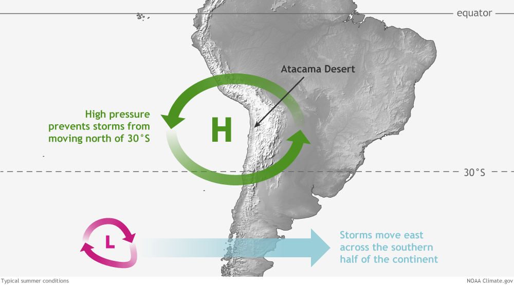
الاشتراك في:
تعليقات الرسالة (Atom)
ردحذفتعالوا نتكلم عن دوله مشهوره مافيش زيها فى الجمال والاصاله وحلاوة الاماكن السياحيه فيها اللى بتجذب العين والنفس وتدى صفاء ذهنى وراحه نفسيه واسترخاء جسدى
جورجيا هى دوله أجنبيه معروفه كلنا نتمنى نزورها ونتمتع بوجودنا واقامتنا فيها وتكون ذكرى لطول العمر نحكيها لاولادنا ونكررها كل مانقدر مش بس وسط الطبيعه والروعه الالاهيه سواء حدائق طبيعيه او صناعيه او كمان جليد مبهر مش بنشوفه كتير فى بلادنا وجونا العربي والامطار الغزيره المتدفقه اللى تديك احساس بالانتعاش والروعه او اماكن للاثار والمعالم القديمه جداااا اللى بتصورلنا روعة الفن القديم واتقان وابداع الانسان من فجر التاريخ لحد الان والتطور اللى حاصل للعماره والتشييد والفن عبر التاريخ
أشهر المدن والمعالم السياحية في جورجيا